

60% of Traffic But Only 16% of Sales: Solve the Mobile Web Challenge for Good
 Yaniv Navot — October 30, 2016 Follow @Yaniv_Navot
— October 30, 2016
The mobile industry is booming and more people than ever are visiting online retailers via their mobile devices. During Q2 of 2016 alone, smartphones accounted for nearly half of all traffic to eCommerce sites, a 10% increase from Q2 of 2015. Overall, more than 50% of traffic to leading US websites today comes from mobile devices, and global statistics on consumer mobile usage and adoption forecast mobile traffic to increase ten-fold by 2017.
Nearly every industry has become more mobile-focused over the past few years, but it is eCommerce that stands out by experiencing a uniquely dramatic shift toward mobile. Gartner estimates that revenue from mobile commerce will equal 50% of all digital commerce in the US by 2017, totaling $ 169.10 billion in sales. What’s more, mobile accounts today for 60% of time spent shopping online.

However, although many consumers use their convenient and accessible mobile devices to browse eCommerce sites, mobile still lags behind in terms of overall dollars spent, totaling a much more humble 16% of total eCommerce spend. It is clear that the majority of businesses are struggling to optimize their mobile web offerings and thus failing to secure conversions from mobile web shopping experiences.
The Mobile Conversion Challenge
Although mobile traffic continues to grow, the majority of conversions are still taking place on desktop and tablets. According to Criteo’s Q4 2015 State of Mobile Commerce Report, even native apps tend to convert 120% better than mobile web and 20% better than desktop computers. Mobile web bounce rates tend to be higher as well.
Just look at the following example from a leading eCommerce brand, reflecting data collected over a 30 day period in august of 2016:

As you can see, it’s clear that the engagement level on mobile is lower compared to desktop. In particular, Conversion Rate is 25% lower and the Average Revenue Per User is nearly 30% lower even though the majority of traffic (62.8%) is coming from mobile devices!
There seems to be a consensus in the market that mobile web just isn’t leading to conversions. However, an opposite trend seems to be refuting this very consensus- companies which have invested in optimizing their mobile web experiences are growing faster than those that have not! Is it possible that marketers are leaving significant amounts of money on the table by neglecting to optimize their mobile web offerings
According to Internet Retailer, “the 10 e-retailers ranked in the mobile commerce top 25 — but not included among the 25 top global e-commerce companies — grew their total web sales last year by an average 25%. On the other hand, web merchants ranked in the top 25 of global e-commerce — but excluded from the top 25 in mobile commerce — grew their average web sales by just 7.5%”.
How can mobile web be turned from an obstacle into an opportunity? To meet the expectations of today’s mobile consumers, marketers need to find innovative ways to satisfy their customers and alleviate frustrations from both a UI and UX perspective. This can be done by optimizing mobile web experiences, so any hindrance to mobile web shopping is effectively removed, and any unique opportunity it presents is utilized and capitalized on.
Why People Don’t Buy on Mobile Websites and What You Can Do About it
Understanding how to optimize your mobile website is essential to driving more mobile conversions. In essence, there are four key challenges hampering mobile conversions: omnichannel inconsistency, poor user experience, small screen size, security and safety concerns.
Pro Tip: Use this 25-point mobile commerce optimization checklist to conduct a thorough audit and develop a better understanding of what actions need to be taken.
Let’s explain each of the four key challenges in depth:
1. Omnichannel Inconsistency
Providing a consistent omnichannel shopping experience is the goal of every leading retailer out there. Yet while more than half of US retail decision-makers fully believe retailers provide a consistent customer experience across all channels, just over a quarter of US shoppers feel the same way.
Disappointing shopping experiences are often the product of a business’s inability to carry over data between devices. In other words, what a shopper does on a mobile device won’t inform their desktop or tablet experience and vice-versa. This is especially critical considering that around 90% of people move between devices to accomplish a goal, and 40% of users researching on smartphones directly go on to complete their purchase on a desktop.
Therefore, a very effective way for retailers to demonstrate omnichannel consistency is to connect user affinity for a certain category across all devices. To illustrate, many users exhibit a certain category affinity. In other words, If a user demonstrates repeated engagement or interest in Men’s apparel on mobile, they can be shown relevant category banners when re-entering the site from desktop.

2. Poor User Experience
70% of mobile shoppers consider poor mobile web experiences as obstacles when it comes to mobile shopping. In particular, 71% say that the shopping cart experience itself could be improved (Source: Facebook IQ). Attention on mobile is often fragmented, which is usually reflected by high bounce rates and super short sessions. Short mobile sessions mean that marketers must design for interruptions.
One powerful example for adjusting to short mobile sessions is to present recently-viewed items upon site return, or by simply opening the cart with recently left items. Doing this will bring visitors back to context, refocus them on products that they’ve expressed interest in and encourage them to add those products to the cart.

Marketers should adjust mobile web experiences based on context, making it easy for users to find what they are looking for, and resume interrupted tasks.
3. Small Screen Size
In a large scale usability test of the top 50 mobile eCommerce sites, the Baymard Institute found that 42% of mobile e-commerce sites have a homepage design that doesn’t allow users to accurately deduce the type of site they’ve landed on.
Even with brands that have massive name recognition and relatively intuitive sense of product offerings, like Best Buy or Macy’s, 70% of users would scroll across the home page to get an overview of what options were available to them.
Mobile phones come with inherent pixel constraints and their limited screen size makes navigation and product discovery harder for end-users, leading to frustrated or confused shoppers. As a result, discoverability on mobile is much more difficult for the average user than on larger desktop screens.
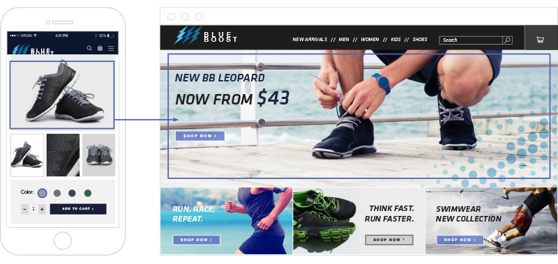
Take a look at the example below. On the left is Macy’s product page as shown to desktop users. On the right is the same page when viewed on mobile. Mobile shoppers who are looking for the item’s price, colors or size availability, have to scroll down “below the fold”; on desktop, the information above the fold provides users everything they need to help them quickly make a decision.

Maximizing screen space and guiding visitors throughout the purchase funnel are key to increasing conversions on mobile web. One effective tactic to improve product discovery and entice visitors to engage with new, top-selling, or personally-preferred items, is to display a scrollable carousel upon arrival to category pages. Alternatively, retailers can float a Tinder-like discovery questionnaire that allows users to swipe through to products or easily add them to their wish list.

4. Security and Safety Concerns
Bizrate Insights has found that nearly 2/3 of American shoppers don’t trust retailers with their payment and personal information, especially across mobile devices.
There are three key points which affect the consumer’s purchase intent: the trustworthiness of the eCommerce site, the expected benefit, and the perceived risk (e.g. the consumers’ perceptions of the uncertainty and adverse consequences of engaging in an activity). Building trust has been found to be a key factor in reducing consumers’ concerns and driving purchases.
Retailers can minimize checkout burdens and reduce security concerns by optimizing the checkout flow with triggered notifications. For example, retailers can offer idle visitors (i.e., visitors who linger for more than 40 seconds during checkout process) a quick way to contact customer support, or get help over email in order to complete the purchase or address and issues that may have arrived.

Bottom line: marketers must be constantly reminding their mobile shoppers that their information is safe and secured.
What This Means for eCommerce Marketers
Mobile devices and smartphones have completely changed the way humans think, connect, and work. Nowhere is this transformation more apparent than in the way we shop. It’s not that mobile is replacing any of the popular commerce media. Rather, consumers are incorporating mobile devices into their shopping ecosystem.
While the rise of eCommerce itself has forced retailers to conduct their business in fundamentally different ways, the explosive increase in ownership and usage of mobile devices presents a tremendous opportunity for eCommerce focused businesses. By creating omnichannel consistency, tailoring a rich user experience, maximizing small screen size, and addressing security and safety concerns, mobile marketers will be able to tap into the mobile web opportunity and drive more conversions from mobile traffic.
Digital & Social Articles on Business 2 Community
(28)