7 Cyber Monday Wins and Missed Opportunities
— December 2, 2016
Well, it’s happened.
Cyber Monday 2016 has come and gone. While there are plenty of “Cyber Tuesday” and “Cyber Week” emails, push notifications, and deals still rolling in, I think it’s safe to say we’ve seen the bulk of what our favorite brands had to offer this year.
With so many deals flying about on a single day, getting customer attention and following through with a useful, targeted, valuable deal is the only way to cut through the crowd anymore.
Let’s take a look at some clear winners, and some campaigns that missed an opportunity or two.
Be obvious: The Bouqs Company and NYC Social Sports
Sometimes overly complex should take a backseat to obvious, and Cyber Monday is probably one of those days.
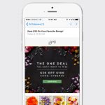
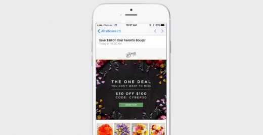
1. Check out the email from The Bouqs Company, with it’s clean, simple design, clear call to action, and the saving amount called out in the subject line.

2. NYC Social Sports perhaps was trying to do too much on a day when everyone’s already getting approximately a zillion emails. According to my colleague who received this email, “I needed to click around too much to find what I was looking for.”

Subject lines are the front lines: Minibar, Urban Outfitters, and Sephora
When sending an email, oftentimes the only thing people will see is the subject line, before they decide to open, delete, or ignore your email. This means these words are your front line.
3. Minibar included “Fwd:” in the subject line—a potentially risky move, but one designed to get attention. Since most emails we get that are forwarded come from a friend, they’re banking on customers noticing this email more readily than others in their inbox. The risk is that customers might be irritated when they open the email and see it’s not, in fact, from a friend. But Minibar does follow up with a referral offer at the end of their email—the customer can save money while sharing with a friend who can also cash in on the deal.

4. This Urban Outfitters subject line pretty much nails it. While other brands go for dollars and percentages off, they chose to stand out with a note about money they “owe you.” Everyone likes collecting cash they’re owed. The email itself is no slouch, either. It’s entirely a gif—eye catching, fun, and, to the point above, clear.

5. Sephora delivers with a clean and pretty email below, but perhaps a little flavor could have been added to the subject line. An emoji, maybe?

Remember the click-through experience: Expedia
6. The email from Expedia below is clear and concise. Score.

But there’s a missed opportunity—when the customer clicks through to the app, the screen landed on has nothing about Cyber Monday on it. That means a confusing experience for the user, who is fairly likely to abandon their shopping at this point, instead of clicking around to find what they thought they were looking for. Instead, use deep linking to take users straight to the part of the your app or in-app message for the campaign.
Tying it all together: Digital Marketer
Let’s look at a campaign’s user experience from start to finish.
7. Digital Marketer used a web push notification to alert readers to a discount. Props for using this new, underutilized channel on a day when everyone else is sending emails.

The copy, however, might have benefitted by being a bit clearer and directed toward the benefits to the customer. “Super Sale” sounds jazzy, but what does it mean? “50-84% off” is very specific, but off what, and why that range? What are their “best selling products?”
Some possible copy to test this against could be things that highlight the benefit to the user, like “Learn! Head start on 2017 personal development,” or “Templates for your 2017 planning,” or “Support charity and do business,” for example. Additionally, with targeting and personalization, marketers can set up a series of messages with different product offerings for different user segments.

Once the user gets the to landing page, an interstitial is triggered within the first 15 seconds, with a deal unrelated to the web push the user just came from. This has the potential to confuse and derail a customer. Instead, they could have paused this notification during the Cyber Monday campaigns, or triggered it later in the visit.
The landing page itself has a couple great elements—a countdown clock to let users know how much time they have left to buy, and 10% of the sales go to charities. Plus, the deals themselves are highlighted with the old price directly next to the deal price. This is a great way to show exactly what benefit the user will get from “claiming the deal.”


Tips to hold onto for next year
When it comes to emails, remember that everyone is sending them. Spend lots of time on your subject lines, and test them. Plus, take advantage of other channels. Web push and in-app notifications can stand out from the crowd.
Finally, remember that experience is king. Put yourself in the user’s shoes and walk through all the clicks and swipes. Do they go seamlessly from your message to the deal they can take advantage of? With so many distractions and other deals on the same day, marketers can’t afford to lose potential purchases to confusion. Instead, create an easy experience that allows for converting in as few steps as possible.
Digital & Social Articles on Business 2 Community
(9)