

Brilliantly Mundane: 9 Ways Boring Brands Turned Ugh, Meh, And Bleh Into Big Business
Health insurance. Bras. Tax prep tools. Investment products. Chinos. These aren’t products that people are typically excited to talk about, let alone shop for. Yet these product categories have enjoyed a surge of youthful relevance, and a handful of “boring brands” are attracting loyal—and in some cases outright fanatical—consumers by designing shopping experiences that can actually border on pleasant.
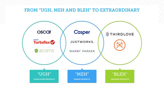
I’ve sorted nine modern brands into the very scientific categories of Ugh, Meh, and Bleh to denote shopping categories that are typically considered complicated, boring, or inconvenient, respectively. Yet these nine Ughs, Mehs, and Bleh brands have created entertaining, cohesive, and easy-to-use digital experiences, thoughtfully using digital experiences to behave with a bit more humanity. What choices did they make that allow them to stand apart from established category players? What insight informed or inspired those choices? What’s the benefit for the consumer?
A quick word on millennials—they’re getting old. Which means they’re forced to deal with shopping for even boring stuff that probably didn’t make their teenage vision boards. Almost half (46%) of today’s B2B consumers are now millennials, according to a 2015 study commissioned by Google. Understanding exactly how to make the mundane romantic for this audience is increasingly critical across industries.
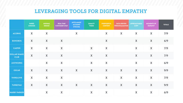
By digging into the shopping experience of these nine brands, as well as talking to some of the people who designed their websites, nine specific design choices emerged. Few brands ticked all nine boxes (and that’s okay), but the Ugh, Meh, and Bleh brands average between six to seven of these defining behaviors.
1. Uncluttered Design
Landing page as first impression: cool, clean, and unchaotic
Say you pass someone on the street who catches your fancy. Then the moment you make eye contact he starts yammering about his purpose, passions, and beliefs, when a simple “hello” would have been . . . normal. Minimal design is just a friendly “hello” to someone who doesn’t know you as a brand yet. More importantly, a clean interface establishes a small but hopeful first glance for the first-time user—this might not be so painful after all.
“People don’t want a lot of clutter,” says Jennifer Barrett, chief education officer and editor-in-chief of Grow magazine from investment app Acorns. “There’s so much information out there already. We made a conscious decision to make our page streamlined. Very streamlined, very clean, very accessible—all the things we want our content to be.”
Minimal design is also an exercise in restraint for brands tempted to ask too much too soon (“Can we have your email address?! All your identifying information! Will you take our five-minute survey?!”) of their potential new users.
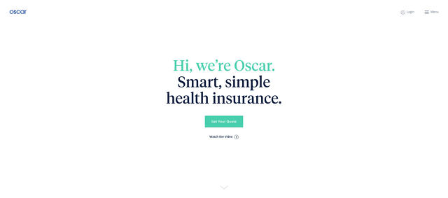
Compare the mobile or desktop landing page for Oscar to say, Oxford Insurance. Currently on Oscar there are six elements commanding your attention compared to about 29 on Oxford. Oscar’s streamlined interface isn’t boring, it’s peaceful. The complicated act of shopping for health insurance suddenly seems easy when there are fewer elements vying for attention.
Ask yourself: What’s the least amount of information you can give that leaves people wanting to know more?
2. Less Choice
Intrigue rather than overwhelm potential new users with what you offer.
Smart brands today drastically reduce the number of decisions required before you decide to part with your money. This comes in two flavors: 1.) a pared-down number of products offered and 2.) a streamlined number of clicks or swipes required to complete a goal, such as a sale or setting up an account. “The benefit [of less choice] is eliminating decision fatigue for users,” says Kathy Geisel, UX researcher at General Assembly. “When there are too many choices and too much information, it causes a stressful experience and users will leave your site. They want a clear direction. ‘Don’t make me think’ is the title of a famous UX book.”
Pared-down choices or actions generously lighten the cognitive load on a user. The “Magical Number Seven, Plus or Minus Two” is a handy rule of thumb to keep in mind here. This theory, developed by esteemed cognitive psychologist George A. Miller, suggests that the average number of objects a human can hold in working memory is seven plus/minus two. If you’re shopping and comparing different products, then have a tightly edited set to choose from, that’s a favor to your brain.
The number of products offered by our featured brands largely fall within the seven-plus/minus-two threshold: Acorns: five smart portfolios, Bonobos: five standard fits, TurboTax: four personal tax products, and Dollar Shave Club: three blade subscriptions.
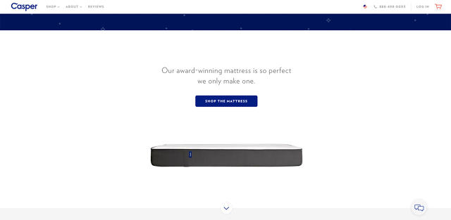
Casper is the master class in simplicity, with its marquee product being the “award-winning mattress so perfect they only make 1,” (though available in six sizes) followed by one set of sheets, and one type of pillow. This radical simplicity helped Casper net $1 million in its first 28 days, and more than $100 million in revenue in its first two years.
Ask yourself: How much choice is just enough?
3. Approachable Copy
A tone of voice that actually sounds human: familiar speech pattern, yet distinct in attitude
Despite the fact that the brands on our list fall in dry categories, each committed to a distinct and likable tone of voice. They didn’t let the complicated nature of their industries scare them into hiding behind a clipped tone, nor did they swing the other way and invent a saccharine tone to mask the experience. Most kept it simple and consistent.
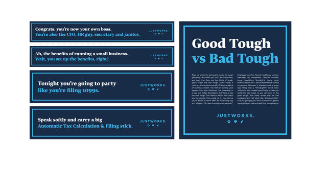
I came across Justworks, a B2B “professional employer organization,” because its cheeky New York subway ads punched through the not-fully-caffeinated leg of my commute. As a PEO, Justworks is arguably the least enthralling industry to be in. But rather than play into the sedate nature of their category (dealing with compliance and 1099 filings, etc.), Justworks created a playful campaign called Good Tough vs. Bad Tough that takes the piss out of the most tedious pain points of entrepreneurialism. “It’s about plain speak. Speaking openly and transparently, but also with a little bit of humor,” says Camilla Velasquez, head of product at Justworks. “It’s not about scary or esoteric branding, which you see a lot in the B2B space. You definitely see it in the compliance and heavily regulated industries for example. There’s no reason that you can’t be thoughtful and educational about it, but also not entirely self-serious.”
On the far end of the humor spectrum, check Dollar Shave Club’s tone for its unapologetic One Wipe Charlies product description and product video viewed more than 3.3 million times. Your day might be better for it.
Ask yourself: What tone reinforces the emotions you want your users to feel when interacting with you?
4. Real-time customer chat
Real-time support chat: a chance to build a one-to-one relationship with your audience while speaking their native tongue
Take a moment to relate to your textually active millennial audience: 34% of millennials would rather have their teeth cleaned than call customer service. And more than a quarter (26%) would rather go to the DMV than fire up a dial tone. This helps explain the rising investment in real-time chat functionality. “We had real-time customer chat since very early on,” says Luke Sherwin, cofounder and chief creative officer of Casper, a mattress startup. “We see it as another conversation channel. It breaks down the feeling of there being anything between you and us a brand. No formality, no bureaucracy, it’s just people to people.”
Real-time chat support isn’t notable just because it’s on trend with millennial behavior. It’s about purchase-proofing your digital presence, given that 52% of millennials are ready to abandon an online purchase if they can’t find a quick answer. Six of the nine featured brands offer real-time chat support along with traditional modes of customer service. Heidi Zak, cofounder of the lingerie company ThirdLove says. “For us, a large number of customers contact us through chat because they have questions or a follow-up, and it’s really great to be able to provide a personalized conversation with them live through chat. This makes it a lot easier for women to make a decision. It’s like having your own personal fit specialist with you.”
A few brands take customer service a step further and reframe agents in a playful way: At the apparel company Bonobos customer service reps are “Ninjas” and at Casper they’re “Snooze Specialists.” This seemingly small gesture telegraphs to users that their customer service reps might actually enjoy their job, and therefore truly enjoy helping customers. Not to mention the title makes for a more enviable business card.
Ask yourself: How do you reassure your users that you’re with them every step of the way?
5. Credible content
Independent, resource-driven journalism subsidized by brands is where the action is.
The eternal question: who does content well? While there are three common approaches, one of these is most relevant to our question of how boring brands can become more enticing. For context, approach one is about “humanizing the company culture and product, like Justworks and Oscar, and tend to be written by full-time employees. Approach two represents the gorgeous, well-produced lifestyle blog, such as Warby Parker, that uses creative professionals (like photographers) in addition to content strategist types.
Then there’s approach three: the rise of independent brand-subsidized journalism.
Brands that can bankroll independently produced journalism have broken ground on a space worth watching. What’s at stake is a more equitable and symbiotic relationship for consumers, brands, and the media industry. There are obvious obstacles, both financial and ideological (is branded journalism truly more virtuous than branded content), however, both Casper and Acorns in particular have found significant success, and their approach merits a closer look.
The modern approach differs in two ways: its purpose for existing and in the type of people behind the content curtain.
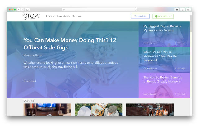
Let’s start with the purpose of content. For example, Casper makes mattresses (boring) but publishes Van Winkle’s, which exists to explore the “science, culture, and curiosity of sleep” (interesting). Acorns makes a personal investing platform (complicated) but publishes Grow magazine, which offers advice on “financial wellness” (compelling). Both publications make little mention of their mother brands, because the driving purpose is to intrigue their audience, rather than herd them through a marketing funnel. Having a purpose or editorial vision beyond instant sales conversion can pay off. According to Nick Light, PR manager at Casper, Van Winkles.com reaches “about half a million readers per month.” The Grow newsletter commands “between 1.3 and 1.4 million subscribers,” Barrett says.
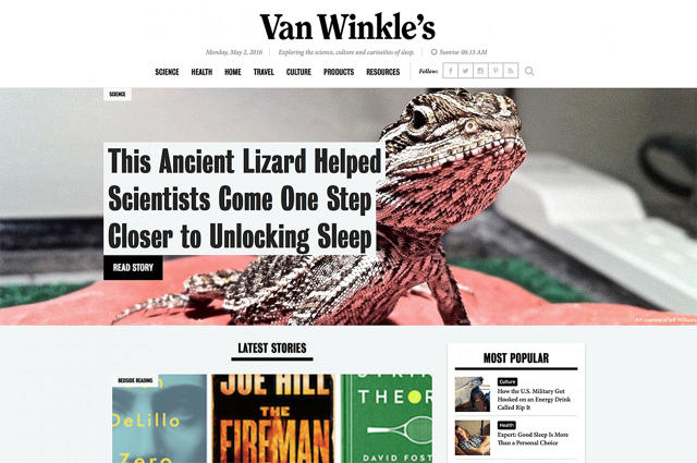
Brand-subsidized journalism, when done correctly, can benefit an audience in terms of quality control. Meaning, content capable of getting further reported by a blue-chip media company is likely more worth your time than content automatically pumped out of brand’s social feeds. “Van Winkle’s has exceeded our expectations in driving true organic curiosity in the ways that sleep touches culture and science,” says Sherwin. “The second thing is the authority and credibility that Van Winkle’s has managed to independently build up. The New York Times and the Wall Street Journal have cited it for the conversations we’ve started. It’s a big qualitative indicator that investing in content for the sake of content, not for the sake of conversion, can be worthwhile for a brand.”
Finally, the people behind the content matters. Van Winkle’s and Acorns intentionally hire vetted journalists, not content strategists with marketing backgrounds. The content is coming from a place of integrity and objectivity, or at least that is the intention. “We went out of our way to bring actual journalists in to write these stories,” Barrett says. “We’re introducing investing to a whole new generation of investors who haven’t had much exposure to it. It was a conscious decision to bring someone in who didn’t have a marketing background, but a journalism background, both for the credibility but also because this is really about education first and foremost.”
For other brands considering a foray into the subsidized journalism space, keep in mind that the leadership driving two successful publishing initiatives repeatedly stressed the importance of setting and defending a purpose beyond immediate sales. “It’s important to create boundaries within your organization and make sure everyone’s on the same page about what the objective is in your content. That needs to be really clear.” Barrett says. “All these companies want to do content. Content because it’s a trendy thing to do, because it’s a shiny marketing tool. But, it’s content—an opportunity to engage and educate. If you do it as an afterthought, then it’s really clear to the readers.”
Ask yourself: Are you willing to invest the right resources and guardrails in making content credible?
6. Data-driven personalization
The personal is profitable: Data informs product innovation and instills trust that the consumer is getting the best possible product for her/him.
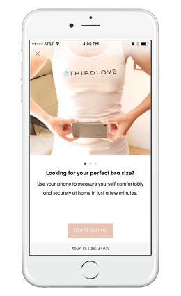
Finally we get to the sexy business of algorithms and personalization. Trends toward personalization are nothing new yet not as common as you’d expect. Businesses that personalize their products enjoy a 19% increase in sales, yet only 29% of marketers today invest in website personalization and use behavior-based data. While users don’t need to know exactly how the algorithm works, several brands do a great job of flexing the fact that algorithms and data scientists have done serious crunching of data sets to generate better, more personalized recommendations and/or product innovations. In other words, the magician never fully reveals his or her secrets: “What we strive to do is make the fitting experience as seamless as possible by leveraging technology so that the average consumer isn’t thinking about that. Instead she’s just thinking how cool it was that she found her correct size and got an amazing bra that fits really well, all through her mobile phone,” says Heidi Zak, cofounder of ThirdLove, which uses technology to help women find better-fitting bras.
ThirdLove’s philosophy tab does a solid job blending the right amount of “what nerdy thing we’ve done” and “what it means for you.” For example, ThirdLove’s data set gleaned from their iOS mobile fit app revealed that “50% of women sizes A-D fall in between standard cup sizes,” so they developed an entirely new-to-the-category line of half-sized bras. The app then steers women toward the best possible bra for them. The ability to wield data in a way that helps your audience suddenly feels a lot less “not normal” is a powerful purchase motivator. ThirdLove’s revolutionary half-size product line is now worn by about 35% of customers, Zak says.
What’s notable for other brands is the ability to embrace the idiosyncrasies or nuances of a diverse audience—in ThirdLove’s case, the variety of women’s breast shapes—and turn those differences into selling points rather than treating them like unfortunate outliers.
Ask yourself: How can aggregated data be used to filter the product selection experience and make it feel more personal and delightful?
7. Moments of Empathy
Simple, thoughtful touches that flip a pain point into a moment of delight
Empathetic brands don’t shy away from paint points. Instead, they view pain points as purpose and develop digital gestures that communicate to users that the company cares, making even the most banal tasks more compelling.
Moments of empathy are a case for the importance of great user experience designers—the wonderful people not afraid to ask “What’s the worst thing about our page?” and then develop an elegant solution. “In today’s world you have to consider the needs of the business, brand, and user,” says Kathy Geisel, a UX researcher at General Assembly. “It’s not just about making the most money, but about having the world think you care about your customers, and then actually showing you care by creating these experiences.”
The great thing about moments of empathy is that there is no end to the myriad of ways brands can show they care about their users. What follows is a grab bag of different tactics currently in play, but it’s by no means a full list.
- Is something complicated? Hovering “learn more” carets allow users the flexibility to get to know your brand at their own pace.
- Is proper fit important to closing the purchase? Develop a digital fit simulator like ThirdLove’s virtual sizing mobile app.
- Is something seemingly boring or academic? Add a “_ minute read” header to the content à la Grow from Acorns.
Ask yourself: What’s the worst part of a page and how could it become the most delightful?
8. Quality video
Video well done: Moving pictures move product.
Whether you represent a B2B or B2C brand, it’s worth noting that 80% of millennials watch video to aid their purchase decisions. Again, that stat is not watching video for entertainment (although good video is often entertaining), it’s watching video specifically to make better shopping decisions. A 2015 study commissioned by Animoto found that the top three preferred video types are 1.) how a product or service works, 2.) testimonials, and 3.) “about the company.”
Dollar Shave Club’s 2012 “about the company” video still holds up as one of the all-time greats, with over 22.5 million views. Millions of views for just a guy, standing in front of you, asking you to buy disposable razors. It’s not a paid comic or actor standing in as spokesperson, that’s Michael Dubin, one of the two cofounders. Dubin wrote the spot himself, parlaying his previous experience in New York’s Upright Citizen’s Brigade improv comedy scene to CEO of a company whose revenue is projected to hit $240 million this year.
Ask yourself: Are there easy, evergreen stories about the brand, product, or process that can be told in a compelling way?
9. Auto-magic account syncing
Automating low-engagement actions allows an audience to experience the perks, not the pitfalls of your brand.
TurboTax. Probably not the first brand that comes to mind when you think “millennials.” Yet if you poll millennials who have used TurboTax before, you might be surprised how suddenly excited young things are to discuss filing their taxes. All because TurboTax has mastered the art of auto-magic account syncing, among other things. By keying in banking account information, financial investment info, and in some cases even a designated employer code, all the related questions on a tax return are auto-magically and accurately populated, saving the user precious time.
In Acorns’ case, by connecting your bank account, the simple act of swiping your debit or credit card rounds up your purchases, and deposits the spare change into an ETF. Oscar syncs your daily steps taken while wearing their Misfit fitness tracker with perks like Amazon gift cards.
These are examples where 1.) the value exchange of personal account information for tangible, desirable rewards are equitable—time saved filling out forms, easy and convenient way to invest, and handy perks respectively—2.) the convenience of the user is front and center, and 3.) the brands are confidently willing to play a less overt role in users’ lives by running quietly in the background.
Ask yourself: Are there overlooked opportunities for a value exchange between users’ needs and your brand’s digital capability?
Boring brands have become the new cool kids because they demonstrate a higher order of respect and empathy for their audience—if only because they never had the luxury of taking their audience for granted.
Fast Company , Read Full Story
(64)
