
Chart The Rise And Fall Of America’s Most-Eaten Foods
Potatoes have been Americans’ favorite vegetable since the 1970s, and for the last two decades, our most-consumed dairy product has been American cheese. But in some ways, U.S. diets are getting healthier: We now eat more chicken than red meat, and dark greens—once consumed less than onions—are now second only to our beloved potatoes.
A fascinating infographic charts how the most popular foods in the U.S. have changed over four decades, based on USDA data. Whole milk has been overtaken by 2% milk and cheese; butter is now more popular than margarine. Carrots rose in popularity after “baby carrots” became common in grocery stores.
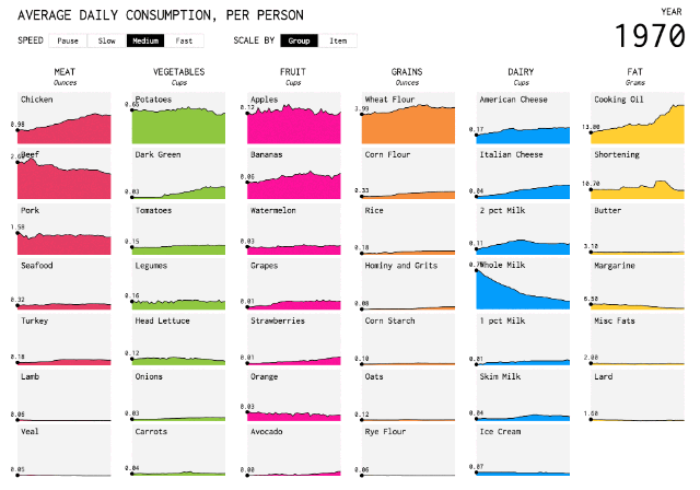
Nathan Yau, a statistician, created the chart for Flowing Data after seeing a similar visualization about the changing British diet. The infographic simultaneously sorts foods into six food groups. “I wanted to compare multiple foods at once, rather than to just see a time series for each food,” says Yau.
The data surprised him, as he writes on the site:
I also didn’t expect dark greens, which includes vegetables like spinach and broccoli, to rise so much from barely anything. Did people really consume basically no dark green vegetables pre-1980s?
And how about chicken with the come-from-behind victory? In 1970, people consumed more than twice as much beef than chicken, but by 1987 it surpassed pork, and in 2004 moved passed beef. Chicken has been on top since. You go, chicken.
Watch the full visualization at Flowing Data.
Cover Photo: Petrified Collection/Getty Images
Fast Company , Read Full Story
(38)