When you walk down the streets of New York City, you aren’t walking just through the present. You are surrounded by the canyon walls of the past, and the signage around you—the building names, the business signs, the faded slogans—are actually fossils, peeking out from the strata of decades gone by into the present.
An adjunct professor of design and typography at the Cooper Union School of Art, Alexander Tochilovsky considers himself something of a paleontologist of these signs. By wandering around the streets of Brooklyn’s Fort Greene neighborhood, Tochilovsky was able to point out what the billboards, building names, house numbers, and mailboxes that surround us say about New York’s past.
In this fascinating video for Quartz, Tochilovsky goes over some of the peculiar typography and signage you might see in Brooklyn on any given day, and decodes it for viewers. “Signs are about communication,” he says. “If you can decode them, you can understand a city much better. Even old signs have something to communicate to us.”
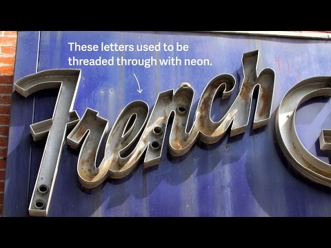
Pointing out one example, he notes how the hollow metal letters of garment cleaner’s sign indicate that they used to contain neon, and that the the A’s and N’s were designed to accommodate the tubes, which is why we call such a style ‘gaslight’. Stumbling upon another building, he explains the period at the end of an apartment complex’s name—The Clinton.—was a typographic mark broadcasting respectability in the 19th century, just like the current Wall Street Journal wordmark.
Born in what is now Ukraine, Tochilovsky says that looking at the signs around him helps him feel closer to his adopted home city. “It kinda sounds hokey, but it’s a way for me to touch history,” he says. But really, it doesn’t sound hokey at all.
[via Quartz]
Sign up to learn more about Fast Company’s Innovation Festival in November