

LinkedIn refreshes desktop interface, emphasizing content and conversation
For the first time since LinkedIn’s inception, a new design has hit the LinkedIn desktop browsing experience.

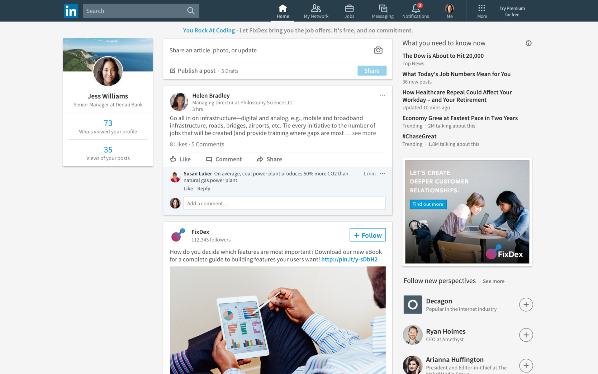
LinkedIn is about to look different. Starting today, LinkedIn’s interface on desktop browsers will sport a brand-new user interface overhaul. The company acknowledged in a blog post that it is the “the largest desktop redesign since LinkedIn’s inception”– and about time. It’s been long enough.
Rebuilt from the ground up, the redesign enhances the interface and draws inspiration from other popular networks. A streamlined navigation includes seven core areas: home (your feed), messaging, jobs, notifications, me, my network and search. Other LinkedIn features are available if the user clicks “more.”
LinkedIn also has overhauled the feed, leveraging algorithms and a group of human editors to ensure that each user gets a custom experience that is appropriate to his or her interests and needs. When your content is published, the updated interface also lets you know what type of individual is reading and where they work.
The search functionality has also been rewritten, allowing users to use one single search bar to find anything and everything on LinkedIn: people, jobs, companies, groups and schools as before. Users can also refine their queries.
LinkedIn has also suggested enhancements to make your profile stand out above the crowd.
Perhaps the most familiar newly introduced functionality is what LinkedIn calls “smarter messaging.” Messages appear on the bottom of the screen, much like you’ve seen on Facebook.
The rollout will begin today and continue worldwide to all LinkedIn users over the next few weeks.

Marketing Land – Internet Marketing News, Strategies & Tips
(84)
