

The Gender Pay Gap Is Even Worse At The Top
It’s already well known that a woman makes 79¢ for every dollar a man makes. But did you know that the gap gets even wider for women with the highest incomes?
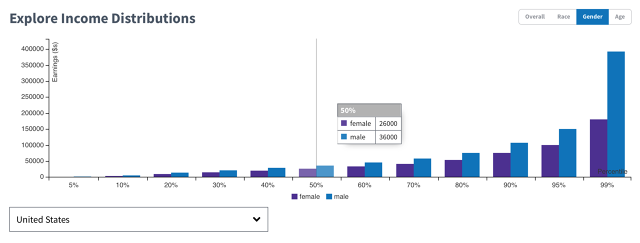
The amount women are paid decreases to 46¢ on the dollar when it comes to the top 1% of earners, according to new data released by the Commerce Data Service (CDS), a group of data engineers, technologists, and scientists who work in the Department of Commerce.
There are several anecdotal examples of this disparity. Robin Wright, who plays Claire Underwood on the Netflix series House of Cards, recently had to negotiate for the same pay as her costar Kevin Spacey. Yahoo’s CEO Marissa Mayer was paid less than the man who held the job before her. And General Motors CEO Mary Barra received a first-year compensation package that was less than half of what her male predecessor was offered.
But there are relatively few large-scale analyses of the difference in pay between women and men at the highest income levels. The findings in this study come from the American Community Survey Public Use Microdata Sample, which is gathered by the U.S. Census Bureau, and includes income data for millions of people. It’s a highly granular data set that looks across 20,000 different attributes, including sex, educational attainment, and employment status.
The job roles analyzed included c-level executives, medical professionals, financial professionals, lawyers, and computer engineers.
“At the 90th percentile and the 80th percentile, the gap grows dramatically,” says Joshua Patterson, a Presidential Innovation Fellow with CDS who helped build the system used to crunch the data. “From the median all the way up to that 1%, it just keeps growing and the gap gets larger.”
The mission of the Commerce Data Service isn’t just to crunch numbers, but to give people ways to use and act on the data. The group has already had a hand in creating HackThePayGap and the Commerce Data Usability Project. And this March, in coordination with the White House, CDS helped launch The Opportunity Project, a network of a dozen digital tools with critical information about jobs, housing, transportation, schools, and neighborhoods.
Using a combination of four main data sets from the Department of Housing and Urban Development, the Department of Education, the Department of Labor, and the Census Bureau, they created a score that shows the “opportunity” different life choices represent, and how you can use that as a predictor of your financial success in life. If you move to Nashville from Houston, for instance, how will that affect your earning potential? If you send your kids to this state school versus that one, which will lead to a higher income and less debt for them across their lifespan? This data can help you find the answer.
The project includes private partners as well. Redfin, a national real estate brokerage competitor to Zillow, built a tool that uses the Opportunity Score to rate homes based on the number of jobs within a 30-minute car-free commute. It tells you which homes, cities, and neighborhoods have the most job access. And it does this for 350 cities across the country.
“We make all these micro-decisions everyday,” Patterson concludes. “And if we can make more informed decisions, eventually they’ll add up across our lives. That’s very powerful in its own right, really helping people understand and quantify, What is the economic benefit of very small choices?”
Fast Company , Read Full Story
(15)
