The Onion Announces A Redesign As Only The Onion Could
The ingenious parody news site takes its redesign as an opportunity to (humorously) shit on readers.
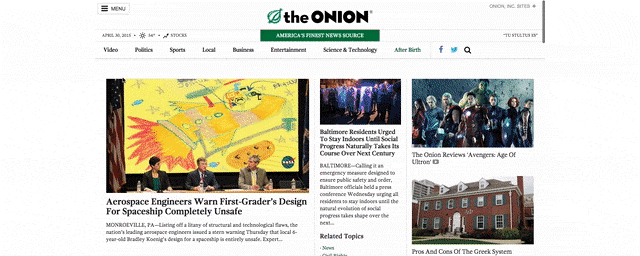
Consistently brilliant satirical news site the Onion just redesigned its website. The redesign is nothing special. It has bigger photos and less clutter overall—typical features of most site redesigns nowadays. But the blog post announcing the new look is gold, a beautiful sendup of self-aggrandizing redesign announcements, which detail the motivation behind every last ad placement and share button. Per the post:
Web users are universally dimwitted, incompetent, and effectively brainless—not to mention often physically repulsive—and for that reason, the newly designed website will feature curated content from the Onion’s award-winning staff of editors.
The homepage contains a dedicated section with recommended articles for readers like you who are undoubtedly too dumb to find such things on your own. Moreover, the curated content will update every few hours in order to more efficiently and effectively herd all of you like the hapless, thick-skulled cattle you are.

Lest readers have any illusions, the Onion makes clear who the redesign is really for:
TheOnion.com is incredibly customizable, with our advertisers now able to cater the user experience in any way they please. The Onion’s many corporate partners are free to adjust our homepage to feature the content that is of most interest to them, and are capable of altering the website’s color scheme, font, and navigation bar, as well as editing content directly on the site. All advertisers will also have full access to the website’s back end, and are indeed encouraged to make as many changes as they see fit.
The post ends with the declaration that every designer secretly longs for: “User feedback on The Onion’s new website is strictly prohibited.”
[Screenshots: via the Onion]
Fast Company , Read Full Story
(119)