These areas either have the noisiest neighbors or the nosiest neighbors, depending on how you look at it.
Noise might seem like merely a nuisance, but it’s also a health risk: according to the World Health Organization, noise pollution can lead to cardiovascular diseases, sleep disturbance, and stress. Last year, NoiseTube gave Smartphone users a way to measure and map noise levels so they could help city officials monitor it. Now, the real estate site Trulia has come up with its own way of visualizing noise pollution: using the crime data on noise complaints.
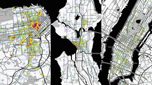
Trulia pulled five years worth of noise complaints and mapped out the noisiest areas of Seattle, New York and San Francisco. It then used the software CartoDB to create GIF heat maps that show the changes by year. (Check out the gallery above for the animated versions.)
But as Trulia admits, this method of mapping out noise pollution is far from perfect. For one, the data depends heavily on the people who are reporting it—their personalities, biases, and eagerness to pick up the phone and call 911. What could be considered loud enough to report to the police for an irritable old lady would not be the same for a teenager in a garage band. And if police have not been historically helpful to you in the past, you’ll be less likely to go to turn to them with a problem like noisy neighbors.
Still, it’s an interesting approach to mapping out the sounds of a city, and the loudest parts of each city do seem to make logical sense. In Seattle, Capitol Hill and the University District are densest in noise complaints, while in San Francisco the hotspot is the Tenderloin. Meanwhile, in New York City, noise is just . . . everywhere.
To see the maps in full, head over to Trulia’s blog.
[All Images: via Trulia]
Fast Company , Read Full Story
(116)
