For years, Apple sought to accentuate the elegant design of its products by using simple colors like black and white, then later expanding to silver, gold, and rose gold. And it has touted the retina display and color quality of iPhone and iPad cameras. Now, Apple is focusing on improving the quality of color hues on the screen, which have the potential to actually improve the health of users.
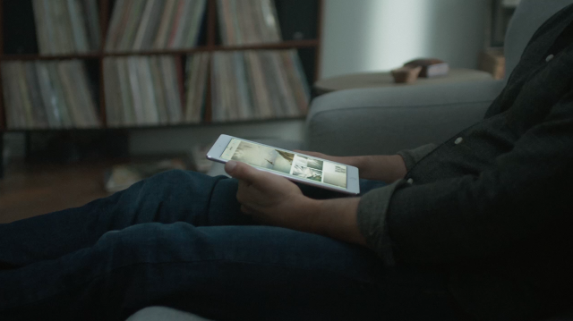
It was one of the little-noticed but consequential changes introduced at its otherwise ho-hum launch event on March 21. On the surface, all Apple seemed to introduce—actually reintroduce—was a smaller iPhone (4 inches) and a smaller top-end iPad (9.7 inches). But both devices, especially the new smaller iPad Pro, establish Apple’s new obsession with color.
The emphasis is not only on prettier hues, but features that could improve the viewing experience in many other ways. The new iOS 9.3 mobile operating system has a feature called Night Shift that changes the screen from a “cool” bluish tone to a “warm” reddish tone in the evening, which may be better for helping people fall asleep. Several studies show that, while all light can screw up our circadian rhythms, blue has the most severe impact.
This has become a trendy topic in the tech world, but the science goes back almost two decades. In 1998, a researcher at Uniformed Services University in Bethesda, Maryland, discovered photoreceptors in the eye that connect to the part of the brain that regulates our internal “clock.” Bright light reduces the production of melatonin, a hormone that brings on sleep. Yet a 1995-2001 study of people by Thomas Jefferson University found that blue light is especially potent, suppressing melatonin for twice as long as green light, which has the weakest impact. (If Apple wanted to maximize the sleep-supporting feature, it would probably tint the screen green at night.)
Blue light isn’t always bad, though. Light exposure acts almost like caffeine, not only keeping people awake but helping them stay alert. A Harvard Medical School study found that blue light is especially powerful at suppressing the delta brainwaves associated with sleep and boosting the alpha waves associated with alertness. So if you are on deadline or pulling an all-nighter and using an iPad, you might take advantage of the option to turn off Night Shift in iOS 9.3.
DCI P3: Real-World Color
For a company that specializes in simple design, Apple isn’t afraid to use jargon in selling new products. It made gigaflops a selling point of its Power Macintosh G4 in the 1990s and introduced most people to technologies such as back-illuminated CMOS sensors and phase detection (or Focus Pixel) autofocus in its iPhone cameras. This time, the new vocabulary lesson is DCI P3—a gamut, or range of colors, on the 9.7-inch iPad Pro screen beyond what most computers or even TVs can display. (Apple’s 27-inch iMac with Retina 5K display and 21.5-inch iMac with Retina 4K display also support DCI P3.)

The “DC” in the abbreviation stands for digital cinema. Apple claims that the new iPad Pro screen is as colorful as big-screen digital movie projectors. This could be a first for mobile devices, says Alex Cranz, a reviews editor at Gizmodo, who has spent many hours measuring color quality on smartphones and tablets. Even the super-colorful OLED screens on some Android devices don’t hit DCI P3, says Cranz.
Deadpool’s red suit (and all that blood) should look just as vibrant on Apple’s new handheld as on the big screen, and much better than it does on all but the priciest new TVs. On most screens today, red comes out looking more like orange. DCI P3 color material is just emerging on the newest UHD Blu-ray discs and streams from Netflix and Amazon. “Having that option for the native color space to be at least P3 is a great idea,” says Joel Silver, founder of a video display standards consultancy called the Imaging Science Foundation.
Color Shifting with True Tone: Helpful or Heresy?
Apple is debuting a feature called True Tone in the 9.7-inch iPad Pro. It uses sensors embedded in the iPad to measure the color cast of the light around the screen—such as reddish for incandescent bulbs or bluish for fluorescent. The iPad Pro then adjusts the screen’s (jargon alert) white point—the “color” of white. (There is no platonic idea of “white.” It can be bluish as in fresh snow, for example, or tawny as in French vanilla ice cream.)
Some experts love this idea; others hate it. Chris Gampat, a photographer and journalist who runs the site The Phoblographer, thinks that True Tone could help a perennial problem by minimizing the difference between the monitor on which the image is created and the device on which it is viewed. “If I were to edit a photo for you right now and send it to you, it would be based off of my current viewing experience,” says Gampat in an email. “It’s dark(ish), there is light coming into the room from my living room, and I have two windows that face the building behind my apartment.” People reading his site probably don’t have the exact same conditions he says, so an image the he adjusts to look “normal” won’t look normal to other people. Gampat gets around this by using two monitors with different settings, to get images that look good on a variety of screens.
Andrew Peters of user experience design firm Epic thinks that True Tone could make digital media feel more natural. “I can imagine that it potentially could make it seem more like it’s replicating the feel of moving a white page between different environments—from your incandescent lights to daylight, etc.—and have the digital world feel more tangible,” he says via chat.
Linn Huang, a technology analyst for IDC , also thinks it’s better to manipulate the whites for the viewing conditions, even though it changes what they were originally meant to look like. “Sometimes actually having a perfect white works to the detriment of the viewing experience. If you’ve ever read an e-book on an iPad or other tablet, this is one of the reasons your eyes get fatigued so quickly,” she says by email. “Having a brighter white increases the contrast but provides a reading experience that most find unnatural.”
Alex Cranz from Gizmodo agrees that consumers might like True Tone, but worries that it could make work harder for creators, since they won’t have a consistent screen to work on. “I think it’s terrible for content creators, but could be supremely useful for content consumers who care more about comfort than accuracy,” she says by chat. (Users can turn off the True Tone feature, however.)
Joel Silver hates the idea of True Tone, even for viewers, because it changes what the creator intended them to see. “A romantic movie will have warm tones, The Terminator will have a cold blue tone,” he says, naming a common practice. “That’s an artistic decision.”
Directors put a lot of thought into the color palette of their creations, from the deliberately flat look of Spotlight to the pastel tones of The Grand Budapest Hotel. Think of how every scene inside the computers of The Matrix has a green cast. Beyond pure artistic arguments, messing with the white point could look just silly, according to Silver, if for example, True Tone overdoes the warm hue. “If you shoot at dusk, and it’s orange, you’re going to make it more orange.”
As with Night Shift on all iOS 9.3 devices, Apple lets users turn off the True Tone feature that debuts in the 9.7-inch iPad Pro. So if beauty is in the eye of the beholder, making a decision about what’s beautiful is at their fingertips.
Fast Company , Read Full Story
(42)