iOS 14 review: Finally rid of the grid
That is, if you want to be.

Apple’s new version of iOS arrives without any new iPhones, which is unusual. It means there’s nothing to distract you from iOS 14 — this is all about the software. As Engadget’s Chris Velazco mentioned when he took an early look, the last two years of iOS updates focused on improving stability, as Apple did away with the home button and other things changed. It’s different this time.
In some ways, this evolves features and settings first seen in iOS 13, but it also shakes up a lot of established norms when it comes to the iPhone, including major changes to the home screen — if you want.
1 review
Pros
- Messages catches up to its rivals
- Widgets remake your home screen experience
- Choose your own default web browser and email client
- Siri is making smart and useful changes to the iOS experience
Cons
- App Library organization is a little inflexible
- Occasionally buggy widgets will often stop refreshing
- Too easy to miss new features
iOS 14 is particularly interesting because the biggest differences and additions seem, well, optional. I suggest trying them out and seeing which ones resonate. Not all of them did with me, but there are plenty worth trying.
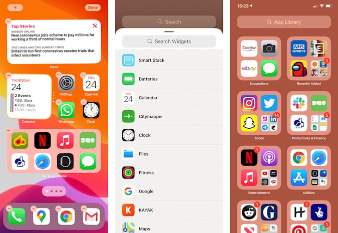
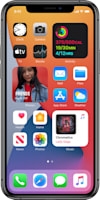
The iPhone home screen hasn’t changed hugely since the original back in 2007; Rows of icons, set in a grid. You could change the order, but heaven forfend if you wanted an icon to float alone! They stayed where they were, left-aligned, uniform and boring. Folders gave you some agency but that was back in iOS 4. If you use everything that’s new in iOS 14, however, your home screen will never look the same again.
The new App Library (kinda like Android’s app drawer) stashes all your apps in an alphabetical list, just keep swiping right to access it. Great. Better still, you can now nix apps from those traditional home screens. The app still exists, it’s just not cluttering up your phone’s display. If you long-press on an app icon on the home screen, there’s a new option of moving it to the App Library instead of just deleting it or hiding it in a folder.
You can even banish app icons in bulk by disabling whole home screen pages. One long-press and you can edit away, tapping the dots at the bottom and unticking any home screens you don’t need anymore. It feels liberating. That said, you can also do none of this, and your iPhone will work like it’s still on iOS 13.
iOS 14 also adds a shortcut to finding the app you’re looking for, without typing its name into the search bar or scouring the new alphabetical app list. It creates its own categories to vaguely organize things. However, they’re really vague and seemingly random. Hinge goes into ‘Other’, while LinkedIn Jobs goes into ‘Social’? But it’s worth noting that sorting has already improved since the beta.
Once you’ve cleared away the useless apps you need but don’t need to see all the time, what do you do with the space? Apple has a few ideas.
Over the years, Google’s Android furnished smartphones with widgets of varying utility, and iOS mostly avoided it. We got drop-down menus for toggles, and a Today view that offered a limited widget experience if you swiped right beyond the main home screen.
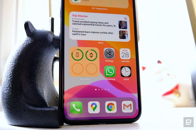
But now iOS 14 has actual, real-deal widgets. And they’re pretty good. They come in a few sizes — the smallest is a 2×2 square and the largest is a 4×4 square, with some horizontal options too, maxing out at a 4×2 rectangle. Apple is sticking to its grid, but at least there are some options now.
There are a couple of ways to add them to your newly liberated home screen. You can hold your finger on existing widgets in the Today feed, or hold down on any part of the home screen itself. All the apps will start to “jiggle”, and a plus symbol in the top right corner will take you to all the widgets your heart desires. At the moment, it’s centered mostly on Apple’s core apps and services, like calendar, reminders, music and the rest, but third-party apps are creeping in, like Google, Zero and Kayak. And expect more developers to get on board soon.
Widgets have their own ‘folder’ function, of a sort, called smart stacks, where you can overlap widgets of the same size. This means you can swipe through weather, fitness metrics, news headlines and more, without having to open an app. It’s an elegant way to stop them taking over the home screen, and a smart stack toggle will automatically cycle through the widgets based on time of day and what Siri’s learned of your iPhone usage patterns.
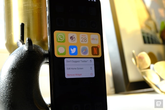
I’m really starting to like Siri Suggestions, not only how it informs the new smart stacks but elsewhere too. Siri Suggestions (which have been around since iOS 12) have improved a lot in iOS14 — in that I’m noticing them and they’re actually helpful.
As the OS learns your routines, you get suggestions from Siri at the right time, in the right place. for just what you need. For me, that meant my workout timing app would pop up when I headed to my gym. It would also remind me to call or message my mum (mom?) in the late afternoon if I hadn’t already.
Beside Smart Stacks, there’s also a dedicated Siri Suggestions widget that, once you place it on your home screen looks like a normal group of eight apps. However, it’s actually an automatically curated selection based on your own usage patterns. You might see Netflix and Kindle apps bubble up during your commute in the mornings (if you’re still commuting somewhere), while news or meditation apps might surface more frequently, in the same widget, later in the day.
You could, hypothetically, nix all your app shortcuts and let the wisdom of Siri decide which apps you and when. I ended up going for a 50:50 mixture of ‘manual apps’ I always want nearby, and Siri’s recommendations.
Siri has also been toned down from a fullscreen invasion to a floating orb in the lower part of the screen. Likewise, calls and connected Apple devices like AirPods, hover around the top half of the screen. It’s a subtle change, but a long-overdue one. Now calls don’t have to disrupt you in the middle of a game, or just as you’re wrapping up an email reply.
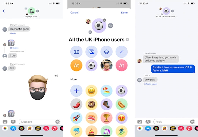
The iOS Messages app was also given plenty of attention this time around, and it needed it, to be honest. A lot of the features here you’ll have seen either in Android messages, WhatsApp, Telegram or whatever messaging app you’ve convinced everyone to use. So, if your life is centered around Messages, you’ll love what iOS 14 brings. If you’re not a user of the blue bubbles, however, all of this is not going to mean much.
In iOS 14, Messages has an improved filtering interface, making it easy to silo unknown contacts from your regular text friends. With “Filter Unknown Senders” enabled in iOS 14, you can go directly to the unknown senders to ensure you haven’t missed anything important, or focus on known folks. And for the people you most frequently message, you can now pin them to the top of your messages list, just by swiping right on it.
Another notable feature is inline replies. This means you can create sub-threads from any message, whether in one-on-one conversations or in group chat, where it’s eminently more useful. Long-press on any message and tap “reply” and it’ll spin itself out, showing the most recent message and a little bracket attached to it shows how many replies are connected. It does it all in a very apple, with polish. The ‘threaded’ chat will lift out from the main conversation, which will then blur out of focus. These are the classiest threaded messages I’ve ever seen.
In other ‘ugh finally’ features, you can create customized group chat names — beyond a list of all the people in the group. Tap the icon at the top, tap info and you can change both the name and the photo of the group. Earth-shattering features they are not, but they add up to a better messaging experience that can better keep pace with the competition.
On that note, iOS 14 finally brings picture-in-picture (PiP) video playback — a feature long coveted by iPhone users — it’s been on Android phones for a while. Compatible video apps so far include Apple TV, FaceTime, Netflix, iTunes, and more — though I had issues getting it to work with Safari. (Alas, PiP for YouTube is for Premium subscribers only.)
Expect this list to swell as apps are updated for iOS 14. It works by swiping up from the lower edge, which will take you out to the home screen. The now-floating video can then be resized between two presets, made fullscreen again, or swept aside to the edge, allowing the audio to continue playing, but keeping your phone screen clear for whichever app you wanted to use. The video can then be swiped back into frame. It’s been a long time coming, but I’m glad to see the feature here — it shines most on the bigger iPhone models.
Another quiet but important upgrade is the ability to assign default web browsers and email apps. If you want to, that means you’d never have to open the native email app or Safari ever again. Firefox and Chrome are both options (as are Edge and DuckDuckGo), while Gmail, Outlook, Spark and more are now available as default mail apps.
They’re each simple enough to setup. Go inside Settings, find the app by typing its name into the search bar or scrolling through all your apps. Then, open the entry and you’ll see a “Default Browser App” option if it’s compatible. It’s hard to understate how much easier it’s made my iPhone life, knowing that links will automatically open inChrome (with my passwords and bookmarks integrated).
That said, there was a bug in this initial version of iOS 14 that resets preferences back to Safari if you reboot your device. Apple has since fixed this. Still, offering the ability to change these default apps is a big move for Apple — offering the choice a lot of power users have craved.
Another welcome addition is Apple’s very own translation app, new for iOS 14. Translate works on-device (if you’ve downloaded the language files ahead of time) and covers English (US and UK), Mandarin Chinese, Japanese, Korean, Spanish, German, French, Italian, Russian, Brazilian Portuguese, and Arabic for now.
It works surprisingly well, capturing my middling Japanese and rudimentary French and German. There’s the ability to bookmark your most useful phrases and the mere convenience of some kind of translation without data needed, could make this a power travel assistant — when we’re traveling again. Apple has made a few new additions to its devices that reflect the historic coronavirus outbreak, like mask coverings for your Animoji and, separately, watchOS 7’s hand washing timer.
Privacy is a major part of iOS 14. Some features have been delayed, but the new approach is demonstrated best in permission requests. There’s one when an app “would like to find and connect to local devices on your network” for smart home tech and streaming, a new one for photo access that lets you decide whether an app can access your entire camera roll, or specific images only.
The most effective restriction could be the new approximate location setting. When an app doesn’t really need pinpoint accuracy (like a restaurant reservation service) it will get a fuzzier location using data, WiFi and Bluetooth networks. Whatever you decide the first time around, it can be readjusted in each app’s listing inside settings.
****
What do those dots mean?
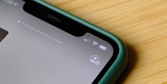
There are always one or two features that are never a big part of Apple’s presentation, press releases, or even the company’s own tips app. This time around, it’s pesky dots. They’re about privacy.
Floating next to your signal strength bar, you might occasionally spot a red or green dot. The red one indicates that you’re currently using an app that has access to your microphone. You’ll see it during any voice calls you make, or when an app requires voice input. A green dot, then, means something is using your camera. You’ll see it in Facetime, Zoom or Instagram for instance.
Report cards are the privacy feature that’s been delayed — these would spell out precisely what apps were tracking and gathering from your iOS device. They’ll arrive later this year, and we’ll take another look at them when they do. To be honest, this seemed like the strongest privacy feature for iOS 14.
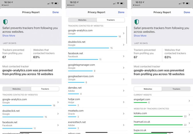
For now, you can access a Privacy Report for Safari. It tells you which sites are tapping into most trackers, and exactly which trackers Safari has blocked. Tapping on the letters at the start of the address bar opens up the report. Naturally, if you’ve decided to swap your default web browser, you’ll miss out on this.
The rest
Given the big presentation at WWDC earlier this year, you might be surprised that I don’t have much to say about App Clips. That’s because I haven’t used them. Any of them. App Clips are snippets of apps that have tiny file sizes and can be temporarily installed. They can be initialized through NFC, QR codes, or even locations on Apple Maps or links shared on iMessage, In the US, you can order food from Panera Bread and not much else.
The posit is that these are streamlined, one-shot apps for lightweight tasks like buying things or registering your details. Typically they connect to Apple Pay and Sign In With Apple, streamlining things — but helping to ensure that Apple is involved with app interactions even at this lightweight stage.
Expect to see plenty more App Clips for major service apps, where they make the most sense. For now, however, it’s not a big deal.
I also want to mention the new accessibility features in iOS 14. “Tap on the back“, buried in settings, can recognize double and triple taps on the back of the phone. These inputs can then be assigned to system controls, like volume, taking screenshots and even as shortcuts to the home screen or app switch, the latter of which I assigned to double-taps on the back. Additional new accessibility features include Sound Recognition which can detect a fire alarm or doorbell, and notify you and, incredibly sign language detection in Group FaceTime, which i haven’t been able to test out.
Wrap up
iOS 14 may not be groundbreaking but, if you embrace the new widgets and reassess how you use apps, iOS 14 is refreshing. Then there’s the ability to shed Safari and the native email app if you want too — hopefully Apple expands on this and offers similar default app flexibility elsewhere, say Maps or Notes.
Apple’s focus on privacy is incredibly user-friendly and mostly easy-to-explain, putting the focus back on app developers to reconsider what data they’re collecting from us.
What’s interesting is that you don’t even have to actually embrace a lot of these changes. They coexist with the old way of using iOS. And, you’ll probably be happy to hear that iOS 14 is compatible with all iPhones since the iPhone 6S, including both generations of the iPhone SE. Yes, five-year-old iPhones are still getting functionality boosts, which is impressive in its own right.
The changes are worth it, however. It’s time to get rid of your app grid.
(44)