It’s called San Francisco, and you can download it now.
Editor: Suzanne LaBarre
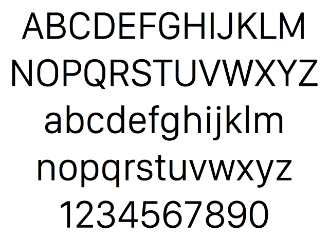
That may be no accident. If San Francisco is in fact the “Apple Sans” font rumored to have been in the works for years, it’s possible that Apple intends on bringing San Francisco to iPhones and Macs later on down the line. In fact, the very name of the typeface might portend it. In the early days of the Mac, Steve Jobs told Susan Kare and Apple’s other typeface designers to name all of the system fonts after major cities, which is why we have Chicago, New York, Geneva, and Cairo. By naming their newest typeface San Francisco, Apple is signaling a return to the tradition of in-house type design that helped make them great. We’ve reached out to some typographers and type designers to get their thoughts on San Francisco. In the meantime, if you’d like to play around with San Francisco for yourself, you can download the typeface here.
(201)
