I am sitting in a conference room with a bevy of laptops in front of me—so many that they’re blocking my view of the monitor where I’m about to videoconference with some of the people who created them. With a variety of case stylings, colors, materials, and approaches to fundamental design decisions, they are not exactly a matched set. But they’re all iterations of a specific computer: Dell’s XPS 13.
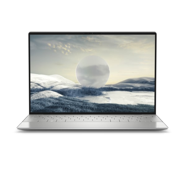
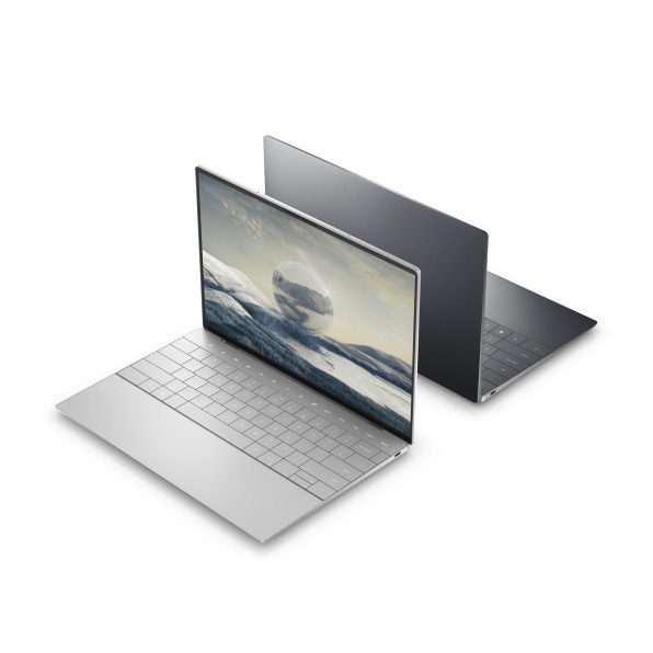
The disparate models represent a decade’s worth of evolution and lead up to the new XPS 13 Plus, which Dell is unveiling today and plans to ship this spring, with pricing still to be announced. Like its predecessors, it squeezes a 13? display into a surprisingly compact case by shrinking the bezel around the display. But beyond that, what’s new is really new—not just for the XPS 13 line, but also for laptops in general.
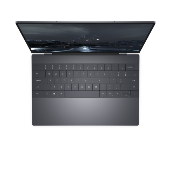
For one thing, its keyboard flouts the industry’s recent design conventions by giving you oversized keys without any space between them. It also does away with the physical function keys along the top, which have been replaced with a strip of virtual keys—not a tiny screen like Apple’s late, unlamented Touch Bar, but a touch-sensitive area with illuminated key indicators. As for the touchpad, well, there isn’t one. Or, to be precise, it’s another touch-sensitive area that’s been completely integrated into the palm rest, with no line of demarcation.
If you are raising your eyebrows at any of these choices, Dell is okay with that, says Justin Lyles, the VP of Design for its Experience Innovation Group. He cites the XPS line’s “long history and legacy of taking bold risks, having a vision, being very, very inquisitive and asking the big design questions, like ‘What if we did this? What if we combine these two things? What if we removed this? What if we changed this to a new technology?’” Along the way, the company has been willing to turn off some prospective customers and has never continued in a particular direction purely for consistency’s sake.
[Photo: courtesy of Dell]
All of which helps explain why the parade of XPS 13 models in front of me is defined as much by differences as similarities. The line has not been a ThinkPad-like marvel of instantly recognizable design. Instead, it’s a tapestry for high-profile experimentation. “Our charter is to deliver brand value for Dell—to create a halo effect for Dell’s consumer business,” says XPS Senior Director Donnie Oliphant, who has been at the company for a startling 34 years.
Judged by that benchmark, the XPS 13 has been a clear success. Reviews tend to gush: It’s often declared to be the best Windows laptop, period, and the overall XPS line has won more awards than any other in Dell’s history. That raises the stakes for the XPS 13 Plus’s departures from the familiar. People may love or hate them—but one way or another, they’re going to get noticed.
If at first you don’t succeed
Though the XPS 13 has long been among Dell’s best-known products, it sprung from a flop that would otherwise be a footnote in its history. In 2007, Apple’s stylish MacBooks were playing a major role in that company’s resurgence and putting staid Windows laptops to shame. Oliphant—who’d worked on consumery initiatives such as the DJ, Dell’s answer to the iPod—was charged with creating “a premium consumer portfolio product to basically compete with Apple.” Dell gave this effort the code name “Adamo”—Italian for “to love”—and then turned that into the official product name, too.
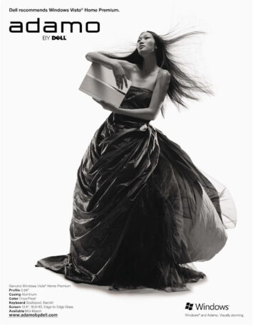
Dell’s roots were in building reliable commodity computers more efficiently than anyone else, which was precisely what the business buyers who made up most of its customer base wanted. With Adamo, it made an in-your-face attempt to buck its own DNA. When the first version shipped in 2009, Dell touted it as the world’s thinnest laptop and ran extremely un-Dell-like ads showing it being brandished by models. The second-generation Adamo, which put the hinge partway up the half with the screen to angle the keyboard for comfier typing, was even more aggressively new than the first.
[Photo: courtesy of Dell]
And it didn’t work. Adamo “was a complete and utter failure,” says Oliphant, who blames at least part of the problem on the fact that that it was marketed as a luxury item—and released at the start of a recession. But even though Dell decided to scrap the Adamo brand, it didn’t give up on the goal of competing at the high end of the consumer market with laptops that incorporated daring design ideas. In fact, it decided to apply some of the same thinking to its XPS brand, which had originated on desktop PCs back in 1993 and migrated to portables in 2007.
“A lot of people ask me,’ What does XPS stand for?’” says Oliphant. “My smart answer is always, ‘It’s an abbreviation for expensive.’ But the reality is, the first meaning of it was ‘extreme performance systems.’” Over the years, it had become a catch-all for Dell’s fancier consumer models, and since it wasn’t terribly well defined, the company had the freedom to take it in a new direction.
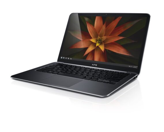
A defining moment came when Oliphant pitched Lyles on releasing new XPS models in four screen sizes: 17?, 15?, 13?, and 11?. The two largest versions would cater to people who craved plenty of display real estate and didn’t care that much about portability. But the smaller ones were both meant to be easy to tote—it was just that 13? was about as small as you could get and still have a general-purpose computer, while 11? would tilt the balance in favor of ultra-mobility. (At the time, Apple was selling its MacBook Air in both 11? and 13? variants.)
[Photo: courtesy of Dell]
That led to a question: What if you could fit a 13? screen into a case similar in size to that of a typical 11? laptop? To pull it off, you’d have to reduce the bezel around the screen as much as possible. And so that’s what Dell set out to do.
In retrospect, deciding to shrink the bezel down to fit a bigger display in a smaller computer doesn’t sound like an act of genius: Wouldn’t that always have been a great idea? Maybe, but factors such as the necessary cabling and need to incorporate a webcam made the feat harder than it sounds: “It seems like an obvious thing, but the technology didn’t really allow it,” says Lyles.
The response was, ‘This is the worst experience for the user. The users are going to hate this.’”
Indeed, Dell couldn’t quite pull it off at first. Its initial pass at the concept, a 2012 XPS 13 code-named “Spider,” was “the smallest 13-inch in its class at the time, which was pretty amazing, but it wasn’t quite 11-inch in size,” explains Lyles. So the company continued to chip away at the challenge. And when CES 2015 rolled around, it had a new XPS 13, code-named “Dino,” that achieved the original goal by grinding the bezel down as much as possible.
The bezel was now so skinny, in fact, that there was no room for one of the most standard laptop features imaginable: a webcam centered above the display. Instead, Dell stuck it below the screen and over to the left. That didn’t provide the world’s most flattering perspective for video calls, and the company knew it.
“We tested it before we ever shipped the product,” remembers Lyles. “And the response was, ‘This is the worst experience for the user. The users are going to hate this.’” To achieve its landmark bezel-shrinking design, Dell went ahead with it anyhow.
Providing what Cnet’s Dan Ackerman called “a nearly up-the-nose angle,” the new XPS camera became known as the “nosecam,” and was often cited as a downside in otherwise highly favorable reviews. In a later model, the company centered the camera below the screen. And in 2019, Dell was finally able to cram the camera into a thin top bezel, ending the nosecam era.
Lyles says that he’d never put a nosecam on a computer today, but taking the risk was the right decision given the technology available at the time: “The spirit of XPS, I think, was cemented with a decision like that.”
New generation, new machine
When it came to the new XPS 13 Plus being introduced today, Dell began with one overarching big bet: reimagining the XPS 13 to cater to a new, youthful market segment which it calls “young metropolitans.” It’s not a super-specific niche. Lyles defines the group as including “16 to, I don’t know, 30-year-olds. There’s some range that covers Gen Z into late millennial, or early millennial, depending on which way you look at it.” Oliphant cites a figure of 4.9 billion young people, which is actually everyone on Earth under the age of 40, from 39-year-olds to babies.
According to Dell’s definition, young metropolitans grew up with technology and aren’t impressed with it for its own sake. It’s easy to see why a PC company would want to court them: Oliphant says that they value products that deliver better experiences and are willing to pay $1,000 and up for a new laptop every couple of years.
Now, some of us are instinctively skeptical of theories involving a vast number of people having similar outlooks on life simply because they happen to have been born in the same general timeframe. But even if young metropolitans are a squishy concept, trying to appeal to them led Dell to design a new XPS with a decided point of view.
Like many higher-end laptops, previous XPS designs expressed their premium aspirations in ambitious use of materials such as aluminum and carbon fiber. They “were much more about the physical presence and the physical artifact,” says Lyles. By contrast, the XPS 13 Plus “is less about the physicality and more about the experiential.”
[Photo: courtesy of Dell]
More specifically, it’s about an experience that aims to let users focus on the tasks at hand. Dell has introduced a variety of changes that “work together to kind of visually clean up the product,” says Industrial Design Senior Manager Nick DiLoreto “And these were all based on values that we saw. In some of our interviews, we heard things like people have trouble focusing. They want greater simplicity, so they can just focus on that screen.”
The result is a laptop that’s at least as posh-feeling as earlier XPS models, but in a more minimalist fashion: Other than the Dell logo on the outside of the case, there’s nothing that feels like ornamentation. For instance, the previous-generation XPS 13’s palm-rest area was made of a woven glass with a distinctive texture. With the XPS 13 Plus, the texture is gone in favor of a smooth surface that doesn’t call attention to itself.
That’s not to say that Dell didn’t take its materials seriously. The outside of the case is still made of aluminum, but the company fine-tuned the bead-blasting technique it used to apply a subtle finish to the metal. “It’s a finer finish than any of the other aluminum products we’ve had,” says Falza Khanani, director of design for color, materials, and finish. “The idea was to create super-soft tactility and [make it] less reflective of light.”
[Photo: courtesy of Dell]
As before, Dell is offering the new XPS in two colors—basically light and dark options. It’s rethought both of them in ways that are understated, not flashy. The new platinum model is “a bit more whiteish, a bit more matte,” says Khanani. With the graphite version of the laptop, meanwhile, Dell “did our best to create this very nuanced dark [color]. Everyone says ‘Is it purple? Is it black? Is it gray? Is it warm? Is it cool?’ And that’s a bit intentional.”
These things are like balloons—when you squeeze ’em, things that customers care about are going to pop out the other side.”
Dell’s desire to streamline unnecessary elements out of the XPS 13 Plus also led it to reconsider the keyboard. Over the past decade and a half, most laptops have used what the company calls a “lattice” (aka “island”) design, with the keys isolated from each other in wells. On the XPS 13 Plus, they sit immediately adjacent to each other. With no latticework eating up space, they’re surprisingly large given the laptop’s diminutive overall size. It’s a simpler look, and though Dell isn’t claiming it’s an ergonomic breakthrough, “we’ve heard feedback that people appreciate having the larger striking surface,” says DiLoreto.
Rather than making the XPS 13 Plus’s function keys bigger, Dell did away with that row of keys in its conventional form. Instead, there’s a capacitive touch strip with illuminated indicators for tasks such as adjusting the volume, muting the speakers or microphone, and turning screen brightness up or down. Everything is still where you’d expect it to be, and if you hold down the function key, the indicators get replaced with those of traditional function keys F1 through F12.
Replacing clicky, tactile keys with a flat surface is bound to be controversial, opening up the possibility that some people will see the capacitive strip as a nosecam-like flaw in an otherwise impressive computer. At least Dell’s virtual keys—unlike those of Apple’s Touch Bar—don’t wreak havoc with muscle memory by moving around depending on the context. And they aren’t just about aesthetics: They helped Dell to improve airflow inside the system, a necessity for cooling its more powerful 28W Intel Core processor, up from the 15W chip used in the previous XPS. Airflow considerations also led the company to get rid of the headphone jack, a decision it found to be a reasonable compromise in 2022 even though it acknowledges that some computer shoppers won’t agree.
Over the years, laptop manufacturers—led by Apple—have eliminated discrete touchpad buttons and replaced physical clicking with a haptic simulation. With the XPS 13 Plus, Dell made the entire touchpad … well, invisible. It’s still there in the middle of the palm rest, as touchable and clickable as ever, but there’s no visible indication that there’s a touchpad there. It’s a sleeker look, and DiLoreto says that the company is confident that people won’t be discombobulated, since they rarely look at the touchpad anyhow. (Just in case, the protective material that covers the keyboard for shipping will explain what’s going on.)
Nothing that’s notable about this computer smacks of hopping aboard current design trends: “Thinking about what people like right now is a good marker, but it’s never what will lead you to innovation or the next thing,” says Khanani. Then again, Dell needs to build computers that people want to buy, and it feels like it has the basic balance of size, weight, power, and features about right. As Oliphant puts it, “These things are like balloons—when you squeeze ’em, things that customers care about are going to pop out the other side.”
Whatever the market’s reaction to the XPS 13 Plus, how its new ideas change—or don’t change—XPS models yet to come will be one measure of its success. “We’re learning and growing through this process and through this journey,” says Lyles. “Every step of the way.”
(55)