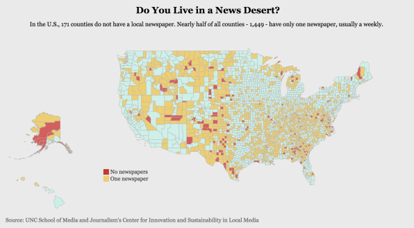
The United States is in the midst of a local media crisis. Media companies are struggling and journalists are losing their jobs, which creates an entire nation of uninformed citizens. It seems every few months there’s a new headline about media business model failing, or a new study about media polarization. Today we have an interactive map that performs the very simple task of highlighting news deserts.
The map is part of UNC School of Media and Journalism’s new study about the country’s depleting local news coverage. The study contains a number of bleak data points. For one, the United States has lost about 1,800 local newspapers since 2004–which represents nearly 20% of the total number of local news publications. Of the ones that remain, over 80% publish just weekly.
With the decline of these publications come news deserts, or areas where people have no local news source. According to the study, nearly 200 out of the 3,143 counties in the United States don’t have a local paper. Furthermore, some 1,449 counties–whose populations range “in size from several hundred residents to more than a million” have only one paper. And if the media business continues in the direction it’s going, these numbers are likely only going to get worse.

The map shows every county in the U.S. and assigns it a color: Blue means multiple newspapers, yellow means one newspaper, red means none. You can see the yellows all over the map and the red peppered throughout as well. The site also lets people learn more about their counties and what the news environment is like.
While the study presents some depressing findings, it’s important to see just how much local media has died out over the last few years. You can check out the interactive map here.
(29)