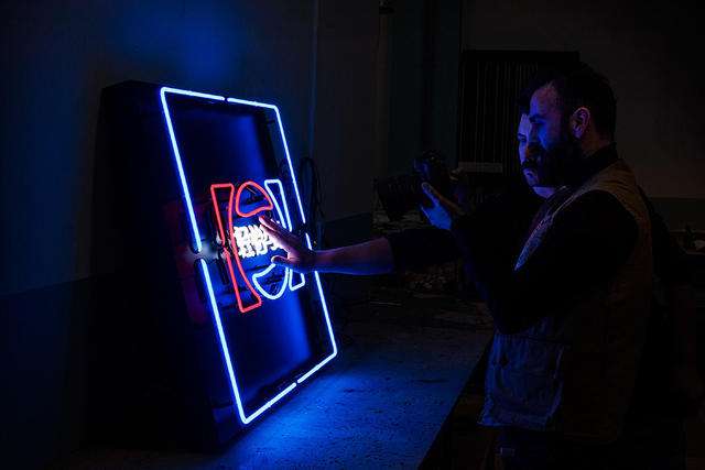
Maybe it’s time to start designing our logos with the other half of the planet in mind?
When a logo is well designed, it works like a lightning bolt to the central cortex, sparking a sensation of instant familiarity. But does that lightning bolt still strike when you see a logo in an entirely different language like, say, Chinese?
That’s what artist Mehmet Gozetlik is trying to find out in his new project, Chinatown. In the project, Gozetlik reinterprets familiar Western logos as neon signs that seem plucked straight from the side of your local Chinese restaurant.
Here’s how Gozetlik describes the project:
Chinatown is a Chinese translation of the trademarks in a graphical way. It’s a carefully arranged series of artworks showcasing 20 well-known western brand logos with [a] maintained visual and narrative continuity.
‘Chinatown’ pushes viewers to ask themselves what it means to see, hear, and become fully aware. ‘Chinatown’ also demonstrates our [culture’s] strangeness to 1.35 billion people in the world, when you can’t read Chinese.
It’s actually a fascinating look at how, and why, different logos stick in our brain. In general, Chinatown’s signs seem to indicate that the sweet spot for a great logo that can bridge the divide between the East and the West has more to do with its distinctive art than it does with its typography.

For example, certain logos, when adapted into Chinese, are immediately recognizable by their shapes and colors: 7-Eleven, MasterCard, Shell, Burger King, Pepsi, even NASA. Others, like the Starbucks logo, or Chiquita Banana, have distinctive mascots who help tell you the brand you’re looking at.
To my eyes, though, the most challenging logos to place are the ones that are driven mostly by typography, not art. The Intel logo, for example, is just a nondescript blue swirl when the name of the company is rendered in not just a different font, but a different character set. Same for Best Buy: I needed to stare at Chinatown’s version for a good five minutes before I recognized it.
As the world shrinks due to globalization, I can’t help but wonder if Gozetlik is onto something here. When you’re designing a logo, should you be designing it with China’s 1.4 billion people in mind from the get go?
[via Gizmodo]
(348)