How Do You Redesign The Simpsons?
Why are the Simpsons yellow? According to Matt Groening, that unmistakable hue was chosen because it was unmistakable. “An animator came up with the Simpsons’ yellow and as soon as she showed it to me, I said: ‘This is the answer!’” the show’s creator once told the BBC.”Because when you’re flicking through channels with your remote control and a flash of yellow goes by, you’ll know you’re watching The Simpsons.”
It’s not just a piece of lore. That yellow, and countless other aesthetic standards like line weights, have been carefully maintained and cultivated over the decades. The Simpsons has one of the most uniform and recognizable visual brands in the world—by design. The yellow, by the way, is Pantone 116 (here’s the full Pantone palette, from Marge’s hair to Bart’s shorts).
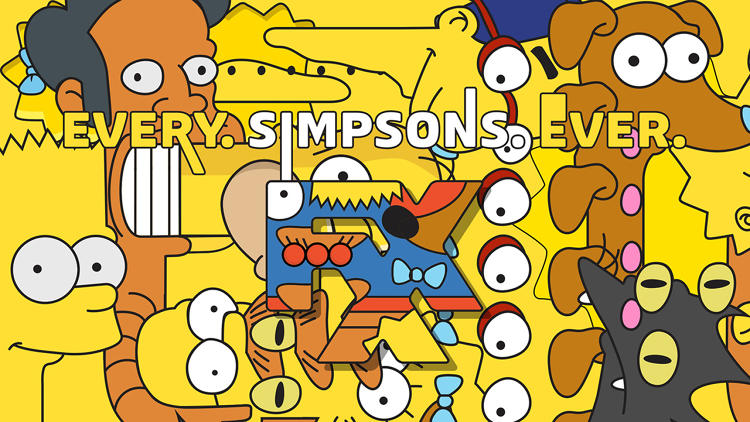
FX bought the show in perpetuity a few years ago, making The Simpsons one of its bedrock shows under the tagline “Every Simpsons Ever.” It was an appeal to superfans—of which there are many—but when it came to repackaging the old episodes, it still needed new introductions, known as idents, to promote and introduce them. It also had to compete with the most iconic introduction sequence ever televised.
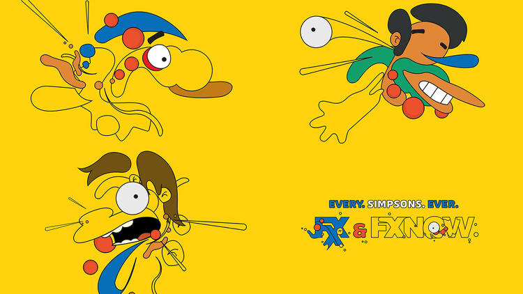
“It was definitely intimidating,” says PJ Richardson, creative director at Laundry, the Los Angeles studio chosen to design the idents. “Even more challenging was that FX really wanted to do something completely different within even the graphic language of The Simpsons, while retaining the key elements—the linework, the colors, yellow especially, the patterns.”
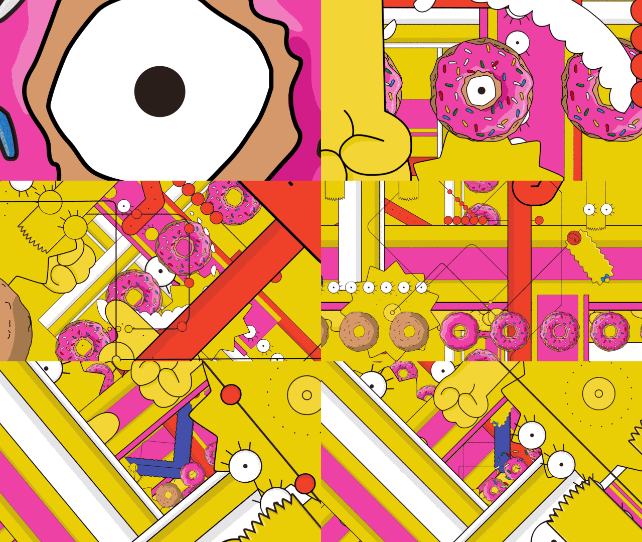
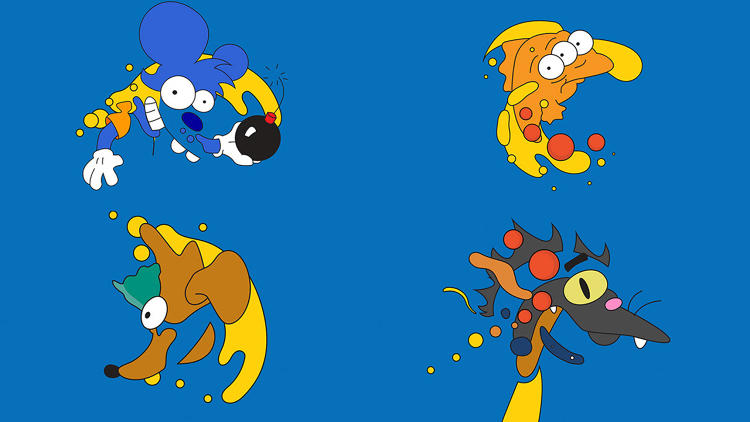
The team at Laundry pored over full-res episodes and color charts provided by the channel, drawing and redrawing, resurfacing little-known characters and studying their sounds, their colors, their patterns. “We ended up having to basically rebuild and re-illustrate from scratch,” says Anthony Liu, another creative director at the studio. “If a shade of blue was even 5% different—the team at FX is so on it. They could just tell by looking at a JPEG—‘that blue’s not quite right.’”
Even the physics of the show—the way Homer skips, the way icing lands on a doughnut—were carefully fact-checked. Every element had to have some basis in the historical show, says Dan Masciarelli, who heads up the studio’s broadcast wing. “So if Homer opens his mouth in one way in one of our designs, if it looks a little bit off from anything you could find in The Simpsons archive, then we would dial it back and tweak it.”
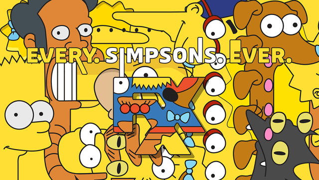
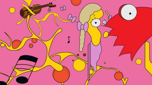
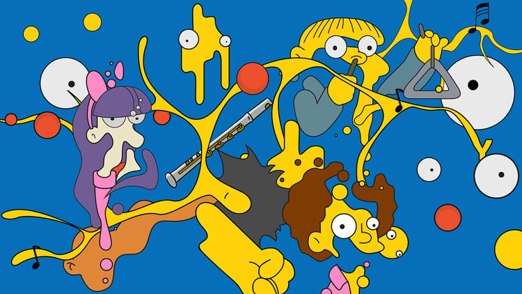
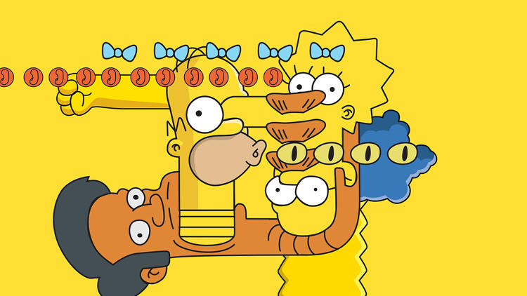
Yet by obsessing over the archival details, they were able to collage them into something deeply weird and new: a Groening fever dream that deconstructs the familiar line weights, noises, and bouncing parts we’ve all spent thousands of hours staring at, and then rebuilds them as something new.
It looks nothing like the show, and yet it looks exactly like the show. They’re unsettling and far more fun to watch than an ident has any right to be. And they’re instructive to anyone trying to create an aesthetic identity: rules, guidelines, and boundaries can lead to the best improv. “You can take everything away—all the decadent stuff, design-wise—and just leave it with an eyeball, the yellow, and then that stretchy effect,” Richardson says. Somehow, it’s still The Simpsons.




Fast Company , Read Full Story
(95)

