By Elizabeth Goodspeed
The paperback pulp romance—birthed in the 1930s, but arguably at its height during the murky cultural soup of postwar America—exists at a unique intersection of smut and chastity. Though the covers of books from this era feature characters in the throes of passion, the stories themselves, especially in the earlier half of this period, were generally quite chaste, in accordance with the sensibilities of the time.
Characters often waited until the last page to kiss, and the prerequisite happily-ever-after, aka the “HEA,” almost always included a man, a woman (both white, middle or upper class, and able-bodied, of course), and an engagement ring. That’s not to say that pulps didn’t describe sexual behavior—it’s just that the descriptions themselves weren’t explicit, nor was legally obscene language used. They weren’t porn, they were simply marketed that way.
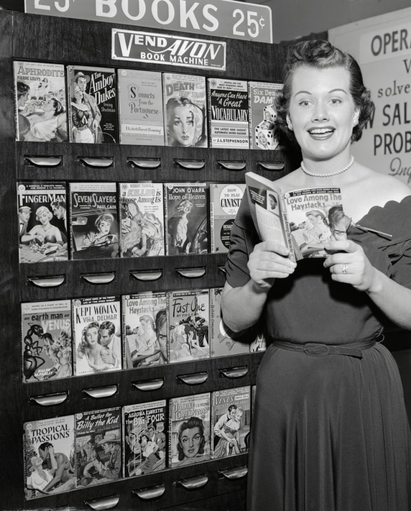
Unlike “serious” hardcover books, which were found only in bookstores, romance novels and other pulp paperbacks were highly affordable and typically displayed at newsstands, lunch counters, and drugstores; all third-place spaces where a potential reader like a housewife, perhaps unlikely to frequent a proper bookstore, might spontaneously browse and buy a book while running errands or waiting for the bus.
Just as the rise of the Kindle afforded contemporary readers a new, more private way to engage with erotic content (the best-selling Kindle e-book of all time remains Fifty Shades of Grey, after all), the distribution model of early romance paperbacks of the 1940s and ’50s allowed readers access to a genre, and a hobby, previously unavailable to them.
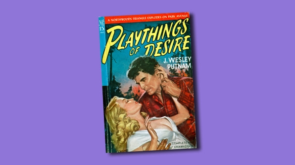
Within these new retail spaces, mass-market paperbacks were displayed in revolving wire racks with the cover facing outward, rather than the spine (as in a conventional book shop). This made them more akin to a display of candy bars than to a display of encyclopedias. As such, the cover became the de facto advertisement for a book: It had to quickly and efficiently communicate the content and tone of the novel to the consumer, and it had to be loud and eye-catching enough to compete with the books directly adjacent to it.
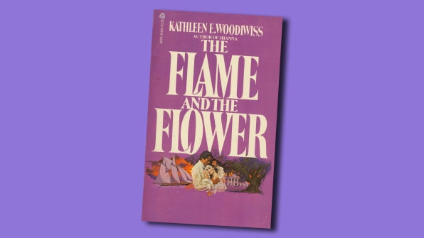
The 1960s marked a shift toward romance novels that featured exotic locations and heroines with less domestic and more jet-setting careers like stewardess—but it was in the latter quarter of the century that the real paradigm shift occurred within the romance genre. In 1972, The Flame and the Flower, a story of a passionate sea captain and his abducted bride, disrupted the landscape of mass-marketed romance novels by introducing a new, more explicit, subgenre: the bodice ripper.
These books typically revolved around a beautiful ingénue who was pursued, or dominated, by a dashing alpha male. Whether we can thank the golden age of porn (see: Deep Throat, 1972) or the free-love movement for its creation, the book ushered in a new era of historical fiction that placed emphasis on the more carnal elements of the love story—it was no longer enough for romance novels to be mere vehicles for chaste doctor-nurse fantasies.
As romantic genre fiction exploded beyond the bodice ripper into other categories like the gothic or the paranormal, pulp artwork became an even more direct pledge to the reader, with visual clues often indicating the specific subject matter and plot of a book—a cover showing a car might indicate an adventurous road trip, or a desk might suggest a workplace romance.
By the turn of the millennium, the diversity of themes and romantic subgenres had grown considerably, expanding to include a wider representation of queer stories and characters of diverse ages, ethnicities, and careers. But along with these positive changes came the crossover of romance into the mainstream, ultimately leading to a decline in the use of illustrated and custom lettered covers in favor of cost-effective stock photography and standardized typefaces. Pulp had broken up with the bespoke.
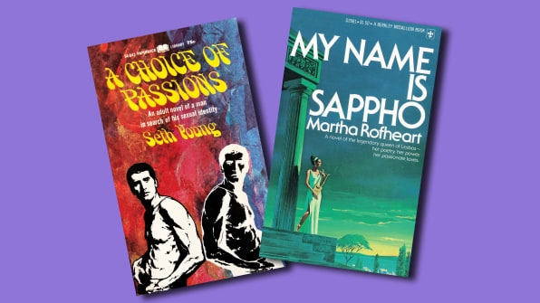
Canonical conversations about romance artwork mostly focus on Fabio and the sentimentally lush paintings of Harlequin “clinch” covers, but there’s not much known or documented about the typography of the form despite its clear value in marketing and communicating the content of a book. Like the typography of other so-called lowbrow media operating at the fringes of culture (B movies, comic books, etc.) the typography of romance and erotic paperbacks is unabashedly campy and bold—very unlike the formalist, centered type seen on most ordinary hardcover books.
The lettering on romance covers dances with bouncy baselines, flirts with right alignment, and tantalizes with enjambment-style line breaks; all faux pas under the academic standards of design, but powerful at eliciting an emotional response. Type is often large-scale and boldly colored, calling out to be touched. But this emphasis on typography shouldn’t be a surprise. After all, letters serve a not dissimilar purpose to both graphic designers and writers—like clay to a sculptor, they’re the raw material waiting to be molded into art.
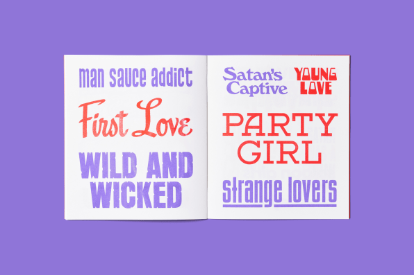
While the persistent categorization of romantic and erotic fiction as “pulp” was intended derogatorily, it also afforded immense freedom and opportunity for artistic expression; letterforms aren’t beholden to the conventions of traditional, commercial typography, and instead are often handcrafted and customized, with rough edges or strange textural effects.

That’s not to say that romance lettering was exempt from trends; just as a rebrand can help a consumer packaged good find more favor with a contemporary audience, most title typography taps into the spirit of the vernacular styles of their era in order to appeal to readers. This means sans serifs in the 1950s and ’60s, curvy psychedelic lettering in the 1970s, and luscious scripts in the 1980s.
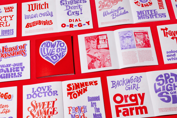
If the painted art of a pulp cover serves as a contract with the reader, clueing them in to what they can expect from the book, the letterforms also give hints as to what the story within will contain. From typography one can assume a novel is hot and heavy, dark and mysterious, or a bumbling flirtatious romp. Some titles use direct symbols that speak to the title or content, like the arrows in Traveling Tramp or the use of the female Venus symbol in Busy Bodies. Others use type more evocatively, choosing to represent the overall tone of a story through nuanced mark-making, like the distressed wood of Wild and Wicked or the calligraphic italic of PS, I Love You.
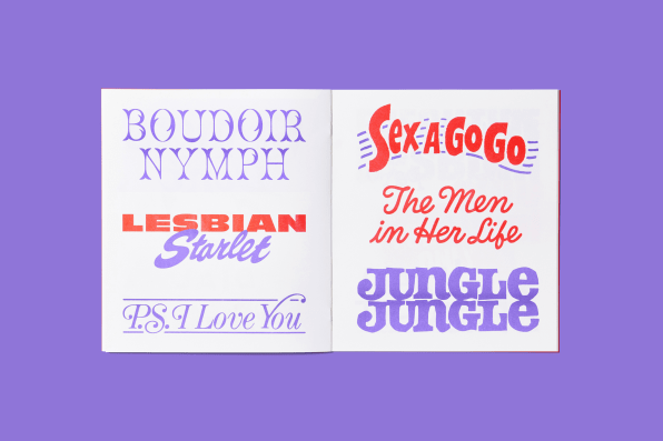
Isolating these titles away from the context of their illustrated covers, their energetic spirit and exceptional artistry becomes more immediately apparent. Imbued with the promise of promiscuity, these titles challenge the reader to slip into something a bit more comfortable: a paperback romance.
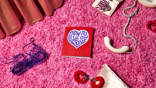
This essay was adapted from How to Live on Love, a publication of romance novel lettering produced in collaboration between designer and archivist Elizabeth Goodspeed and design studio High Tide’s 2022 Design Director in Residence program. Preorder the zine here.
(42)