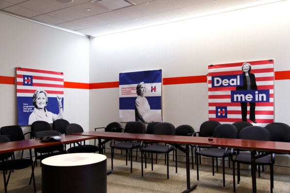
November 2016 was a time of reckoning for many, but it was especially so for Jennifer Kinon. In fact, she called the result of the U.S. presidential election that month “the biggest emotional reckoning of my life,” while speaking with co-founder of the Center for American Politics and Design, Susan Merriam, at the Fast Company Innovation Festival last week.
The founding partner of The Original Champions of Design had dedicated the previous year and a half of her life as the design director of Hillary for America, and when the 536 days it took to build that brand came to an end and the election results came in, it seemed her team hadn’t done enough. Or that it hadn’t made the difference.
There’s a simple truth that Kinon came to abide by after the success of Barack Obama’s landmark brand identity in 2008: “Design wins presidential campaigns.” According to Kinon, the Obama campaign was the first to invest in design, and bridged the corporate and political design spaces. “He was ahead of his time by bringing a metaphor”—the “O” with fields of grain within it—”into the core visualization of the identity,” said Kinon. The visual language, borrowed from corporate branding, gave the less experienced candidate a more official look. The risk paid off. For Kinon, Obama’s win—and the campaign’s design—was a boon to the design industry. It showed that design mattered.
But in Kinon’s own experience eight years later, the equation didn’t work out. Design plus politics equaled a loss. She was left thinking either, “One, my design was bad; or two, design is not as powerful as I believe it is.” But with her steadfast belief in the power of design, she couldn’t allow for the second option. That left her with the “responsibility of number one.” And in evaluating everything that went wrong and right (Ida Woldemichael’s “I’m with Her” slogan; Mina Markham’s UI library, “Pantsuit“; and more)—Kinon came away with two key learnings that she imparted onstage for 2020 primary presidential candidate brands.

Differentiate (read: Don’t use Gotham)
One particular design innovation coming into focus in this cycle’s Democratic presidential primary: brand differentiation.
While Kinon said that politics has never been on design’s cutting-edge, campaigns are being more intentional in their visual look and are taking risks to stand out from a crowded field. They’re “trying to be authentic to who they are and differentiate, rather than pile on and use Gotham,” said Kinon, referring to the Hoefler & Co. typeface, first developed in 2000, that became ubiquitous after its use in the 2008 Obama campaign, and since then has “trickled down” across politics and branding at large.
But it seems the campaigns of 2020 have recognized its ubiquity, and this cycle, says Kinon, “each candidate is using different threads of design to show who they are.” She cited Pete Buttigieg as one example: with an identity system that looks like it could be letterpressed in its entirety, and reminiscent of American pastimes like baseball, it just reads Midwest. And differentiating yourself as a brand—establishing who you are—is important when you’re dealing with direct competitors in the double digits.
“Authenticity” isn’t under-design
There was a lot of conversation about authenticity in 2016—who has it, who doesn’t, and how each candidate conveyed it. Did the Trump campaign’s design aesthetic (or lack thereof) convey authenticity better than Clinton’s sleek, corporate brand?

For Kinon, those conversations were based on a false premise. Candidates this cycle should learn that authenticity doesn’t equate to under-designed identities or even poorly designed ones. Authenticity is about true identity and morality. When working in the political design space, you’re not creating a brand around a consumer product. You’re building a brand around a person that many won’t interact with personally. So as a designer, you have to “to get those little bits of personality through design—those one-on-one experiences—and that’s what makes it authentic.” Conveying the true nature of your candidate through your brand is authenticity.
The design algebra was easy and understandable in 2008; not so in 2016. Kinon said the Trump campaign followed a model in which its design was largely driven by the vendors that make T-shirts, hats, etc., and that was more cause and reaction than prescription. Whether or not the Trump brand was authentic, Kinon believes the cycle to be an anomaly. And if elements of the Trump brand identity were effective, they would not be something Kinon would design, calling the message conveyed by the red MAGA hat an implicit hatred and the brand itself racist.
“What was beautiful about the Obama campaign is that it operated on hope,” said Kinon. “What’s terrible about the Trump campaign is that it operated on hate.” For Kinon, we are all living with the consequences.
“What’s the question we want to ask to get meaningful information out there?” said Kinon when talking about the role of design criticism. “We’re not artists. We’re communicators. The more people I can get information to, the better.” Designers’ endeavor should be not to fall prey to reductive conversations around whether a brand identity is good or bad, but to ask, is the design effective? Will it make the difference?
(20)