It’s still one of the great mysteries of the Internet: with the millions of images that bombard us on the web every day, what makes us click on one instead of another? Are some pictures universally appealing, or is art always a matter of personal opinion?
Netflix has been pondering these profound questions for years. After all, images are critical to getting you to binge: A small, compelling thumbnail could mean the difference between getting you to spend the entire weekend watching House of Cards or losing interest and bouncing over to Hulu.
A powerful picture is an incredibly efficient tool: The human brain can process an image in just a few milliseconds, so the right picture can spark someone’s interest and convince a viewer it’s worth exploring a new show in a single glance. Which is why, in 2014, Netflix began gathering consumer research specifically about the images on its service.
The research indicated that looking at images not only prompted users to watch content, but accounted for a whopping 82% of their time spent browsing (as opposed to, say, reading movie titles or descriptions). In other words, the images mattered almost four times more than the text describing the storyline. Members also spent only 1.8 seconds considering each title. “We know that if you don’t capture a member’s attention within 90 seconds, he or she will likely lose interest and move on to another activity,” says Nick Nelson, Netflix’s global manager for creative services. “Images become the most efficient and compelling way to help them discover the perfect title as quickly as possible.”
Recently, Netflix—which is famously tight-lipped about its own data—has been doing experiments to better understand which images capture our attention and why, and shared some of its findings with Fast Company as well as in a post on its blog. The effort was both science and art: Data scientists analyzed user statistics, while creative teams considered the colors, emotions, and words that appear on pictures. The company tests several images for a single show or movie to try to discover what makes members click. Its first lesson was that images had to be high quality in order to draw viewers in. “We saw one clear thing,” Nelson says. “Using better images to represent content significantly increased overall streaming hours and engagement.”
Netflix’s data reveals some interesting takeaways about why people watch one thing over another, but more broadly, may be applicable to anyone looking to hook readers, viewers, or buyers with compelling imagery.
Three People Or Fewer, Please
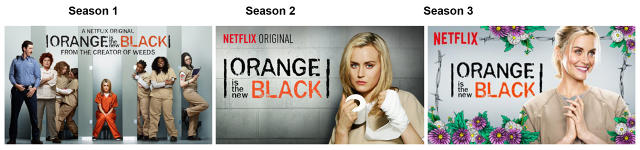
One of Netflix’s earliest findings was that interest tended to drop off when an image touting a show or movie contained more than three people. It seems that users find it hard to focus when there are too many people, and may not be able to absorb cues about the storyline. This was a surprising insight for Netflix, given that some shows are popular precisely because they have large casts. Orange Is the New Black is a good example of this. “While ensemble casts are fantastic for a huge billboard on the side of a highway, they are too complex at small sizes,” Nelson says. “They are ultimately not as effective at helping our members decide if the title is right for them on smaller screens.”
Complex Emotions Make Us Pause
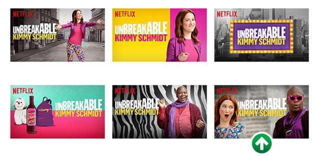
Scientists have known for a long time that humans are hardwired to respond to faces: Studies have found that infants process faces long before they are able to recognize other objects. However, one interesting thing that Netflix discovered is that people tend to focus more on images of people displaying complicated expressions over stoic or benign ones. These highly emotive images are able to quickly and effectively convey subtle details about the show or movie, drawing users into the storyline and prompting them to watch it. Take, for instance, the image for the second season of Unbreakable Kimmy Schmidt, which drove a lot of engagement; its thumbnail ad features Ellie Kemper’s face looking over at Tituss Burgess with an expression of surprise and possibly disbelief:
A Focus On Polarizing Characters
Just like complex emotions are more likely to capture our attention, images of polarizing characters also tend to grab our attention. Netflix found that members responded better to recognizable villainous characters over pictures of the hero. They found this to be true in the kids’ genre, as well as for action shows and movies.
Different Countries, Different Tastes
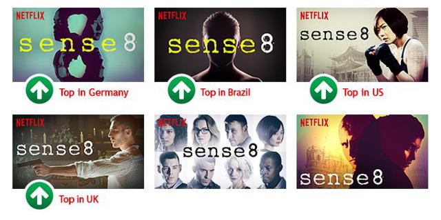
By testing across geographies, Netflix found that there are regional preferences when it comes to imagery. For instance, Sense8, a show with a diverse, international cast, has a wide audience across countries, but Netflix discovered that different images worked better in different places. While the company didn’t offer us a clear rubric about what kind of images work best in each country, from the images they showed us, it seemed that more artistic images worked better in Germany, while American audiences were more compelled by images that revealed the storyline clearly. The point is that in order to sell the same content or product across different countries, it is worth testing several images.
Nelson says Netflix’s ongoing research reveals some unexpected things about human psychology. “While the results from our research were often surprising,” he says, “it is clear that an image can move people in powerful ways.”
Fast Company , Read Full Story
(46)
