Pop Chart Lab’s latest charts the ABCs of typography.
Many of us learned our ABCs in elementary school from big alphabet posters tacked up by our kindergarten teachers on the walls. New from Pop Chart Lab, the Alphabet of Typography is like that poster, but for aspiring typographers instead of aspiring readers.
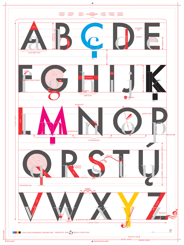
Printed on 100-pound archival stock, the Alphabet of Typography uses the ABCs as a primer on the terminologies of type. In the Alphabet of Typography, A isn’t for Apple; it’s for Axis, Apex, Aperture, and Ascender. C, M, Y, and K, meanwhile, are set apart in their own colors (cyan, magenta, yellow, and key or black), to represent the four-color printing process. Although the design seems simple at first glance, there’s actually a lot to discover here. Kerning, glyphs, line spacing, leading, diacritics, swashes, and more are all covered.
It’s a great poster for type-loving adults, but it’d also be a great thing to hang in your kid’s room if you’d like him or her to grow up just as literate about the way letters are designed and printed as they are about the letters themselves.
You can order the Alphabet of Typography starting at $29 here.
Fast Company , Read Full Story
(206)
