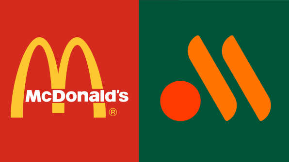
Following Russia’s attack on Ukraine, McDonald’s sold its Russian business to a regional franchisee with a caveat: He could serve the same food, but he couldn’t use McDonald’s iconic branding to do it. McDonald’s called this “the process of ‘de-Arching.’”
Now, from a report by the state-run TASS news agency, we have a first look at Russia’s new, de-Arched McDonald’s brand. The logo is an abstract “M,” built out of two sticks of fries and a circular burger patty. (You may also see the Warner Music Group logo turned clockwise.) The green backdrop is meant to instill a sense of quality.

This new logo is notable not only as a marketing tool but as a cultural snapshot. McDonald’s first entered Russia after the fall of the Berlin wall. Its glowing signs were a symbol of hope and globalization. And now, that hope has retreated back to the West while leaving its saturated fats behind.
The Golden Arches have long been the most important symbol at McDonald’s, the world’s most popular restaurant. First born in the 1950s, the arches were an architectural icon dreamed up by the founding brothers Richard and Maurice McDonald alongside architect Stanley Clark Meston to grab attention to their burger joints. They were later formalized into the famous “M” logo by McDonald’s head of engineering and design, Jim Schindler, in 1962.
But following Russia’s unwarranted attack on Ukraine, McDonald’s pulled out of the country, selling its nearly 1,000 locations to the Serbian franchisee Alexander Govor, who now wrestles with localizing McDonald’s for the region. Alongside the new logo, his company must update the names of popular menu items. The Filet-O-Fish will be renamed “Fish Burger” while the Royal Burgers will be called “Grand.”
What’s still unknown is what Govor will name his new chain. One provision to the sale is that it not be called “McDonald’s” anymore. For now, the logo hints at an ‘M’ shape—serving as a wink and nod to anyone looking for their Fish Burger fix. And in this sense, Govor might be better off to not name the new chain with a word at all. Because while he doesn’t own the arches, he can own the M. And as long as that M is associated with McDonald’s, it will still serve as a signpost—not of a more unified world, but of what’s for dinner.
(29)