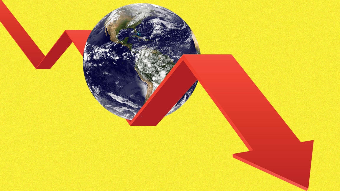
Stock market meltdown: How to track the volatility in near real time for free
The markets are crashing. If you’re interested in keeping track of the carnage in real time, the best way to do that is on a well-curated dashboard. Most dashboards are either a maze of tiny numbers or require subscriptions. Here’s how to watch for free.
Note that these dashboards are not quite real-time—they typically have a 15-minute delay, which is close enough for most of us.
A word of calm: Though the markets are in a tailspin from the new coronavirus outbreak, remember that back in May 2015, the Dow peaked at just 18,312. Just a few weeks ago, it was up nearly 40%, at 29,551. We have arguably been in a bubble for a while, and at the very least, a major market correction was in the cards, with or without coronavirus.
(19)


