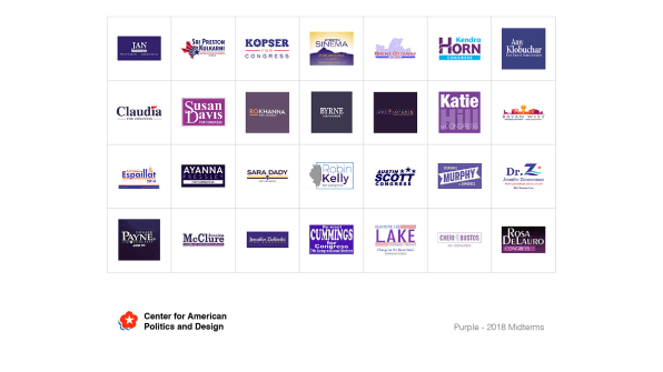
Krysten Sinema, a Democrat running in a hotly contested race for Senate in Arizona, sets her name in purple against a golden desert sunrise. Sri Preston Kulkarni, a Democrat running for Congress in Texas, uses a blue lone star bursting into shades of purple and red.
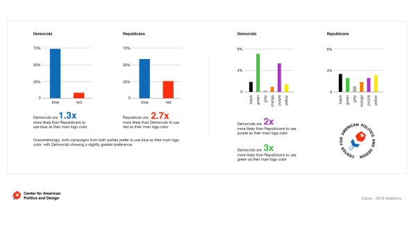
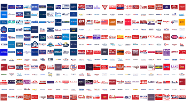
For the most part, this election’s campaign design looked fairly predictable: Nearly 75% of Democrats and and more than half of Republicans used blue as their primary campaign color this year. If you’re a Republican running in a solidly Democratic district, you’re three times more likely to use red as your logo color than your peers in Republican districts. But in general, candidates choose blue–a color strongly associated with America from the beginning, from the color George Washington chose for continental army uniforms to the resolution of the Second Continental Congress in 1777 describing a flag with white stars against a “blue field representing a new constellation.”

Things get more interesting when you take a closer look at Democratic candidates specifically, though. Democrats were twice as likely to choose purple as their running color compared to Republicans–and three times as likely to choose green.

These numbers come from the Center for American Politics and Design, a new group of designers and creative directors including Susan Merriam of Graj + Gustavsen, Kevin Wiesner and Lukas Bentel of Hello Velocity, and Will Denton and Seth Kranzler of Channel Studio. Their analysis of every campaign brand in the midterm election is a glimpse into the visual culture of campaign season–and in some cases, a way to track the evolution of visual identities across the political spectrum.
“Overall, it’s interesting to think about why some of these trends exist,” says Merriam over email. “Given the production value of a lot of these logos, we can guess that many of these design decisions aren’t (necessarily) 100% calculated or engineered to appeal specifically to the audience’s psyche, but that they are symptomatic of the designers’ and candidates’ own.”
Do the purple, gold, and green campaigns of 2018 reflect the simmering conflicts within the Democratic party, with left-leaning candidates renouncing party leadership and centrists attempting to align more closely with Republicans?
But Merriam points out another detail: All of those purple campaign logos, 21 are women, four are men of color, and only one is a white man. “Why do only women or men of color use purple?” Merriam continues. “That would probably be relevant for a larger discussion about the relationship of white masculinity and color theory.”
A slew of low-fi campaign logos are highlighted by CAPD’s analysis, including Republican Ron Curtis’s comic sans wordmark set against an American flag graphic. In another election, such details might have been funny–and let’s be honest, they are still kinda funny–but it would be naive to see them as stupid or thoughtless. If the 2016 presidential campaign taught us anything about the power of design in politics, it was that “bad design” can be an incredibly powerful way to broadcast a candidate’s outsider status successfully.
“I hope going forward we can do some more analysis in relation to past elections as well,” Merriam says. “I’m interested to see for example the difference 2016 had on branding overall. As politics becomes increasingly polarized, are there more bold, red candidates with torch iconography? Will we also see more logos like Ocasio-Cortez‘s that try and get away from the traditional color schemes of the Democratic party? I would guess so, and we shall see.”

Red was associated with the Republican party long before Donald Trump slapped on his first MAGA hat–but it hasn’t been the color of the GOP for all that long. The “red state, blue state” trope seems to have emerged alongside contemporary network television coverage of politics within the last two decades. In 2004, The Washington Post’s Paul Farhi traced it to the 2000 election:
The first reference to “red states” and “blue states,” according to a database search of newspapers, magazines and TV news transcripts since 1980, occurred on NBC’s “Today” show about a week before the 2000 election. Matt Lauer and Tim Russert discussed the projected alignment of the states, using a map and a color scheme that had first shown up a few days earlier on NBC’s sister cable network, MSNBC. “So how does [Bush] get those remaining 61 electoral red states, if you will?” Russert asked at one point…
Newspapers began discussing the race in the larger, abstract context of red vs. blue. The deal may have been sealed when Letterman suggested a week after the vote that a compromise would “make George W. Bush president of the red states and Al Gore head of the blue ones.”
In this nightmare of a campaign season, it’s fascinating to remember that the simplistic language we use to talk about national politics–as if it were game between two teams of different jersey colors–was bestowed upon us by network graphics departments that chose those colors for on-air analysis.
Fast Company , Read Full Story
(59)