These 26 letters look just like levels in the award-winning puzzle game.
First released in 2014, and nominated for one of our very own Innovation by Design Awards last year, Monument Valley is an iPad game that looks, feels, and play like a team-up between Studio Ghibli and M.C. Escher. Now, Monument Valley has inspired a Barcelona-based graphic designer to make a typeface based upon its visually deceptive levels.
What makes Monument Valley such an incredible game is hard to put into words, and easier in some ways to just see for yourself. In short, though, the game uses optical illusions and other perception tricks as a gameplay mechanism.
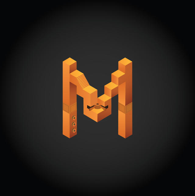
With Alphabet Valley, designer Claudia Mussett wanted to try building a typeface based upon the game’s beautiful level designs. Inspired by the 36 Days of Type project, Mussett created her typeface, one letter at a time, using Adobe Illustrator, recreating elements of individual game levels as components of each letter.
“I love the art direction of the game and the level design/user experience. It’s a aesthetically beautiful game. I enjoyed playing it a lot and just looking at each level colors and layout,” Mussett tells me.
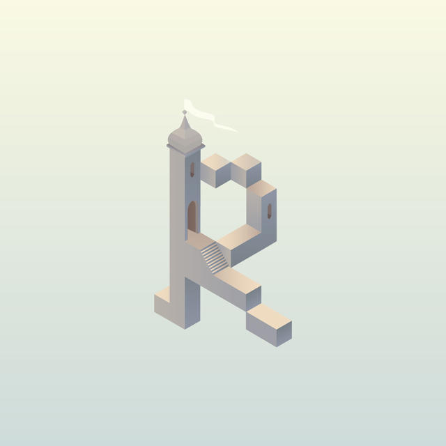
Each letter looks like an actual level from the game. Reaching out to Monument Valley developer ustwo, it turns out they love Mussett’s typeface too.
“We all love Claudia Mussett’s alphabet!” says Ken Wong, Monument Valley’s designer. “We can clearly recognize which level each glyph is based on. Some are even based on levels that only appeared in the game’s beta version, it’s trailers, and the concept art. Looking over the alphabet brings back fond memories of the game’s development.”
Monument Valley already got one great expansion pack. Maybe the next one can bring Mussett’s Alphabet Valley to life?
You can see more of the designer’s work here.
(302)