London’s underground transit system, known as “The London Underground” or “The Tube,” started running in 1863. Its iconic symbol, a patriotically colored bar-and-circle roundel, was first plastered on the city’s subterranean walls in 1908 and has gone through several iterations since. Until now, each new draft of the logo has been a variation on the same theme—all solidly red and blue, with only slight changes to the proportions and weight of the letters. Recently, however, British-Ghanaian artist Larry Achiampong has reimagined the traditional transit symbol to reflect the rich and diverse African diaspora that makes up roughly 44% of London’s population.
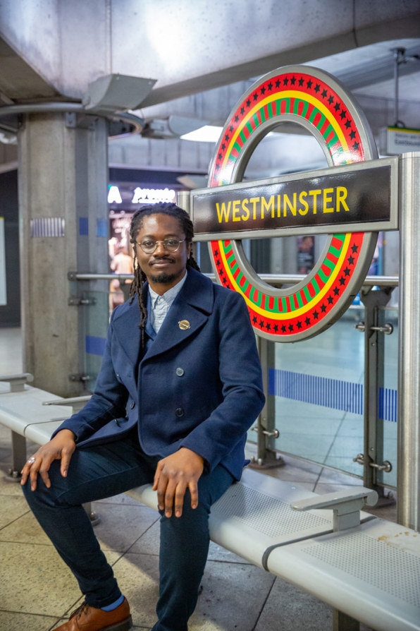
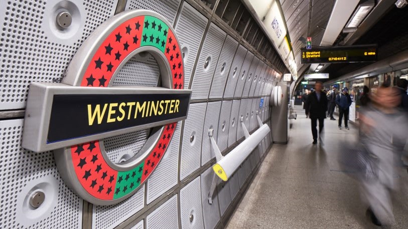
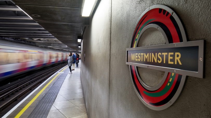
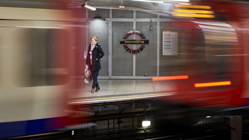
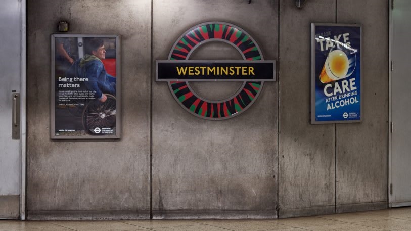
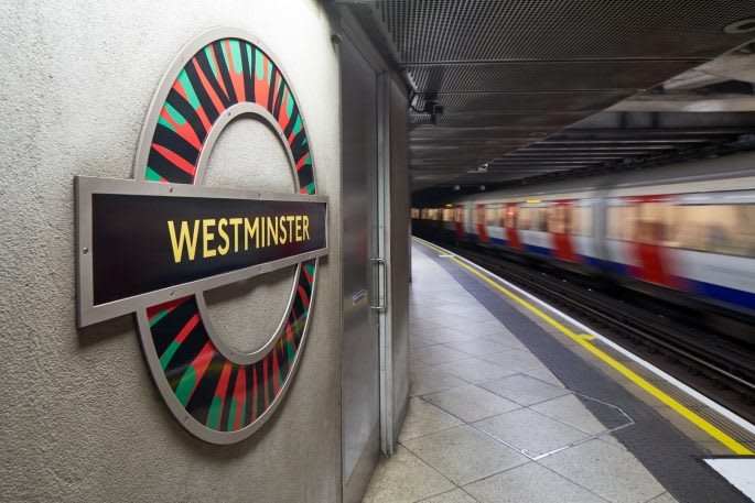
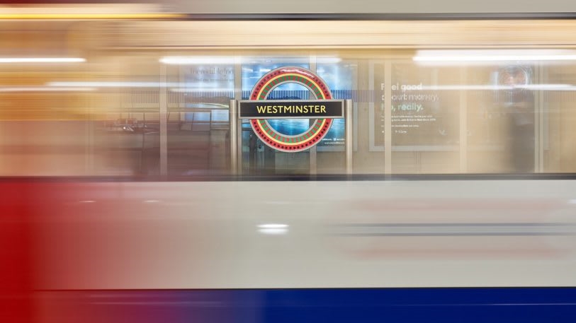
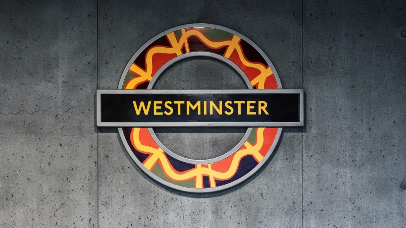
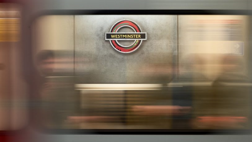
This large-scale logo redesign is a public commission from Art on the Underground, a visual arts showcase funded by Transport for London, which “seeks to consider the possibilities of alternate histories,” according to a statement. “Pan African Flag for the Relic Travellers’ Alliance” exists as a part of the showcase’s 2019 program “On Edge,” which encourages artists to create works that explore themes of unity, utopia, and belonging, inspired by the United Kingdom’s likely departure from the European Union, thanks to Brexit (the deadline to withdraw, deal or not, has been extended to January 31, 2020). Achiampong was invited to create eight different versions of the classic roundel, to be placed in 70 different locations around London’s Westminster Underground station, which sits right across from the Houses of Parliament.
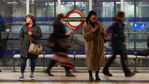
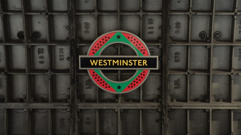
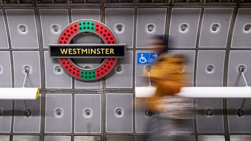
In an effort to celebrate not only his Ghanaian heritage but also other African and Caribbean countries, the artist has reimagined the British flag-colored bar-and-circle as a vivid mix of green, black, and red—the colors of the Pan African flag, representing the history of the land, the people, and bloodshed, respectively. A warm and buttery shade of yellow also finds its way into Achiampong’s designs; his use of this golden color is meant to suggest a bright and prosperous future for the diaspora and the UK, more broadly.
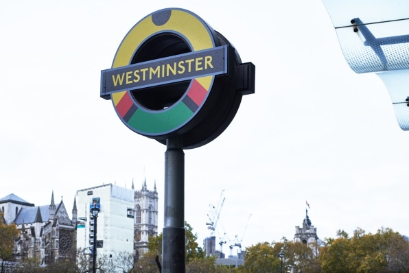
Each of Achiampong’s roundels also feature different patterns, the sum of which make up a complete Pan African flag (called the Relic Travellers’ Alliance flag) that the artist designed and installed in the courtyard of London’s Somerset House in 2017. The flag has 54 stars, which represent the 54 countries of Africa; these stars, along with other patterns including bold stripes and undulating lines, can be seen throughout all eight designs.
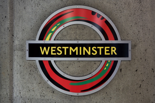
These London Underground roundels are a thematic continuation of Achiampong’s ongoing project, titled “Relic Traveller.” The multidisciplinary and multisite artwork explores Afrofuturism, a culturally specific aesthetic phenomenon that focuses on the intersection of blackness, technology, science, and the arts. Given the complex history of the African diaspora, Afrofuturism works to understand the past in order to imagine new possible futures for the continent and its dispersed people. Achiampong’s roundel redesigns for the Tube turn on the axis of his concept of “sanko-time,” which exists in the universe of African mythologies and their connection to science fiction.
“Sanko-time is based in the Ashanti word ‘sanfoka,’ which roughly translated, means to go back for what has been left behind. ‘Sankofa’ also alludes to using the past to prepare for the future; the wish of being able to go back to an immutable point to make sure that what has been lost is not lost any longer,” Achiampong says in a statement. In a country like the UK, which has a history as a violent, colonial power on the continent of Africa, Achiampong’s quest to look backward in order to move forward on a diverse and united front is particularly poignant. For centuries, the impact African people and their culture has had on European society has been erased from narratives about progress. Through Achiampong’s vision, the merged symbols (his flag and London’s transit logo) rewrite the story as a shared one.
The vivid, thought-provoking roundels will be on display for commuters passing through Westminster through February 2020.
(71)