Three weeks ago the Metropolitan Museum of Art—known colloquially and now formally as “the Met”—unveiled a new logo and identity system designed by the international firm Wolff Olins. The response from critics was swift and fierce. Influential typographer Erik Spiekermann harped on the logo’s proportions and “forced curvy shapes“; New York Times critic Michael Kimmelman accused the museum of pandering to younger audiences; and Justin Davidson, of New York magazine, compared it to a typographic bus crash. Ouch.
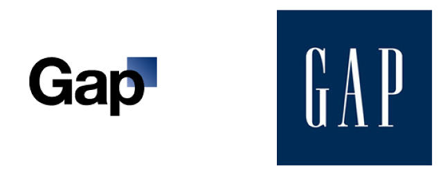
It’s a familiar scenario with logo and identity reveals—the images get passed around the Internet, critics weigh in, and the peanut gallery follows. Such was the case with Google, Airbnb, Hillary Clinton’s campaign logo, the Olympics, and the rebrand that (arguably) sparked incendiary “logogate” culture: Gap.
Designers and clients are understandably spooked. In private, some designers speak of clients who refuse daring work. In public, they gently rue the armchair critiques that undermine months, sometimes years, of work. Others are more forthright. “I think the Internet and the press should shut up and allow the identities to find their audiences,” says Paula Scher, a partner at Pentagram and the mind behind Shake Shack‘s branding among many others. “They will ultimately determine the success and failure.”
Maybe so. But the Internet isn’t going to shut up any time soon. Here’s how the industry has adapted with the times—and how identity design itself has changed. “We can rail against [logo bashing] if we want, but it won’t get us anywhere because it’s not going to stop,” says Howard Belk, co-CEO and chief creative officer at Siegel+Gale, the New York firm whose clients include HP, CVS Health, and Monster. “What it shows is enormous passion about logos. A fair amount of the hue and cry is coming from the design community, but a lot comes from customers and consumers.”
The Logo Is Dead, Long Live The Logo
In the past, logos only had to look good in print. Today, brands exist on dozens of platforms, many of which are very small, like smartphones. This logistical challenge has limited what designers can do. Sixty years ago, the Met probably only needed to emblazon its logo on signs, admission buttons, and printed ephemera. Today, its logo is on mobile apps, the favicon on desktop web-browsing tabs, Twitter avatars, and elsewhere. Efficiency matters more than flourish, adaptability more than cleverness. One has to wonder if the FedEx logo, with its sly arrow hidden in the word mark, would be invented nowadays, at a time when logos have to be legible on screens as small as a watch face.
So branding agencies have adapted. “We’re still holding up the logo as the ace of a rebrand or restructure,” says Jim Bull, cofounder and chief creative officer of Moving Brands, a global creative company that counts Sony, Google, and Netflix, among others, as clients. “It is important, but there’s so much more—the color, the system, the tone of voice—and then we’re getting into the product.”
Take the Met’s identity. It’s conceived as infrastructure that offers the institution a way to build and grow—a set of building blocks that can evolve along with the museum’s new experience-design initiatives. “In an increasingly digital world, one in which the Met wants to go out to the world as much as it brings people in, the visual system needed to be much more robust and less reliant on just a symbol alone to carry the personality and the experience that the museum wants to create,” Amy Lee, a strategy director at Wolff Olins, says. Susan Sellers, head of design at the Met, says of the museum’s rebranding, put it this way: “It’s not an easy story to tell at this point, and frankly the logo does not tell the story.”
The conundrum plagues designers all over the industry. As Pentagram partner Michael Bierut wrote in a recent essay for Design Observer, “How do you design for potential meaning? How do you convince a client to view a new identity not as a purchase, but as an investment?” (He went on to defend the Met’s logo saying, “If this thing was 45 years old, it would be the most beloved logo in New York.”)
Some designers go too far trying to create practical identity systems. “I worry about a generation of designers that believe in formulas,” Moving Brands’s Bull says. “That’s why everything looks the same and there’s no difference between most brands.” That might be a bit of an overstatement, but certainly there are industries that suffer from what Bull calls “sheepism.” In a recent talk for Designers + Geeks, he pointed out that the home pages for Internet of Things companies—August and Nest—look very similar. The same for food-delivery apps Munchery, Sprig, Caviar, and SpoonRocket. “Over the last decade, there’s been a rise in the need for proof of effectiveness and data points to judge if a thing is effective or not,” Bull says. “It inhibits some design firms from thinking about whether something’s actually good.”
Brands Are More Strategic About Launches
Siegel+Gale’s Belk noticed a more, shall we say, spirited audience for new logos six or seven years ago. Since then, the company has incorporated preemptive measures into its identity launch plans. “The first task is to sensitize clients to the fact that this could happen,” he says. “The higher the profile, the more global, the more connected, the more established [the client], the more likely it is to happen. Logos are a lightning rod for attention. When I look at stumbles, a common thread is it appears that the agency and client did not appreciate the power of their logo and the passion people have and the strength of familiarity bias. People don’t like change even when it’s good for them, no matter what.”
Some companies try too hard to control a new visual identity’s launch and come off as heavy-handed. Take Uber, which timed the release of its new branding with a piece in Wired that detailed CEO Travis Kalanick’s involvement in the redesign in excruciating detail. The logo was widely mocked (so was the article). “As a company that needs to be seen as trustworthy and reliable, to choose this moment to walk away from a logo people knew, recognized, and remembered was questionable,” Belk says. “They tried to focus on the internal aspects of the story. The CEO was hip-deep into the logo design. It was inside baseball rather than what it represents for customers.”
Moving Brands oftentimes takes an entirely different approach. The firm says nothing about a launch, conducts zero PR, and doesn’t attach its name to a project or add it to its portfolio. “Saying nothing on social, launch softly, don’t comment, eventually everything goes away,” Bull says. “Where you get into trouble is when you get too self-important. It’s putting a big target up. The glorified days of launching a brand are less and less.”
The New Reality Could Elevate Design
Of course, the true test of an identity begins after the news cycle dies down. For the most part, the design systems work, the world keeps revolving, and no one gets hurt. Riders keep ordering Ubers; vacationers still book rentals on Airbnb; Hillary is still in the race. If anything, all the fuss does is cause graphic-design fatigue.
Ironically, it may also persuade the design industry to fight for its best ideas. Thirty years ago, you could get away with pretty much anything. Today, not so. It stands to reason, then, that the more we argue and critique and throw daggers, the better it is for the industry as a whole. “Implicit with criticism is that standards are higher,” Belk says. “That demand will elevate the craft. If you want to win votes from a knowledgeable cohort, your standards will get better. This is good—even if it does pose some challenges.”
All images except Gap: via Wolff Olins
![]()
![]()
![]()
![]()
![]()
![]()
![]()
![]()
![]()
![]()
![]()
Fast Company , Read Full Story
(45)
