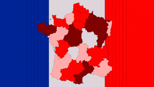
The U.S. should steal France’s excellent COVID map
A map is only helpful if you know what it means. Otherwise it’s just a really pretty picture.
This probably seems obvious. But having reviewed a number of COVID-19 maps that have varying degrees of alerts in a rainbow of colors, it’s easy to be confused.
However, a new map from the government of France might just be the best example we’ve seen of effectively putting its citizens on alert. That’s because it only uses two colors: grey and red.
#COVID19 | Afin de prendre des mesures adaptées face à la propagation du virus, les départements et territoires sont classés en différents niveaux d’alerte. ?? pic.twitter.com/uPndgiz4UJ
— Gouvernement (@gouvernementFR) September 24, 2020
The map, released Thursday, puts different areas of the country into different alert levels so people can take proper precautions based on the level of risk in their immediate surroundings. Makes sense, right? The surprising part is that every alert level is depicted in a graduated shade of red: light red for the lowest, medium red for enhanced, and a deep scarlet red for the highest risk. Grey areas indicate “health emergency”—you know, just the normal day-to-day reality we’re all living now.
[#COVID19] Découvrez les territoires en ZONE ALERTE MAXIMALE et les mesures associées prenant effet dès samedi ?? pic.twitter.com/KUKVYDQA9u
— Ministère des Solidarités et de la Santé (@MinSoliSante) September 24, 2020
The effect is a sort of infographic on-off button—if you live in a place that’s any shade of red, it’s an immediate visual signal of danger. That’s a good thing. Compare that to alert systems that use a range of colors but it’s not at all clear what they mean. What do blue and green stand for anyway? Not exactly the message you want to get across when trying to raise the alarm.
A sequential color palette, meanwhile, clearly indicates which areas should be on highest alert, according to Amanda Makulec, operations director of the Data Visualization Society. It can also “help address the accessibility issues of stoplight colors (red, yellow, and green) used on a lot of other COVID-19 maps and visualizations,” she says. (For people who are red-green color blind, these maps are rendered useless.)
Makulec notes that the French map has based its alert system on per capita infections, not total number of cases, “which would consistently skew highest for those with large populations.” Significantly, it’s also factoring in the share of elderly patients who are infected, which is a population that’s been at particularly high risk to COVID-19.
While some discourage the use of red in a health crisis, calling it “sensationalist,” with deaths surpassing 200,000 in the U.S. alone, it’s hard to argue we’re not already in the red zone. A map that uses the color to show us that is a stark reminder that we need to keep masking up to curb the spread, before we’re all seeing scarlet.
Fast Company , Read Full Story
(23)


