Flat design, Netflix, parallax scrolling, and more. Which of these eight designs should just GFD already?
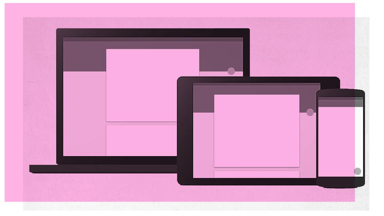
What do delightful design, hamburger menus, Spotify, and iPad apps all have in common? They’re all finalists on our March Madness bracket for the most overhyped examples of interface design.
Whether you love ’em (Netflix! Heart emoji!), hate ’em (Flat design! Puke!), or don’t understand how anyone could claim they’re overrated (doesn’t everyone hate Spotify’s UI?), these were the eight entrants you helped choose as part of our March Madness of overrated design. Check them out in our slide show.
 Don’t see a design you hate on this list? We’ve already posted our picks for product design, and you can check back later this week for picks in graphic design, and architecture, before voting in our bracket to name the single most overrated design in all the land.
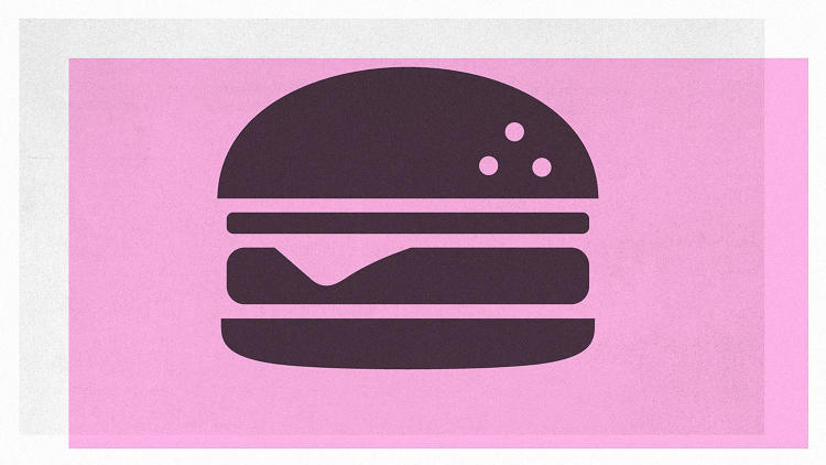
[Hamburger Icon: VoodooDot via Shutterstock]
Fast Company , Read Full Story
(201)
