
The world’s most revolting font is made out of gerrymandered voting districts
The slow and steady progress of gerrymandering has transformed voting maps all over the country. By redrawing dozens of districts along lines that favor their party over the past decade, politicians have reshaped the democratic process in the United States. This process really kicked into high gear after the 2010 elections, which put Republicans legislatures in charge of redistricting based on the 2010 census.
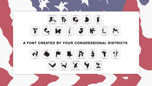
It’s here. GERRY. A font created by your congressional districts. Log on to https://t.co/WkuVp7oDpu and use the font to tell congress how happy you are that your vote doesn’t matter. pic.twitter.com/j9U5W7qmTz
— Gerry (@UglyGerry) July 23, 2019
The issue of gerrymandering’s legality is now foundering after a Supreme Court ruling kicked the responsibility back to Congress last fall, prompting a the Illinois-based designers Ben Doessel and James Lee to turn to public shaming. Their free font, called Ugly Gerry, is made up of the craziest gerrymandering schemes in the country—and while it’s entirely possible to download and use Gerry as an actual typeface, the project’s real goal is its social media presence through its web presence (designed by Kevin McGlone).
“The team is from Chicago, and after seeing how janky our Illinois 4th district had become, we became interested in this issue,” the group said in a statement emailed to Co.Design. “It’s notorious earmuff shape looked like a U, then after seeing other letters on the map, the idea hit us, let’s create a typeface so our districts can become digital graffiti that voters and politicians can’t ignore.”
Online, the team is tweeting at specific politicians for their shameless slicing and dicing:
We couldn’t have made our gerrymandering font without you Ohio. Thanks for the help, @RepBalderson & @RepBobGibbs. https://t.co/WkuVp7oDpu pic.twitter.com/LXBI10mgeL
— Gerry (@UglyGerry) July 23, 2019
These politicians probably aren’t worrying over a few tweets. But for people who might not be fully aware of how gerrymandering works, it’s a perfect illustration of the phenomenon. You can download it and tweet your own messages here.
Fast Company , Read Full Story
(11)

