These interactive maps show vast disparities in women’s health around the world
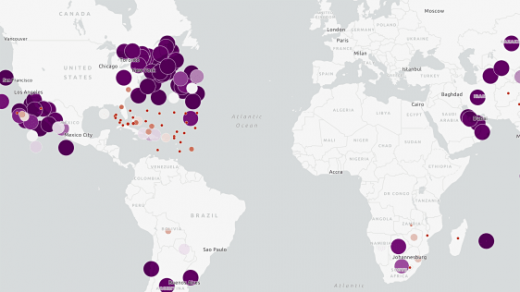
To commemorate International Women’s Day this year, spatial-analytics firm Esri mapped out statistics from the Population Reference Bureau to highlight some of the disparities in women’s health around the world. Its series of health-indicator maps includes stats on women’s life expectancy, fertility rates, contraceptive use, and percentage of births attended by a skilled health professional.
The data and accompanying interactive maps are compelling to look through. I was especially intrigued by the life-expectancy statistics. For instance, with a life-expectancy of 89, women in San Marino can expect to live eight years longer than their counterparts in the United States. Also, while women typically outlive men around the world, in some countries—Russia and Lithuania, for example—the average gap is more than a decade.
International Women’s Day has been around for more than a century, and the campaign theme this year is #PressforProgress, which is an effort to push for gender parity. Progress, of course, starts with good health, so this data feels especially pertinent.
Esri scraped the data from PRB’s 2017 “World Population Data Sheet.” Do check out the maps here.
(18)

