If more people are going to drive electric cars, we need many more EV charging stations. But where to put them? That analysis requires a lot of calculations: figuring out where the current chargers are stationed and where substations and electrical infrastructure is already built out, not to mention identifying which corridors receive the most road traffic.
The Biden administration wants to prioritize building a public charging network that fills gaps in rural, disadvantaged locations, which means determining where those areas are as well.
Building new wind turbines requires a similar amalgamation of data: Where do turbines already exist? What is the mean annual wind speed in a certain region? Are there airports nearby that need to be avoided, or protected land like national parks?

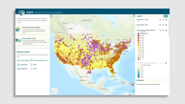
A new tool from the U.S. Department of Energy’s Argonne National Laboratory puts all of that information—and more—on one map, essentially pinpointing where across the country clean energy infrastructure can be developed. Called the Geospatial Energy Mapper, or GEM, the interactive tool contains more than 190 different mapping layers, so a user can search areas for EV charging stations, solar power plants, and more.
GEM isn’t completely new; it’s an updated version of the Energy Zones Mapping Tool, or EZMT, which Argonne released in 2013. But GEM has been “redesigned, rebranded, and reengineered,” per the lab, using those 10 years of experience with EZMT. The hope is that the GEM tool—which can be accessed even without an account—is easier to use, with the most updated software.
GEM also now comes preloaded with “mapping themes” for the lower 48 states—presets that provide quick results for clean energy searches, including electric vehicles, electrical infrastructure, hydropower, solar, wind, and wildfire risk.
Choosing one of those themes fills the map with data. Under the “solar” category, for example, it immediately shows the locations of current solar power plants; details on a region’s “solar potential” (based on measurements that include sun angle, among other information); and whether or not an area is actually developable. When loading the “electric vehicle” theme, the map fills in the locations of current (non-Tesla) charging stations, electrical substations, tribal reservations, roads by average daily vehicle traffic, and more.
Along with those mapping themes, a user can pick from GEM’s layer library to load the map with data on 100-year flood zones, active offshore oil and gas leases, college locations, dams, environmental hazard sites, low-income household percentage, and so on. Once all of your desired metrics are loaded, the model computes a score showing you which areas are most suitable (or unsuitable) for that project.
There’s certainly a federal interest in such a tool, since it comes from the DOE, but the potential for state and local government use is also massive. For example, Kentucky’s Office of Energy Policy used the earlier EZMT version to prototype a tool that identified areas for solar infrastructure on reclaimed mine lands.
(32)