These striking maps depict the invisible—and devastating—impacts of climate change
Here’s one fact about climate change: Between 2002 and 2020, Greenland has lost an average of 279 billion tons of ice per year. Here’s another: In 2021 alone, almost 49,000 wildfires across the U.S. burned more than 6.5 million acres. And another: The last seven years have been the warmest on record.
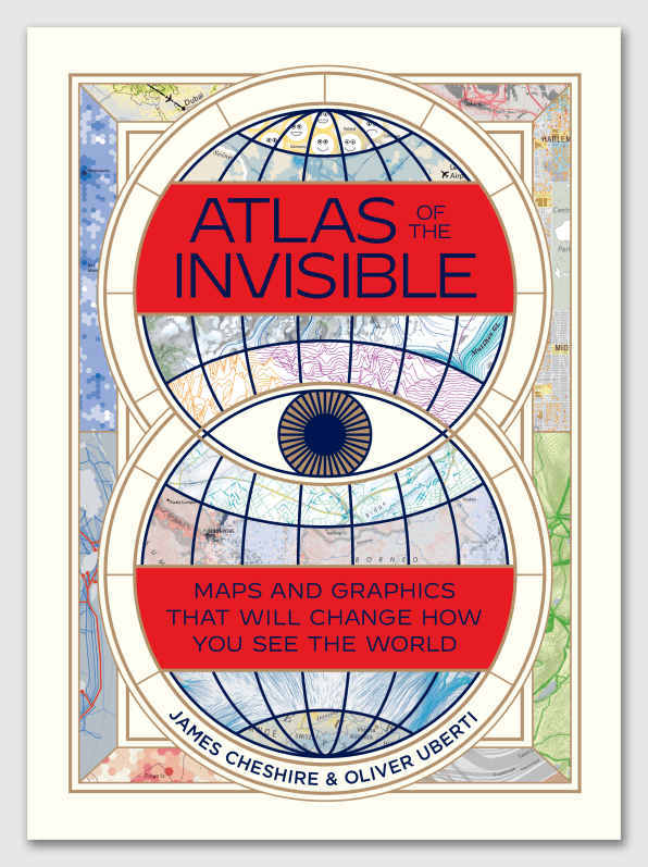
When it comes to climate change, numbers abound, but they can be hard to grasp and their impact is often difficult to visualize. A new book wants to change that.
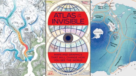
Out today, Atlas of the Invisible turns huge data sets into powerful graphics that reveal invisible patterns in everything from gentrification to illegal fishing and retreating glaciers. Created by geographer–designer team James Cheshire and Oliver Uberti, the book shines a spotlight on the far-reaching implications of climate change and the devastating impact it has on hurricanes, climate refugees, and even Hajj. With extraordinary maps and stunning data visualizations, the book makes global warming ever more visible, and ever more urgent.
We’ve highlighted five sections of the book that visualize the impact of climate change in eye-catching, often surprising ways.
Melting glaciers
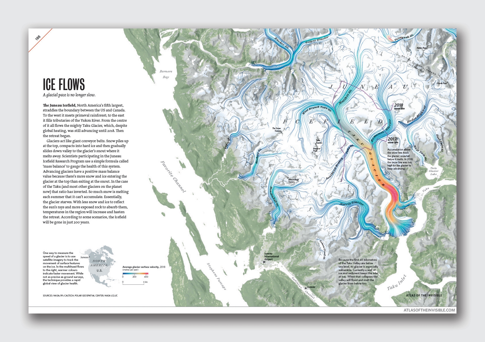
“For centuries, atlases depicted what people could see: roads, rivers, mountains. Today, we need graphics to reveal the invisible patterns that shape our lives,” writes James Cheshire, a professor of geographic information and cartography at University College London. These patterns are particularly hard to detect when they occur thousands of miles away from us—like at the Juneau Icefield in Alaska.
The fifth-largest icefield in the world, Juneau is at least 3,000 years old. As the authors explain, glaciers are like giant conveyor belts: snow piles up, then gradually slides down the valley, helping the glacier advance at certain speeds. This process tends to be tremendously slow (hence the expression “at a glacial speed”).
The icefield’s biggest glacier, Taku, kept advancing until 2018. Then it started shrinking. The map portrays this shift by suggesting motion as the ice slides down the valley at much higher speeds, noted in red. By some estimates, the authors note, the icefield could be gone in just 200 years.
More frequent cyclones
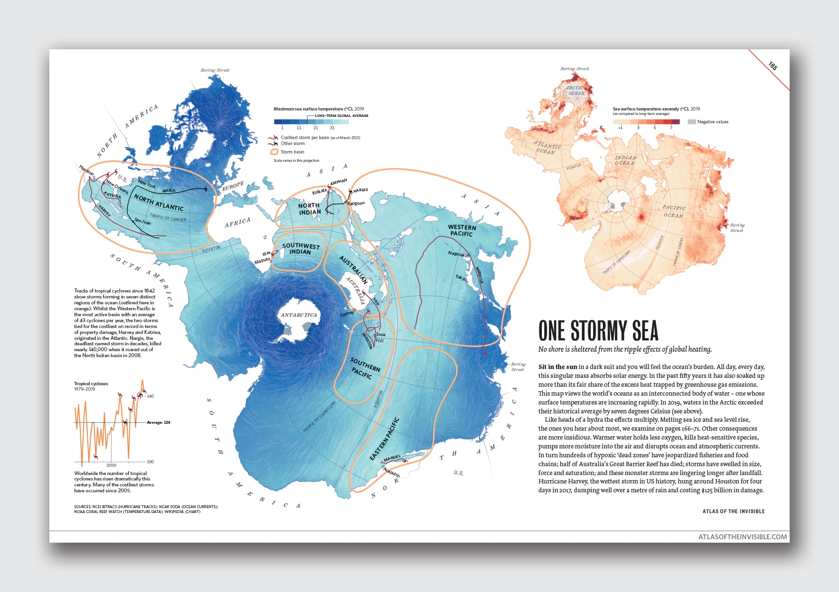
In 2019, the Arctic Ocean exceeded its historical average by more than 44 degrees Fahrenheit. And as it so happens, warm water fuels tropical cyclones. This map shows an unexpected framing of the world’s oceans. By accurately portraying every ocean on the planet as one interconnected body of water, the authors highlight the far-reaching impact of global warming. As Cheshire says: “No shore is sheltered from the ripple effects of global heating.”
Over the past 50 years, the number of tropical cyclones has risen dramatically. Today, most of them occur in the Western Pacific, but the costliest storms on record (Hurricane Harvey and Hurricane Katrina combined caused more than $300 billion in damage) originated in the Atlantic. As temperatures continue to rise—mainly from our fossil fuel consumption—scientists predict that climate change will cause even bigger storms, hotter heatwaves, and heavier rainfalls.
Rising temperatures
“One of the chief misconceptions about the climate crisis is that warming will be uniform,” writes Cheshire. To depict the fact that this is very much not the case, the authors used a gradient, with dark blue indicating a cold spell and dark red signaling a heatwave. Spanning 130 years, the grid suggests that the 10 hottest years on record have occurred since 2005. In the early 1900s, tiles are overwhelmingly blue, but as the grid progresses toward recent decades, more and more tiles are flush with reddish tones.
According to NASA and the National Oceanic and Atmospheric Administration, 2020 tied with 2016 as the hottest year on record. And while extreme heat waves used to happen once per decade, they now occur about three times in 10 years.
Polluting airplanes
In 2019, about 11.2 million commercial planes flew over the United States. That’s an impossible number to comprehend, but a striking web depicting the mindboggling number makes it easier for readers to visualize.
“There’s a web of exhaust we do not see,” writes Cheshire. One trans-Atlantic flight accounts for the same carbon footprint as two years on a meat-based diet, or eight years without recycling. “Choosing to fly is one of the most carbon-intensive choices an individual can make.”
Air travel accounts for around 2.5% of global CO2 emissions, but its contribution to climate change is even higher. On top of the carbon emissions from burning fuel, the plumes of water vapor and greenhouse gases trap heat, ultimately doubling the warming effect of a plane’s emissions. And while the pandemic dealt a blow to the airline industry, this June registered almost 2.2 million travelers (still only about 74% of the total on the same date in 2019).
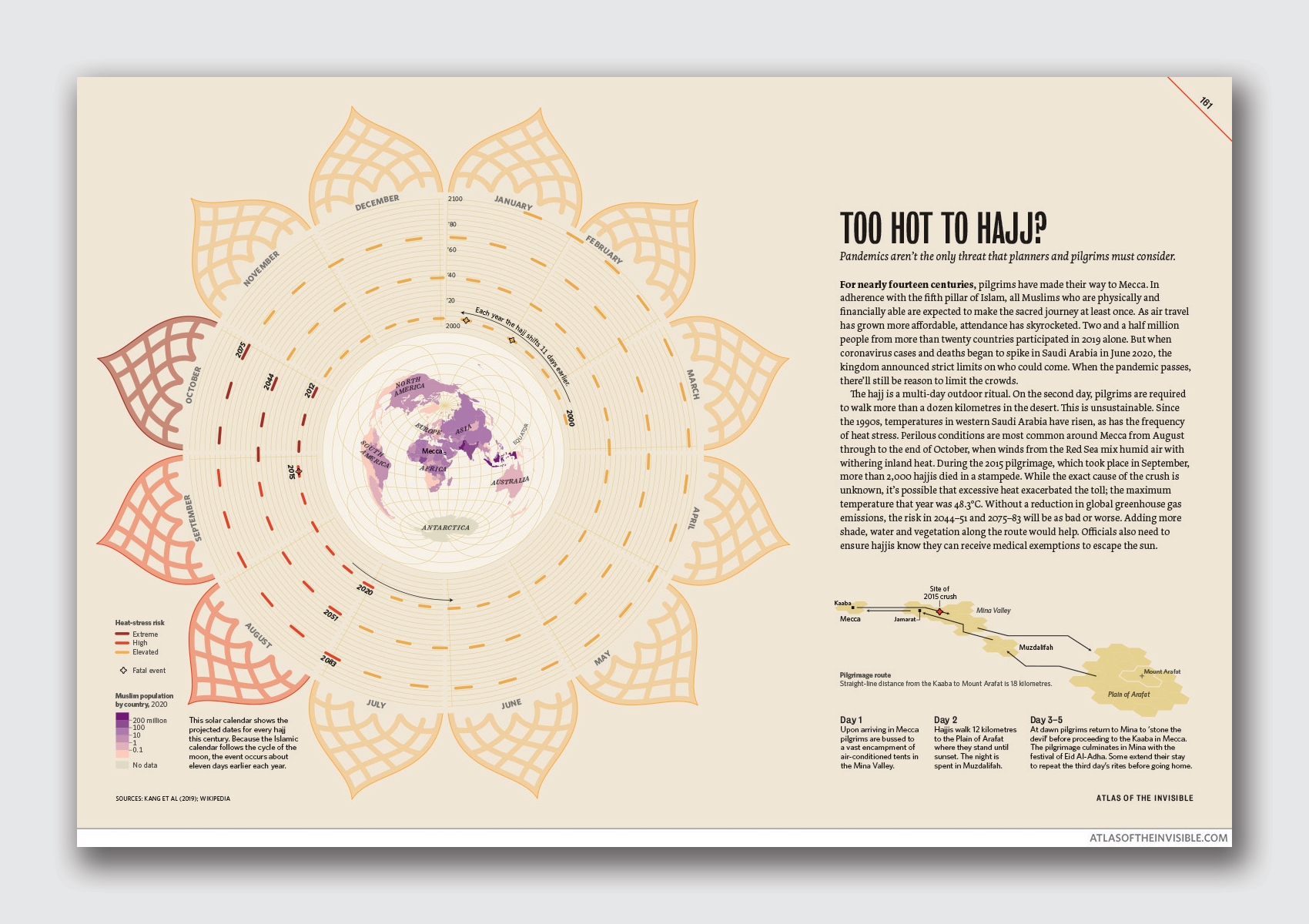
Extreme heat threatens Hajj
In 2019, 2.5 million pilgrims from over 20 countries made their way to the holy city of Mecca in Saudi Arabia. The pilgrimage, also known as Hajj, is an outdoor ritual that requires people to walk more than 7 miles in the desert. This trip is most dangerous between August and October, when can temperatures can reach 118 degrees Fahrenheit, as they did in 2015, when more than 2,000 hajjis died in a stampede. “While the exact cause of the crush is unknown, it’s possible that excessive heat exacerbated the toll,” writes Cheshire.
An illustrative solar calendar shows the projected dates for every hajj this century. If greenhouse gas emissions aren’t lowered, the graphic suggests that the heat risk in 2050 or even 2075 could be as bad or even worse than 2015. “When coronavirus cases and deaths began to spike in Saudi Arabia in June 2020, the kingdom announced strict limits on who could come,” Cheshire writes. “When the pandemic passes, there’ll still be reason to limit the crowds.”
(40)

