This map shows the gaps between who is causing climate change and who is suffering from it
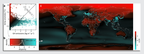
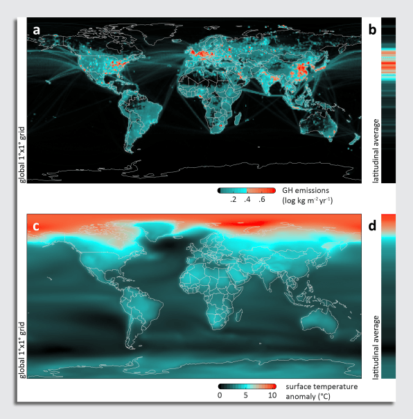
On the map, emissions are shown in a gradient of blue—the higher the emissions, the brighter the color. Temperature anomalies are shown in a red gradient, with extreme warming brighter than the blacker red of lower temperature changes. What emerges is an image where places, such as the northeast United States, western Europe, and eastern China, show as bright blue spots because of all the emissions they put into the atmosphere, whereas such places as eastern Europe, most of Africa, and the Arctic glow bright red—doomed to warm, even though little to no emissions are released from those regions.

“There are places on the planet experiencing ill effects of anthropogenic emissions and greenhouse gases, though there’s never any emissions in that place. We wanted to shine a bright light on this issue,” says Kyle Van Houtan, PhD, current president and CEO of Loggerhead Marinelife Center in Florida, who led this research when he was previously the chief scientist of the Monterey Bay Aquarium in California.
It might seem odd that an aquarium would embark on this research, which was published in the journal Science Advances, but Van Houtan explains that as a public science-based institution, they felt it was their responsibility to deliver science-based messages to the public about what, exactly, is happening to our planet. By putting the causes and effects of global warming together on a map, he hopes people can see what their region is contributing, and how it may be affected.
To put the map together, Van Houtan and his team used existing datasets on the top four heat-trapping agents: carbon dioxide, methane, nitrous oxide, and black carbon; also known as PM2.5, fine particulate matter like soot that measures 2.5 micrometers or less. Together, these three gases and one aerosol make up 92% of all greenhouse emissions. With that data, they mapped the sources of those emissions to show, between 1970 and 2018, from where all these emissions originated.

The researchers combined this data with maps of projected warming, which have been created by sources like the Intergovernmental Panel on Climate Change. The result was a map that shows the disparity between where emissions originate and where temperatures will rise the most. It’s an uneven image; 90% of the human-generated emissions that cause climate change come from just 8% of the planet’s surface. And though the source of those emissions is concentrated on such a small amount of land, more than half of the Earth’s landmass will experience extreme warming by the end of the 21st century. The paper also notes that the ocean absorbs 93% of the heat from climate change, and is crucial to mitigating this warming.
Van Houtan says this research is the first time a global accounting of emissions that lead to climate change has been mapped out in such a way. Now, this map can be used to better communicate this issue to the public, as well as for subsequent research looking at how ready these regions are to deal with that future heat.
The reason for these disparities has to do with how these greenhouse gases spread into the atmosphere. While there are localized effects to pollution sources—like the rates of asthma near coal plants—broadly, emissions from one place end up mixing with the entire atmosphere. Those emissions, Van Houtan says, “work like a blanket around the planet that prevents heat from leaving. …That means the relationship in any one place between the emissions and warming are totally up for grabs.”
And that means there could be zero relationship, which is what the map shows—particularly in places like the Arctic, which produces no greenhouse gas emissions yet is warming at an alarming rate. “For 99% of the planet, they are getting more climate change than the pollution they gave,” he says. “Climate change is really unfair. That’s what this really shows.”
(35)


