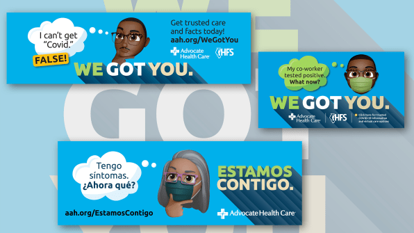
Instead, they responded with a multi-phase campaign that used custom memoji and the simple tag line “We Got You” to meet historically underserved communities where they are: on their phones. “The one tool that everyone has is a mobile phone,” Birkenbeuel says. “So this was something everyone could understand.”
The campaign is a finalist in the 2021 Innovation by Design Awards in the Pandemic Response category. Here, Birkenbeuel walks us through her mobile-first strategy, why her team focused on female memoji, and why representation in advertising matters—but still has a long way to go.

Fast Company: What was your design brief?
So when I started understanding the results that they were looking for and the actual data points, I realized that this wasn’t just putting together a poster that said, ‘COVID-19 is here.’ At that point, it became less of them giving me a design brief and more of my team going back to the client saying, ‘This is what this assignment really needs to look like.’
So we created the design brief to align with how many people they were trying to reach. We needed to create messaging. We needed to create branding. We needed to create a call to action. We had to create imagery that is visually inclusive of the communities we’re trying to reach. We also had to think about non-traditional ways and methods to reach our audiences. Putting a billboard on the highway that is heading toward the airport in a pandemic where no one is flying anymore is not going to work.
What was the client’s response?
People in the healthcare industry are always operating in a crisis. They’re trying to save lives. In this particular environment, this is more than saving lives. There was absolute chaos around this virus. And so it really became a beautiful example of the client saying, ‘You know what, we’re going to work together and hunker down and figure out how we’re going to actually make this work.’
How early in the pandemic did you start working with them?
It was the third quarter of 2020. And the summer of 2020 was when things started getting really bizarre. Everybody was sick. It was horrible. And the good that came out of it was that our agency and the client did everything in our power, within the budget that we had, to reach as many people as possible and these historically ignored communities that still are behind with vaccination rates.
So was the goal to encourage vaccination? Or was it originally just, ‘Here’s what COVID is, here’s how to avoid getting it’?
We built a campaign intentionally so that we could transition because the pandemic was changing. The original campaign was awareness. ‘We need you to know that Advocate Health Care and the state of Illinois are partnering with you to help you get access to care.’ It was a virtual care program where people could make a phone call and say, ‘I have COVID-19, what do I do?’ And then they could get help.
The next phase of the campaign was bringing out some memoji to talk about things like, ‘What will happen when I get this vaccine? Will it give me COVID? If I take this vaccine, will I become sterile?’ There is all this false information going all over the internet. So, especially in the Black and Brown community, we were trying to think: What are some of the narratives that are taking place on a daily basis? Certain things are related to systemic racism. And that’s where we came in and said we need to get out there and talk about myth-busting. People couldn’t tell the difference between truth and fiction.

Why use memoji? Why not use imagery that represents real people?
Real representation becomes very challenging when you’re dealing with public health. You get into questions like, ‘What faces do we do? What should their features look like? What about their skin or their hair or their gender?’ So instead we asked, ‘What are some of the better ways that we can create something visual that would be relatable?’
My mother is 82-years-old, and she sends me text messages sometimes with memoji alone. When you’re trying to reach historically ignored populations, the one tool that everyone has is a mobile phone. So this was something everyone could understand.
And we spent time trying to figure out the best representations. We thought about the audiences that the message would resonate with the most, and also the audiences and communities that would be able to spread the message the fastest. So we did have a higher concentration [of female memoji] because women are the ones who make decisions oftentimes about healthcare. I’m a mixed-race Black woman, and I spent a lot of time working on the Black woman [memoji] and making sure the details were right. I made sure she had lip gloss and I worked on her hair.
You have said that much of the advertising and design that’s meant to reach Black and Brown audiences is stale, clichéd, and full of stereotypes. What have you’ve seen previously and how did that inform a different approach here?
In the United States, there is very little representation [of Black and Brown leaders] on the creative side. What happens in ad agencies is you have a lot of white gaze—what white people think Black and Brown people are supposed to look like. So you have white designers creating things for Black consumption, and this is America—there are a lot of stereotypes and there’s racism!
When I think about how I’ve always approached my work, especially when I’m talking about representation of Black and Brown people, I try to be as authentic as possible and show dignity, grace, and respect and not show the images I saw growing up—really inappropriate images of Black people in advertising.
It’s important for me to look at the work through as wide a lens as possible culturally. I have three Black sons, multiracial like me. My father is Black and had an incredibly difficult childhood. I bring a lens to my work where I’m looking at the humanity of the person before their skin color. But as a Black person, I’m also looking at their skin. I try to be very careful about representation.
And it sounds like you had to do a little bit of that work in this case too, because originally it was just the media buy, and you were able to convey to the client that if they want to reach Black and Brown residents, they needed to go bigger.
When I go into assignments for clients, I’m always thinking longer-term, bigger picture. Especially for something like this. We’re in a pandemic. This is a virus that is taking people out by the millions. This is not an assignment that I looked at and thought, ‘We’re just going to throw up a couple of billboards and hope that somebody makes a phone call.’ This was 2020. This was the world of George Floyd and Breonna Taylor and a public health catastrophe that was negatively impacting historically ignored communities in particular. I took the assignment very, very seriously. This was a life and death branding assignment.
See more from Fast Company’s 2021 Innovation by Design Awards. Our new book, Fast Company Innovation by Design: Creative Ideas That Transform the Way We Live and Work (Abrams, 2021), is on sale now.
(45)