Only about half of Americans read nutrition labels on food, and even fewer say they fully understand them—or what unpronounceable ingredients like “polydimethylsiloxane” actually mean. A new food data platform attempts to make things clearer, using bright visualizations that explain what you’re eating, where it came from, and how it might affect your health.
“We constantly interact with the food system, but the data of that system is really hidden from us as end consumers,” says Sam Slover, founder and CEO of the Sage Project, the new platform. “When it is available to us, traditionally it’s hard to understand. Even people who are highly educated have a hard time making sense of it.”
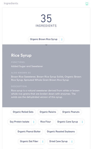
Slover started developing the platform as grad student in interaction design at NYU, and developed a basic version as a thesis project. “I manually tracked every item that I bought from a grocery store over those three to four months,” he says. “These would be things like nutrition, but I went further. If I noticed something was an additive, I looked at what is that ingredient, and why is it used in my food, and what are other names for that ingredient.”
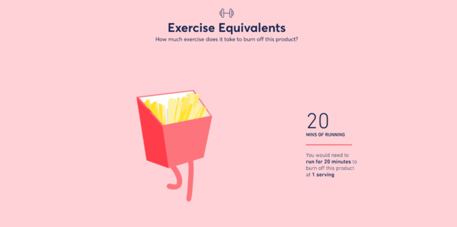
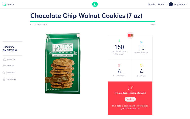
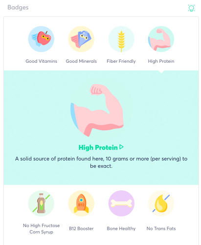
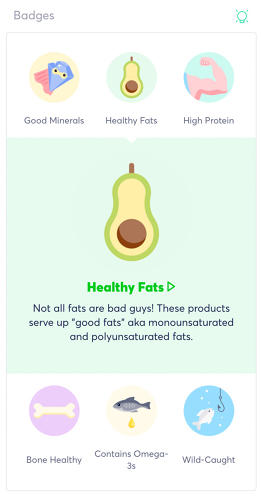
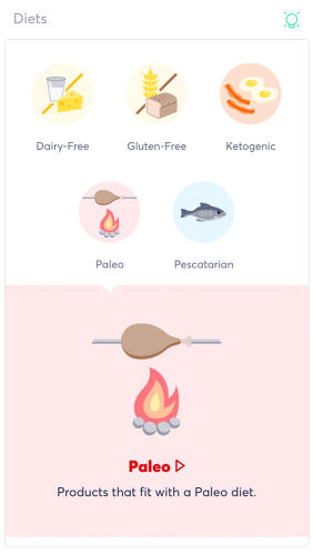
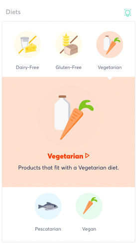
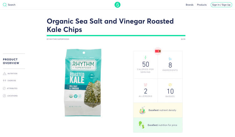
The new platform, developed in a partnership while Whole Foods, includes around 20,000 products so far. Each product has a detailed profile, with visualizations showing the nutrients graphically, and animations showing how much exercise it would take to burn off the calories. Each of the ingredients is fully explained; the system also automatically flags allergens. It also includes details about social practices, like whether a product is Fair Trade certified or if the company is a B Corporation.
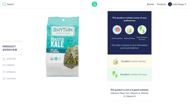
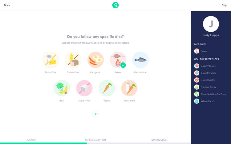
Unlike a label on a package, it’s also customizable. If you eat more than one serving, it does the math to calculate the nutrition. When you create a profile on the platform, you can note any special dietary needs or allergies, or whether you’re particularly looking for organic food or a company that uses renewable energy, and it can filter for foods that fit.
By personalizing the information, it becomes easier to do something with it. “Transparency has become such a cliché term,” Slover says. “The way we like to think about it is actionable data to make better decisions.”
It’s also designed not to be overly serious, even as it helps educate. The illustrations showing how much exercise it takes to burn off a bag of chips, for example, show a playful chocolate bar jumping rope and a colorful watermelon riding a bike. “We want to help people understand kind of these core concepts of nutrition, and do it in a way that’s not preachy,” he says.
The startup plans to soon add mobile apps, so the system can more easily be used inside stores, rather than just for planning at home.
Sage Project uses bright visualizations that explain what you’re eating, where it came from, and how it might affect your health.
If you eat more than one serving, it does the math to calculate the nutrition.
When you create a profile on the platform, you can note any special dietary needs or allergies, and it can filter for foods that fit.

The startup plans to soon add mobile apps, so the system can more easily be used inside stores, rather than just for planning at home.
Fast Company , Read Full Story
(45)