
TWA’s long-lost typeface embodied the golden age of flying. Now it’s being reborn
The TWA Flight Center at New York’s JFK is a living monument to the golden age of air travel. Designed by architectural icon Eero Saarinen in the 1960s, its over the top, neo-futurist design celebrated the unlimited possibilities of technology and our future. (Steven Spielberg would go so far as to use the TWA Flight Center as a setting to define the era in Catch Me If You Can.)
The airline TWA itself shut down in the early aughts, and the building was abandoned. JetBlue built out its own terminal encircling the center before the the state of New York announced a plan in 2016 to turn the landmark-status TWA space into a 40,000-square-foot hotel and conference center. That hotel opens next month, and it promises to be a jaw-dropping ode to Saarinen’s original vision. And to complete it, the design firm Pentagram was brought in to rebuild the TWA logo and a typeface lost to time.

[Image: courtesy Pentagram]
During its heyday, the terminal was teeming with a high energy, hyper-optimistic typeface. Everything from grand Departures and Arrivals billboards, to the “towel” signs in the bathroom, was rendered in an all-caps typeface that made each part of traveling feel epic. Even drying your hands. The typeface was the work of someone (or many someones) in Saarinen’s office.

“Eero Saarinen really got branding. He really did. He really got that it would all go together and it required consistency, unification, and organization,” says Michael Bierut, the Pentagram partner who led the new design. Bierut believes that Saarinen designed the entire Flight Center after being inspired by TWA’s logo. Not only did the typeface on the signs look a lot like the letters in TWA; the color scheme was there, too. “He did what I find myself doing a lot. You find something you see as the authentic core where the DNA [of a brand] resides. He said the TWA logo is what people associate with. I believe it was already red,” says Bierut. “If you go to the Flight Center when it opens next month, all the upholstery in the waiting areas is a bright, vivid red that plays against the white tile work and surfaces. I think he was extrapolating the brand color and typeface, and just trying to make this really intense, total brand experience.”
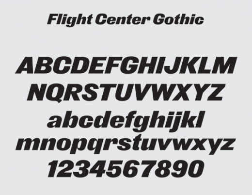
To recreate the typeface, Pentagram teamed up with typeface creator Nick Sherman. They went back to Saarinen’s old source material archived at Yale to build a digital version that could work inside the hotel and on all its marketing materials–not just on signs, but on the web, too.
“The reason it doesn’t look like any digital typeface we have now is [Saarinen’s team] found images in books and blew them up photo-mechanically. Then an architect translated them into the signs you see,” Bierut says. “It was one hand process on top of another hand process rendering the final effect.” To further complicate things, Saarinen’s team was pulling letterforms from all sorts of typeface samples.

[Image: courtesy Pentagram]
“I was already a fan of Eero Saarinen and the TWA Flight Center, so looking through all the old photos, blueprints, and even text documents was fascinating,” says Sherman. “At the same time, looking at some of the material related to the signage could be a bit puzzling. There are many different letter drawings, alphabet sheets, sketches for specific sign layouts, etc, and many of them are very different from each other. To be honest, some of them aren’t particularly well-drawn either, as far as letter drafting goes.”

[Image: courtesy Pentagram]
Sherman scanned some of these analog masters, but they didn’t produce what anyone would consider a passable font. Meanwhile, the closest existing digital font, known as Derek (which is a digitization of the analog typeface Old Gothic Bold Italic which looks quite a bit like the TWA logo’s original inspiration), just looked wrong. As Sherman puts it, letterforms like the “a” and “r” had too much flare and curviness, making them look like something out of the late 1800s rather than the 1960s.
So he started building the typeface again from scratch, using the source material as reference. The results feel all around wider and softer, with a more equalized weight across each part of each letter. It feels friendly. Optimistic. Cool. All those things you want flying to feel like (even though that ship has certainly sailed).

[Image: courtesy Pentagram]
“One very memorable moment from working on this project was unexpectedly seeing the typeface set in gigantic letters on the construction wall around the building, as it was shown in the New York Times,” recounts Sherman. “Of course, after looking closely, I realized the sign was using one of the earlier beta versions of the font that had since been improved. But it was still extremely satisfying.”
Fast Company , Read Full Story
(28)
