It’s been quite the year. From the FBI’s Clinton email bombshell to Trump’s bragging about sexual assault, this election has been unlike any other in memory. It’s also been full of visual emblems, from red Make America Great Again hats to the near-constant stream of memes both campaigns churn out. Yet there hasn’t been a single image that truly encapsulate the mania of 2016: Where is this election’s Hope poster?

There are several reasons for that, as I wrote back in August. One, the candidates are some of the most well-known—and the least liked—in electoral history, and haven’t necessarily inspired artists the way Obama did. Meanwhile, the way we consume images has significantly changed over the past eight years. Today, we are constantly inundated not only with images, but with video and other forms of media.
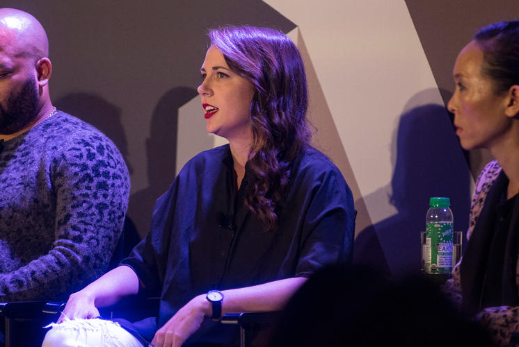
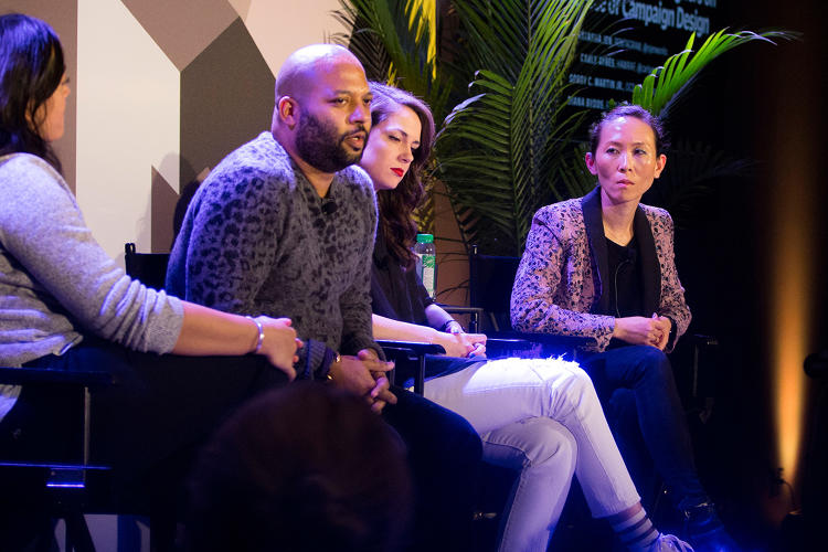
In response to this question, Co.Design asked three graphic designers—Natasha Jen of Pentagram, Carly Ayres of HAWRAF, and Bobby C. Martin of Original Champions of Design—to create an image that they believe gets at the heart of this election cycle. At our Fast Company’s Innovation Festival, all three discussed the images they created in response to our brief.
Visualizing The Media Frenzy
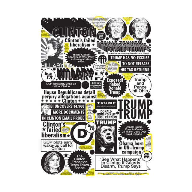
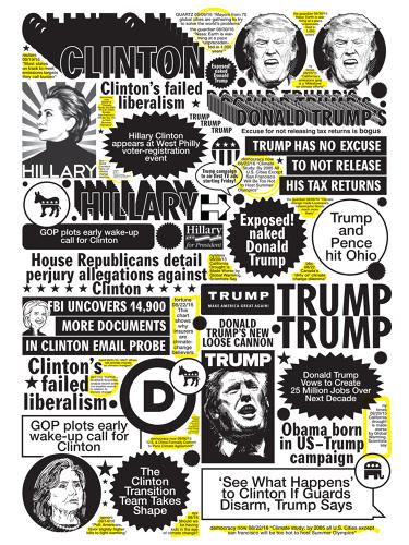
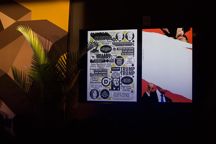
Natasha Jen of Pentagram designed two distinct posters. In one that takes a newspaper as its inspiration, sensationalist headlines jostle against images of Clinton and Trump, whose names reverberate across the poster, almost like they’re shouting at each other. “Exposed! Naked Donald Trump” screams one. “Clinton’s Failed Liberalism” sneers another. “It’s really, really noisy to the point that you can no longer distinguish what’s being said but you get the impression that there’s a lot of garbage going on,” she says.
But there is a thread through the visual cacophony of the poster: climate change. “What is really profound, and also mind boggling that you don’t hear much or at all about climate change in this election” Jen says. “Throughout this entire time there has been so many heartbreaking and frightening news about what’s happening globally to the mother Earth and this has gotten erased really by the brands of the two candidates to the point that they’re almost invisible.”
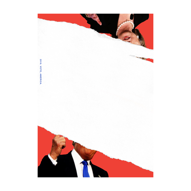
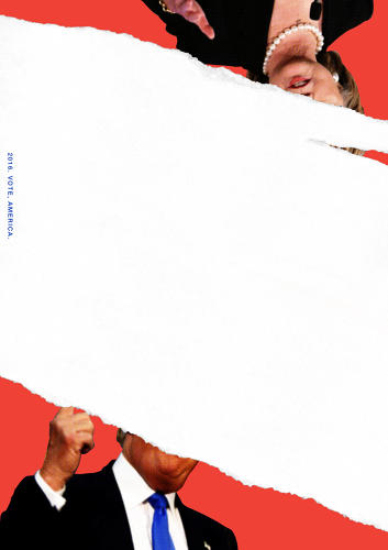
In her second poster, Jen quite literally rips the heads off the two candidates—or at least most of them. In an image that appears almost like a magazine cover with a giant white rip across the front, Trump and Clinton stand on opposite corners of the posters, their arms up and ready for battle. “What I’m trying to suggest here is this country is incredibly polarized to a degree that you kind of ask yourself, what are we left with as a society, as people?” Voting, she suggests, is one way to close the gap.
The Personal Is Political
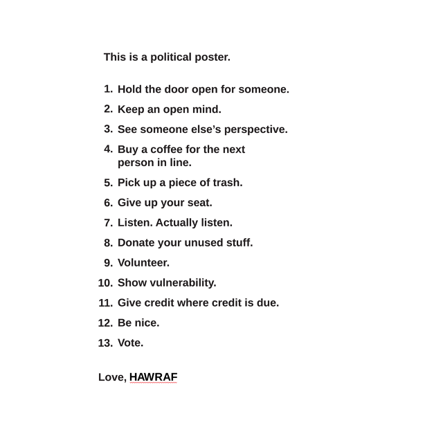
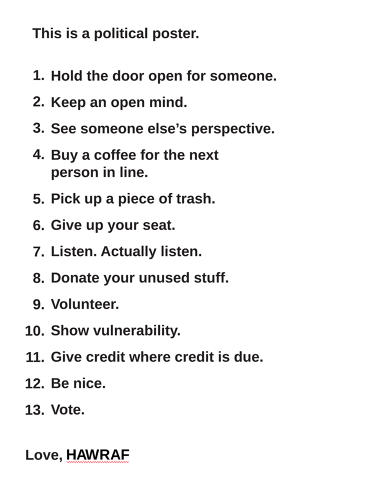
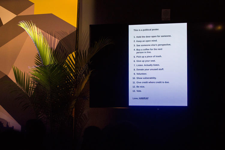
Carly Ayres of HAWRAF moved her gaze away from the two candidates to remind her audience of what truly comprises a political act. In contrast to the purposeful noisiness of Jen’s first poster, Ayres decided to represent its antithesis. “We thought, what is the absence of that, what’s something we want to draw people’s attention to?” she says. “For us, that was what is the impact you can have as individual on society, on the world.”
That meant, quite literally, a practically minded to-do list. Her poster is a simple list of 13 action items that serve as reminders that picking up a piece of trash (#5), volunteering (#9), and being nice (#12) can be inherently political acts that bring civility and kindness back into the discussion—even if this election cycle has obscured both.
The most important of all? #13: Vote.
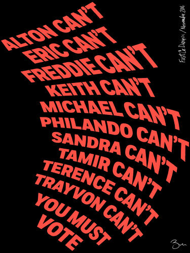
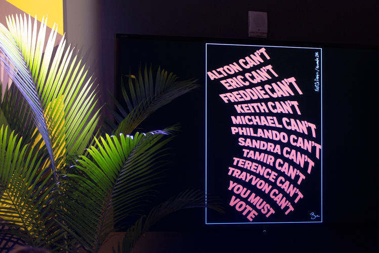
Vote, Because They Can’t
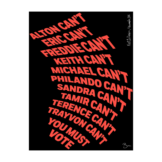
Meanwhile, Original Champions of Design’s Bobby C. Martin created a typographic ode to 10 men and women who were unarmed when they were murdered by police. Their names have become part of the Black Lives Matter movement, and in this poster Martin uses bold, red lettering to remind his audience that none of those 10—nor the many others who have been victims of police brutality—can vote. But you can.
The type is shaped to resemble a megaphone, acting as a typographic call to arms. He chose a deep orange for the lettering, avoiding any patriotic colors to convey a tone of urgency and inspire action.
For Martin, his poster also reacts to those who would submit a so-called protest vote, as he explained today on stage. “How can we not vote or chose to have this vote that’s not going to make a substantial impact in the election, when we can vote for more of this to happen or we can vote for less of this to happen?” he says.
Ultimately, the nature of political imagery has changed fundamentally. “We’re in a society where we’re used to dealing with singular things,” says Jen, referencing the “Hope” poster and the history of campaign design. “We have shifted entirely to the other end of the spectrum, which is the multiplicity. Iconic imagery doesn’t exist in such a single self-contained mode any more. Instead it’s through these micro bits and pieces.”
Fast Company , Read Full Story
(39)
