

Why Content Reigns Supreme In UX Design
Lorem ipsum dolor son of a…
It’s been nearly 20 years since Bill Gates declared that “content is king.”
His original 1996 article reads like a manifesto, calling for sites to deliver quality and entertaining content to their customers, explaining why content-providers must be compensated, and making some prophetic predictions about the future of the Internet.
Despite the dated references to modems and the possibility of video (which is now certainly a reality), the article still makes some valid points—not the least of which is that “content is king.”
As Gates himself addresses, “content” for the web has a very broad meaning.
Content refers to almost anything on a page—text, images, videos, ads, even sound effects. The greater meaning, though, is what you’re offering your users. What does your site give to its visitors? Information, entertainment, stimulation, food-for-thought or a few wasted minutes of browsing in vain looking for something interesting?
We know that it’s not edgy to defend one of the most timeless pieces of advice in design, but we’re not doing it to grab attention. We simply believe that it’s far too easy to overlook content as a design fundamental when the bulk of work focuses on visual design elements.
Don’t fall into the trap of obsessing over the interior design when you haven’t even checked the foundation for cracks. In this piece, we’ll dive into four reasons why we recommend a content-first design approach (which we initially described in Web Design for the Human Eye):
Reason #1 – Design May Impress, But Content Hooks Users
Users place their faith in the aesthetics of a site or product, often judging its value by the design before reading the content. Yet, all the design in the world won’t bring someone back if the content is horrid. In the end, users will care more about content, not the design.
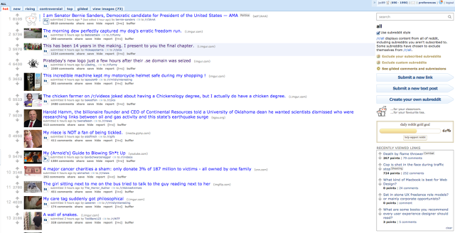
Think what you will about the superficiality of your target users, but time and again they’ve proven, en masse, that sites without substance won’t stand. For example, Reddit has tons of visitors but doesn’t exactly have stellar design, proving that users are more into the content than the pixels.
That’s not to say design isn’t important, you just need to understand it in the context of content. Design is the techniques used to present content in the easiest manner so that users can accomplish their goals. In this sense, design covers everything from site-wide information architecture to the gradients used on buttons for calls to action.
And you don’t have to design without content. As GatherContent suggests, here are a few quick tips to give you a head start on designing with content:
- Write copy yourself. You don’t have to be a master copywriter as a designer, but you have knowledge of the product that can be used to dummy out copy. Don’t fret, you can always have a writer punch it up after the fact.
- Use existing content. If you’re redesigning a site, the old copy is better than using lorem ipsum. Sure it won’t be completely the same as the rewritten copy but it’ll give you a ballpark idea of what to lay out.
- Pull from competitors. This shouldn’t be your first choice, but it’ll do in a pinch. Since your competitors operate in the same space, much of their content probably applies to your own site as well. Just be careful to replace the copy because you don’t want to be accused of plagiarism.
Reason #2 – Content Plays the Greatest Role in Interaction Design
Your content defines the conversation between your site and users. Interactions happen in a matter of milliseconds, and content helps drive users to take the actions you want them to take.
Like we described in Chapter 2 of Interaction Design Best Practices, words are themselves interactions. Furthermore, the content and visuals on the page dictate the cadence of the experience. Before the user is compelled to actually click anything on the page, they must first browse and absorb the information—that whole process is an ongoing stream of latent interactions which you can control with good content strategy.
Do you write whimsically to encourage a choose-your-own-adventure experience (perhaps created through a sparse minimalist layout), or do you construct clear sections that build to a single call to action? In either scenario, users will behave differently based upon how you serve the content.
If your content is carefully crafted, you will create a positive, almost human exchange with your user. Regardless of the visual execution, you should always strive to humanize an interface by using content to create a feeling of conversation.
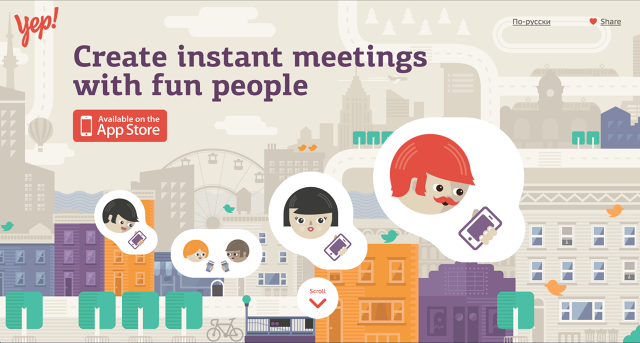
Let’s look at friend-making app Yep (above) as an example of how smart content strategy leads to delightful interaction design. As you scroll through the site, you notice the messaging is crisp, fun, and right to the point.
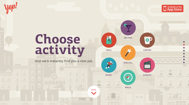
For example, see how the copy and visuals entice rather than just explain what the product does. Instead of listing the number of activities available and how many friends it can find, the content illustrates the possibilities in words and visuals. When paired with the single-page design, users get hooked on the simple value and have no choice but to scroll down to learn more.
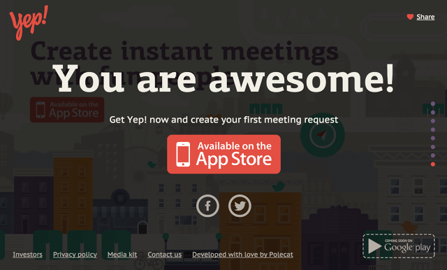
Every part of the scroll is another treat that lures the user into scrolling down towards the bottom, where a simple call to action awaits. The addictive experience is no accident of interaction design—it’s the product of a conscious, calculated, and highly effective content strategy.
Reason #3 – Content Shapes the Design
Rian van der Merwe points out on the Elezea blog that the content is like the product, and the design akin to the packaging. Designing without knowing the content is like creating the packaging before you know what goes in it—and that can lead to some serious problems.
Take a look at a design approach (a mistake we made in our original site redesign) where you don’t prioritize the content.
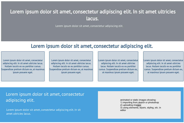
So far, so good, right? Everything looks great, the structure and layout work well, and you’re ready to move forward. But what happens when you add the real content?
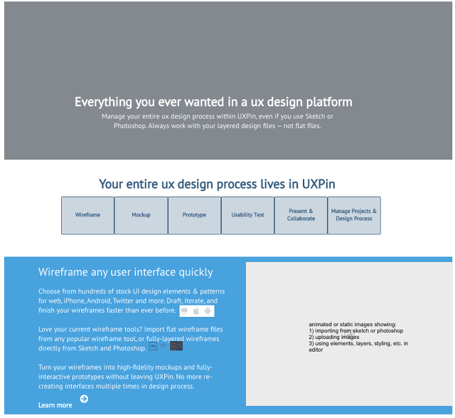
Even though drastic rearrangements weren’t required in our particular case, the situation still highlights the potential dangers of treating content as an afterthought. Imagine, for instance, if we decided that the “Wireframe any user interface quickly” section is better communicated through graphics instead of text. The shapes of the graphics may conflict with the squarish buttons for navigation, which means we’d need to rethink how to lay out the navigation as well.
The bottom line is that your real content will almost never be the same size or have the same look as a placeholder. In extreme cases, this means a redesign is required, which is totally avoidable you took a content-first approach.
Moreover, the style of the content—the words used, the types of images, etc.—influences the style of the design. A dark and ominous image would be undercut by a brightly colored border. Individual pull quotes from an article wouldn’t have any effect if they’re formatted like the rest of the article. Content and visual design must work together as equal parts of an interface—they shouldn’t be developed in isolation, then jammed together near the end.
Reason #4 – Content-First is Mobile Friendly
Mobile-first design and content-first design can and should coexist. You can’t really have one without the other, according to Jeffrey Zeldman.
The content-first approach is essential for determining your breakpoints when it comes to responsive design—otherwise, you’re just guessing based on an arbitrary visual design. Dropping in the content later usually means redesigning and restructuring, as we mentioned above, except with more technical details to factor. Not to mention, you’ll have no choice but to serve up a “watered down” experience for mobile users as you trim away your desktop site to fit smaller devices.
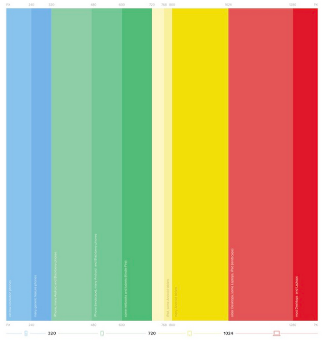
Instead, you need to design the most relevant content for the smallest device, then work your way up, as Peter LaPage points out in this excellent article. This way, you’re adjusting your breakpoints around content, rather than basing them solely on layout. Planning your breakpoints around content also allows you to tweak so that the content looks good on any device, as David Olsen points out on his blog.
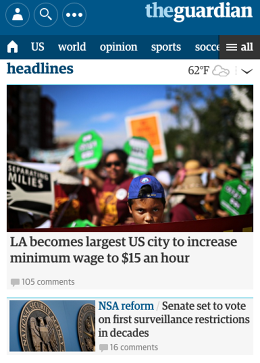
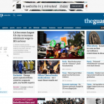
For example, let’s take a look at the Guardian’s responsive site.
We’ll start with the smallest breakpoint, the phone view. As you can see above, the following content is available to the user:
- Prioritized navigation (with rest outlined in hamburger menu)
- Feature story with main image
- Secondary stories available upon scroll
- Search bar
- Weather information
Even on the smallest screen, users enjoy a full experience with more available on scroll. Subtle touches like listing out a few primary navigation items such as “US” and “world” all help create a more content-rich experience on mobile (instead of just filing away all the navigation into a hamburger menu).
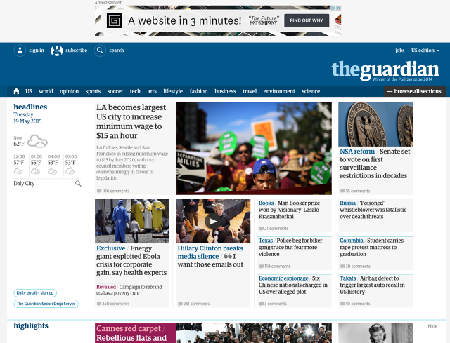
Let’s expand a bit to replicate a tablet view.
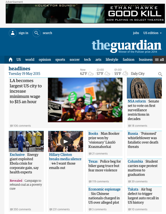
Now on a tablet, you have more screen real estate, which has determined where the content can and should break. With more space, the news stories don’t have to be collapsed underneath the main story. The tablet layout remains consistent with the smaller mobile layout, except we’ve simply moved up secondary stories to appear in the same view. You’ll also notice that the ad now appears at the top.
Overall, the tablet view feels like a slightly upgraded version of the mobile view. The tablet view doesn’t provide any “new” content that was unavailable in the mobile view, it simply makes a few more items visually accessible. The experience, as a result, remains fairly consistent.

When we finally look at the full desktop view, we again see that the “grid containers” widen up to feature more content, but again, nothing is shown here that is otherwise inaccessible on small devices.
More stories are immediately available, but much of the navigation and overall look and feel are preserved. Instead of degrading the experience for smaller devices, we see that the experience actually follows a path of “progressive enhancement” as the screen size increases.
Mobile-first design isn’t easy and may feel unnatural since you’re immediately placing screen size constraints around the design, but it is undoubtedly one of the best methods to ensuring a device-agnostic experience with all your site content.
Conclusion
Users don’t care about you, and they certainly don’t care about the design. Don’t be tempted by the “Dribbblisation” of design.
Dive into your personas, do your user research, then figure out what content best helps them accomplish their goals. What do they want from your site? After you figure that out—and only after—map out your information architecture in the most intuitive manner possible. Then, don’t be afraid to start creating and iterating the content either before or alongside the visual design.
Once you’ve worked through the foundation of the site, only then does it makes sense to explore the interaction and visual design. Otherwise, you’re just barely skimming the surface.
If you enjoyed this piece, feel free to check out the free e-books Web UI Best Practices and Interaction Design Best Practices. Across 200+ pages and 60+ visual case studies, the two books offer practical UX advice for everyday design.
Fast Company , Read Full Story
(55)
