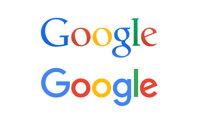
Perhaps you didn’t notice when Google updated its logo last fall. The changes were relatively subtle, with a cleaner, sans-serif typography replacing the original’s highly ornamental lettering. But the revamp was actually a big deal, and not just because the logo is viewed trillions of times a year on Google’s search page. It reconceives the logo as an interactive visual device that adds functionality, using a clever animation of dots to communicate various responses to user actions. We spoke to Jonathan Lee, a Google creative director who helped spearhead the redesign, about how he approached the changes.
Co.Design: Why change the logo now?
Jonathan Lee: We wanted to future-proof the brand. There are things we know are coming: We’re designing for wearables, to have our brand work on a watch face or in Android Auto in cars. That was the core momentum builder.

The logo is designed to react to users. It employs four animated dots to help people grasp what’s going on while they’re interacting with Google products. Why was that important?
The intention was to allow a new level of expression in our interface and for our brand. We’ve been investing heavily in using motion. The way the dots move communicates more than just, “Hey, we’re dots.” How something behaves after you interact with it gives you a better understanding of where you are in an application. Right now, the primary expressions are that it’s listening to you speak [in voice search] and is showing that it’s actually catching some sound from you. It also can show you that it doesn’t understand what you said.
How nervous were you before you introduced it?
It was so nerve-racking the day of, knowing that we had worked for months and months with the collective effort of so many people. I was frankly ecstatic and relieved that people responded so well. It’s kind of a complicated thing to ask the world to understand.
Click here for the 2016 Innovation by Design Awards finalists and winners.
A version of this article appeared in the October 2016 issue of Fast Company magazine.

Fast Company , Read Full Story
(13)