Not until having children did I enter the universe of PBS Kids—the child-friendly arm of the Public Broadcasting Service. With 13.5 million TV viewers between the ages of 2 and 8—supplemented by nearly half a billion streams on digital platforms and an app full of interactive games—the public service is a juggernaut in free family programming.

[Images: PBS]
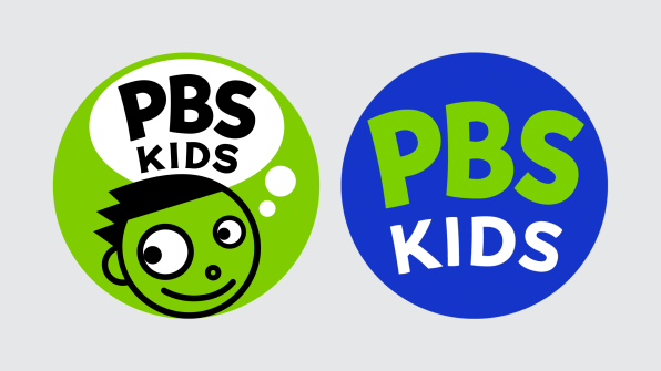
Come July 19, PBS Kids is launching its biggest logo redesign in more than 20 years. Notably, the logo’s mascot—a lime green boy named Dash (who, if you think about it, is old enough at this point to drink)—has been kicked off the mark. In his place will be the bubbly words PBS Kids. And that’s it. There are no children, no animals, nothing screaming “Youth programming here!”
Maria Whelan, senior director and head of marketing and brand engagement at PBS Kids, admits this was a surprising direction for the brand, given that “young kids aren’t always readers yet.”
So why did PBS Kids do it?
As it turns out, the rebrand has been in the works since 2019, and it has been paced deliberately to validate the approach with PBS’s existing audience. PBS led the branding internally but partnered with Lippincott, a firm you may know best for the Starbucks siren, to assist with the process. The bottom line is that the current logo, ostensibly created in 1999 (and iterated upon only lightly since), served televisions better than the growing array of small screens and apps where it might appear. Functionally speaking, getting rid of the face allowed the words PBS Kids to be a lot bigger, and therefore more legible within the same space.

[Image: PBS]
But this functional decision wasn’t the only logic driving PBS’s development process. The team interviewed 33 families from across the U.S. of varying race, ethnicity, and economic background, speaking to children and their parents, and using them to focus test several new directions for the logo.
“We did have questions around inclusion,” Whelan explains. “We wanted feedback from our audience directly . . . to evolve the logo to better represent the [audience].”
What they learned during those interviews was that children weren’t as wedded to seeing another child’s face in the logo as you might think. In fact, these conversations revealed that the typography of “PBS Kids” was the most recognizable piece of the brand (even for children who haven’t yet learned to read).

[Image: PBS]
Even still, on its own the PBS Kids logo does look a bit less fun to me than the previous iteration—and I can’t help but wonder if keeping faces of some sort may have helped kids see themselves in the brand. However, this criticism is largely mitigated by the rest of the PBS Kids brand system.
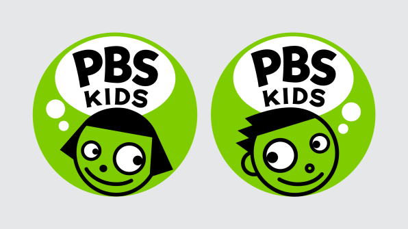
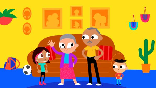
Dash is gone, while co-mascots Del, Dot, and Dee will technically stick around, albeit joined by an endless collection of new characters, who have evolved from green people into all people.
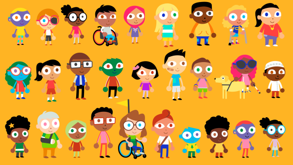
Building on similar character shapes that PBS Kids already uses, designers created a whole kit of mix-and-match humans who represent an array of races, ethnicities, and physical abilities—but also mixed in a few blue, green, and purple friends as well. (If you’re a PBS Kids watcher, some of these new people will be familiar. Their rollout began in late 2021.)

[Image: PBS]
Whether you’re a fan of the update or not, this PBS Kids rebrand does ride the current zeitgeist of representation. The green alien-kid Dash was a single person representing all of us, implying a tacit message that “we are all part of the human race.” But this literally representative update now emphasizes a more modern way of framing diversity—that our differences should be acknowledged and celebrated, rather than glossed over.
(184)