And what can you do to help?
Flat design rose in popularity pretty quickly back in 2013. But is its success thanks to its genuine usefulness and practicality, or is this just another web design trend that will fall to the wayside in a few years?
Flat design certainly deserves merit for its return to a cleaner content-focused framework. But when taken to an extreme, it can just as easily leave sites feeling coldly architectured like a $20M hillside mansion with plenty of class but not enough coziness.
In this piece, we’re going to take an in-depth look at the flat design style and discuss what works, and what simply falls flat.
Pros and Cons
Flat design started with the slate-like feel of early Windows Metro (as seen in their failed Zune player), but designers have realized that tasteful visual flourishes don’t necessarily distract from content. Today’s flat design—nicknamed Flat Design 2.0—is more advanced in the sense that common usage has reworked it to be more functional and applicable to a broader range of sites.
But it’s still not perfect, and far from a cure-all solution to any design woes.
Pros
- Responsive Frameworks – Flat design’s claim to fame is its simple visual layout, which is even more dramatic when you consider the skeuomorphic predecessors. Clean layouts are perfect for responsive frameworks, mobile or otherwise, offering faster load times and more natural breakpoints.
- Easy browsing – Provided you create a clear visual hierarchy, another benefit of the simple layout is that it’s easier for the users to browse and find what they’re looking for.
- Engaging colors – The vibrant color palettes provide more stimulating and exciting visuals than other styles. In modern flat design, however, you want to stick with a simple color palette (even monochromatic works well) or else your site will look like a tacky arrangement of tiles.
- Clear graphics – The simplistic graphics and icons are quick and easy to understand, aiding in navigation and creating a more enjoyable experience. For a sophisticated look, try layering ghost buttons over large spreads of color or high-definition hero images.
- Structured atmosphere – Bold lines and shapes express a logical, almost architectural feel. Instead of relying solely on a hamburger menu, however, we’d recommend a simple top navigation with clean typography.
- Readable typography – The textual style, removed of unnecessary flourishes, ensures readability. As you remove the ornaments of design, you emphasize the content that remains.
Cons
- Design difficulty – A common misconception is that the minimalistic style makes a flat design easier to build, but the truth is closer to the opposite. Because the screen space is limited, each element must be chosen with care. In short, flat design is difficult to do well, but easy to do poorly.
- Confusing clickability – The simplicity can sometimes work against the style, blurring the line between what’s clickable and what’s not.
- Less signifiers – The restraints on the elements—for example, no textures—limit the amount of signifiers available.
- “Boring” to Some – Certain users, like children, may find the minimalism boring.
- Lack of identity – Due to the popularity, the more sites that use flat design, the more they all look the same.
The best approach to flat design, as with any design philosophy, is to focus less on the aesthetic and more on why you’re designing. Flat design is more about creating a design that provides only enough secondary elements to navigate the content. Don’t forget that the visual style is simply a byproduct of its content-first goals.
Flat Characteristics That Will Survive
While there’s certainly an air of trendiness to the flat design craze, we do believe that some of its core elements are rooted in solid usability and visual design principles.
The “sweet spot” in the evolution of flat design is somewhere between the original trend and the skeuomorphic ideals that were abandoned. The flat (or more appropriately almost flat) techniques that will endure are about two-thirds purely flat and one-third skeuomorphic.
1. Iconography
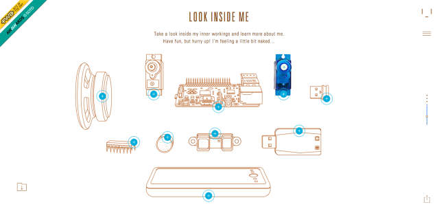
Flat design helped icons get the respect they deserve. Since the page is more stripped down, designers must really focus on perfecting the details of these often-small elements.
Now that users are becoming more accustomed to intricate icons, they won’t want to give them up. Icons are also being used in ways that give them more focus as an art element and not just something for users to click on. Avenues to express a site’s style and individuality will also be welcome by users and designers alike.
2. Typography
As described in the free e-book Web Design Trends 2015 & 2016, the focus on beautiful typography, custom typefaces, and lettering with purpose continues to grow.
With other trends such as hero headers, oversized typography or type-only websites, the influence of flat is easy to see in many of the type selections designers are making.
3. Minimalism
That minimalism as an artistic style has existed for decades is a good sign it will continue to endure. Simple, easy-on-the-eyes designs are a top choice for landing pages especially because their style is captivating and usable.
From a practical standpoint, minimal designs also adapt well to responsive breakpoints thanks to the sparsity of on-screen elements.
4. Single Type Families
The use of “one design, one font” emerges as another branch from the simple typography ideas of flat design.
While type is simple and readable, this concept removes some of the focus from the design of lettering to the surrounding design and words themselves (which is the real purpose of good typography anyways). Logos, however, may still be presented in a separate font to reflect the brand identity.
5. Color Usage
The application of bright color may fluctuate according to trends, but it’s far more than just eye candy.
Rather than filling a flat-style website with color, the preferred option has shifted to using color as an accent tool. As explained in Interaction Design Best Practices, this also pairs well with minimal concepts that include a lot of white space or sites that use large images as a focal point.
Flat Characteristics That May Fade Away
Other elements of flat design are starting to burn out almost as quickly as they came into the limelight.
Most of these elements include “fun” design features that are difficult to employ in a user-friendly way. When done well, each of these techniques can result in a brilliantly designed and highly usable site, but more often than not these elements underwhelm.
- Huge color palettes – Flat design gave designers a new freedom in the allowance to use massive color palettes. Fun for a while, the end result was a little bit of color chaos, and most flat-style concepts are returning to traditional color palettes that contain only a handful of hues.
- Long shadows – Long shadows are beginning to disappear almost as quickly as they became a trend. Designers are still using shadows, but are opting for a more subtler, softer aesthetic.
- Ambiguous emphasis – One of the flaws of flat design is that it best worked on simple designs because of the lack of emphasis on any element over another. This problem has been realized and the “⅔ flat, ⅓ skeuomorphic” concepts are an effort at correcting this lack of visual hierarchy.
- Fear of visual flourish – Flat purists have no room to talk about simple shadows or ornamentation of any kind. The majority of designers, however, are more flexible in using subtle design tricks—shadows, simple gradients and other hints of realism (color=#545454)—to create visually distinct experiences.
- Super-thin typefaces – Some of the early type in flat design outlines was actually difficult to read; in fact, there was an entire argument surrounding the choice of Helvetica Neue when Apple went flat. Super-thin or ultra-light typefaces are less popular, while medium-width strokes are more popular thanks to improved legibility and readability.
Luckily, flat design is not an “all-or-nothing” style. Traits can be taken or left at will, according to the project. In general though, you’re much better off focusing on the fundamentals behind flat design rather than simply copying its aesthetic.
Conclusion
While these days flat design seems trendy, there are reasons why flat design has risen in popularity. Even if the flat aesthetic gets replaced in the near future, we still think that whatever takes the throne will be flat-inspired.
The visual style does, after all, represent a huge leap forward in terms of visual maturity. And when you take a look at Material Design’s manifesto, you get a glimpse into evolved design philosophies that aren’t afraid to introduce a dimension of real-world physics to make the canvassed layout feel more relatable.
Flat design is like the rebellious teenager who started realizing not everything was worth fighting against. In 2013, it raged against anything skeuomorphic, but as it mellows out, we see the return of texture and gradient for creating familiarity with users.
When you consider the spirit behind flat design (visual simplicity) and skeuomorphism (visual familiarity), you find that both concepts can certainly co-exist. The tricky part, as current years and the future will certainly prove, is finding the perfect balance between the two.
(45)
