3 Lessons in Great UX, From the Chicago Symphony Orchestra

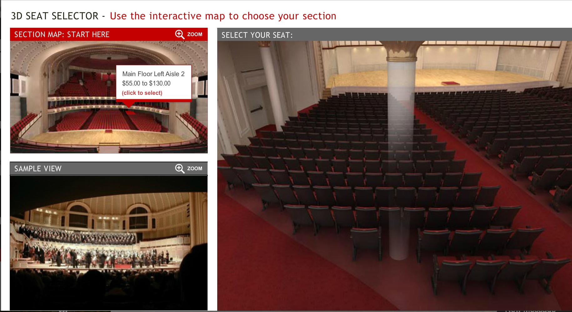
Almost all of us have had the experience of buying seats online—airline seats, stadium seats, concert seats. And we’re all familiar with the standard, 2D visual grid we’re often provided to give us context, a sense of where we will be in relation to the main event and the audience. But does this really give us a sense of what the experience of those seats will be like? How would visualizing the experience change where you’d like to sit? Or how much you’re willing to spend? When a brand sets clear expectations for the experience, how might we as customers act differently? These are some of the questions provoked by my recent experience with the Chicago Symphony Orchestra‘s digital site. By thoughtfully designing with the customer’s experience in mind, the site sets an enviable standard for other event-based brands (sports, travel, music, etc) to keep in mind. Here are a few takeaways, for marketers and UX alike, from what they’re doing well: #1: Sell the view, not the seat. Humans are visual creatures. What a grid might tell us of the logistics of a position, it won’t tell us of the experience. This is where the Chicago Symphony Orchestra shines, by providing a highly visual, 3D interactive guide that brings you into the venue itself to select your seat. By illustrating your seat selection through multiple points of view—from the seat itself, from the stage, and the view you can expect of the performance—the Chicago Symphony Orchestra makes it possible for customers to truly visualize what they’re about to experience. And that’s important. By being able to visualize the angle at which you’ll experience the performance, this interactive tool provides richer data to customers about what their dollars are buying. What might be overlooked as a circle on a grid map becomes a clear column in the visual experience, a clue that might prompt the customer to seek a less obstructed view. And by comparing visual experiences, customers have a stronger incentive to pay more for seats that will give them a preferred vantage point.
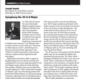
For brands that are not as event-driven, there is still a lesson to be learned. By providing a preview of the customer experience, you create a more seamless and accessible path for prospects to become customers. #2: Make the audience the subject matter expert. In addition to previewing the concert experience by vantage point, the Chicago Symphony Orchestra goes several steps further, providing musical previews and program notes for concert-goers to fully understand the history, context and nuance of what they will experience. This expertise is provided in a variety of formats (podcasts, mobile apps, downloadable PDFs) and at varying degrees of depth, so that audiences can select the mode they prefer. The customer-centricity of the content and the easy access to knowledge makes it possible for music amateurs to feel like experts, fully prepared upon arrival at the venue to get the most out of the experience.
For brand marketers, this is a great reminder to think about content as a way to enhance an experience with your specific products and services, versus convincing the customer how much the brand knows about a topic. In other words, it’s all about giving the customer confidence in their own knowledge. To do this, marketers can ask: “what is the real-world experience a customer can expect to have [with this product/service/event], and where can we supplement and improve that with additional knowledge?” #3: Make the value exchange clear. Like any institution, the Chicago Symphony Orchestra would love for you to sign up for future updates and promotions. But unlike some organizations, their request for email signup comes with a critical piece of microcopy: “Sent on average 2x a month” accompanied by a link to manage email preferences. What this accomplishes at this micro level is significant: it allows users to know, in advance of signing up for anything, that their time will not be wasted and that they are in control of the email experience. Microcopy like this helps to mitigate the common gripes customers have about email signups and effectively removes barriers less fanatical devotees of music might have towards a subscription.
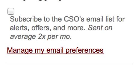
The takeaway here for UX designers is to never overlook the power of microcopy. It has the ability to significantly reduce barriers in the decision-making process if placed in the right spot at the right moment. And for marketers, this is another great example of providing a preview into the customer experience and clarity about the value exchange (in this case, asking for customer data in exchange for the respect of not being pestered while still receiving informative updates). By taking an approach that is rooted in the customer’s perspective, brands can set clear expectations, enhance the customer’s own confidence and affinity, and drive the kinds of behaviors that will ultimately be mutually beneficial to customer and brand.
Digital & Social Articles on Business 2 Community
(224)

