For decades, the pot leaf was a potent symbol of the counterculture, an unnuanced logo adorning everything from lighters to T-shirts and endlessly doodled in teenagers’ notebooks. Brandish a pot leaf, and you conjured a world: High Times subscriptions and communes along the Russian River and Dick’s Picks Volume 29. That the logo looked like bad clipart was just part of its scruffy charm.
But marijuana no longer belongs to the subculture. Today, medical marijuana is legal, or partially legal, in 23 states and Washington, D.C. It’s the fastest growing industry in the U.S., valued at an estimated $2.7 billion and expected to reach nearly $11 billion by 2019. Almost half of Americans have tried pot. The country’s relationship to pot has changed. Pot’s logo has not.
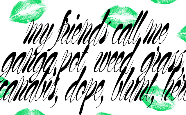
 Arno Baudin/Base Design
So we asked a handful of branding firms to create new visual identities for how Americans use marijuana in the 21st century. The resulting proposals—from Base Design, Collins, and Siegel+Gale—offer visions of Brand Marijuana that still evoke the heady iconography of smoking up while acknowledging the fact that weed has irrevocably gone pro.