
Bookmark these COVID-19 trackers to see how state reopening policies affect outbreaks
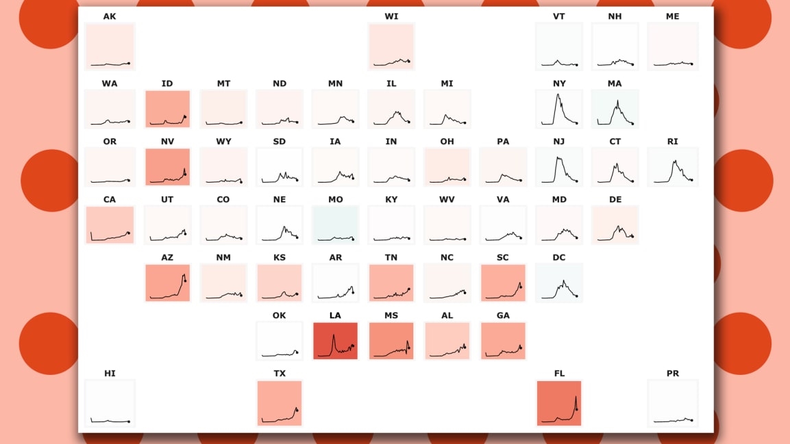
As 4.8 million Americans returned to work in June, COVID-19 did not magically go away. New cases are spiking in a number of southern states—and tracking this clusterjam from your screen has become the new people watching of our era.
To make sense of the chaos, the excellent Johns Hopkins University Coronavirus Resource Center, which already operates the COVID-19 dashboard that scientists and policymakers depend on, has added two critically helpful new tools:
This is all in addition to the center’s U.S. dashboard, which snapshots county hotspots nationwide, alongside helpful case and death curves for each county. The new tools, listed under “Critical Trends,” feel like acknowledgement that we’re in this pandemic for the long haul.
(8)
