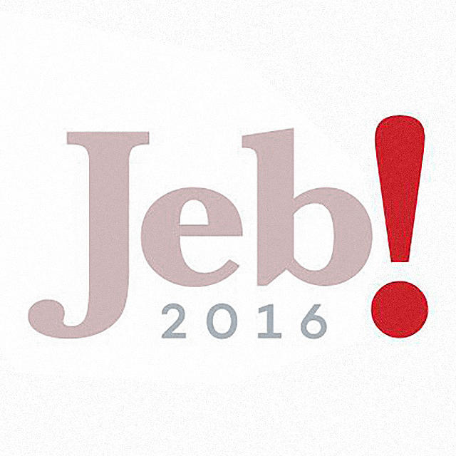
On Sunday, a day before officially announcing his bid for the 2016 U.S. presidential election, former Florida governor Jeb Bush tweeted an image of his new campaign logo. Designed by GOP consultant Mike Murphy (who only seems to have one gear in his logo design transmission), the Jeb! logo is a variant of the same design that Bush used when he was elected governor of Florida in 1998. Does it work, or is it another Marco Rubio-sized disaster?
We asked three designers what they thought. Surprisingly, given the design world’s tendency to skew left—and the right’s tendency to produce some truly awful logos—pretty much everyone we showed it to liked it, with a few caveats. Here’s what bigwigs from Siegel+Gale, Moving Brands, Doyle Partners, and Chermayeff, Geismar, & Haviv thought.

When compared to the 1998 version, a big change to the Jeb! 2016 logo is the typeface. Swiping a trick from Errol Morris (the documentarian who once got former Secretary of Defense Robert McNamara to confess to war crimes) the logo uses Baskerville as its main serif, a typeface that has been shown to make us more likely to believe what we are reading).
“It’s a huge improvement,” says Sagi Haviv, partner at Chermayeff, Geismar, & Haviv. “The last font he used was just awful. By using a more traditional serif font, and by putting it in all red, Bush is trying to send a message to Republicans: I’m one of you, and I value tradition.”
But Howard Belk,* co-CEO and Chief Creative Officer of Siegel+Gale, thinks the logo falls apart when you compare the Baskerville of “Jeb!” with the sans-serif of “2016.” “The mix of fonts is weak,” he says. “The 2016 just has no visual relationship to the Jeb! serif. It just looks like it’s about to be flattened.”

Even more noticeable than the typeface in the logo is the huge exclamation point at the end. Moving Brands co-founder and chief creative officer Jim Bull says he’s not sure it works.
“Historically, exclamation points have been used by many famous brands to represent their story and character; Yahoo!, BigLots!, ChipsAhoy!, E!, and Zappos!, for example. They are all striving for an openness, friendly, for-everyone feel and conversation with their consumers,” Bull says, “But are these the traits that we look for in a presidential candidate? Is the American public looking for its next president to be a friend or a leader?”
Haviv thinks that the exclamation point is a little lame. “I think it’s a little hokey, a little forced,” Haviv says. “And a good logo shouldn’t try to force you to be excited about it.” Even so, Haviv says that at least the exclamation point is well-executed. “The exclamation at least balances well with the letters, unlike Marco Rubio’s awful logo, which reduces the entire country of America to what looks like a tiny whale dotting the ‘i.'”
Stephen Doyle, of New York Based graphic-design firm Doyle Partners, had another take. ” Jeb’s logo demonstrates an alarmingly genuine surprise that he’s running for president at all!” he says. “I wonder if the team, while exploring punctuation, had considered ‘Jeb?'”
The only designer who was unapologetically a fan of the exclamation point was Siegel+Gale’s Howard Belk. “The exclamation point is saying: Don’t get confused by those 14 other Republican candidate pretenders—Jeb is the answer!” Belk says.

One of the most striking things about the Jeb! 2016 logo is its lack of iconography: no stars, no stripes, no eagles—none of the usual visual clichés. Both Haviv and Belk thinks that helps the logo send a very strong message.
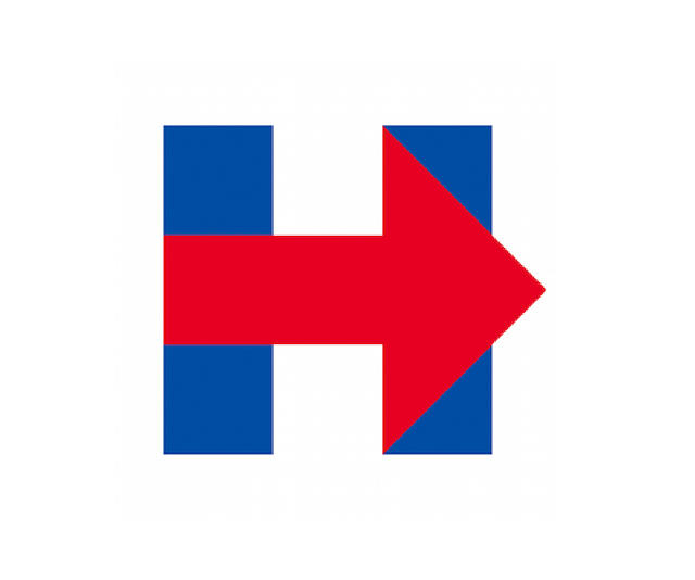
“With this logo, Jeb’s going for a simplicity that matches his chief rival: Hillary’s Arrow-H,” Belk says. “It was a good decision not to try and reinterpret the standard visual clichés of political campaigns. Those all look bereft of new ideas. The tone here is confident, assertive, positive. And it was a smart move not to use the family name in the logo: with this logo, it looks like Jeb wants to establish he’s not afraid to be his own man, as opposed to simply another leaf off the same old Bush.”
In a year in which both Republicans and Democrats are looking to establish dynasties in the White House (the second Clinton as president, and the third Bush), Haviv also sees it as significant that both Jeb and Hillary do not use their last names in their campaign identities.
“Hillary went a step further, and didn’t even use her first name,” Haviv points out. “Bush is stopping just short of that, but he’s still sending a very clear message: I’m not just my brother’s brother, or my father’s son.”
Jeb! 2016. A surprise hit among designers. Has the entire world gone mad?
An earlier version of this article misspelled Howard Belk’s last name. We regret the error.