Does this font make you feel something?
What makes a typeface feel exciting to one person but boring to another? It turns out that our culture and geography can have a lot to do with how fonts make us feel, according to new research from Monotype, the Massachusetts-based type giant whose library includes Arial, Futura, and Helvetica.
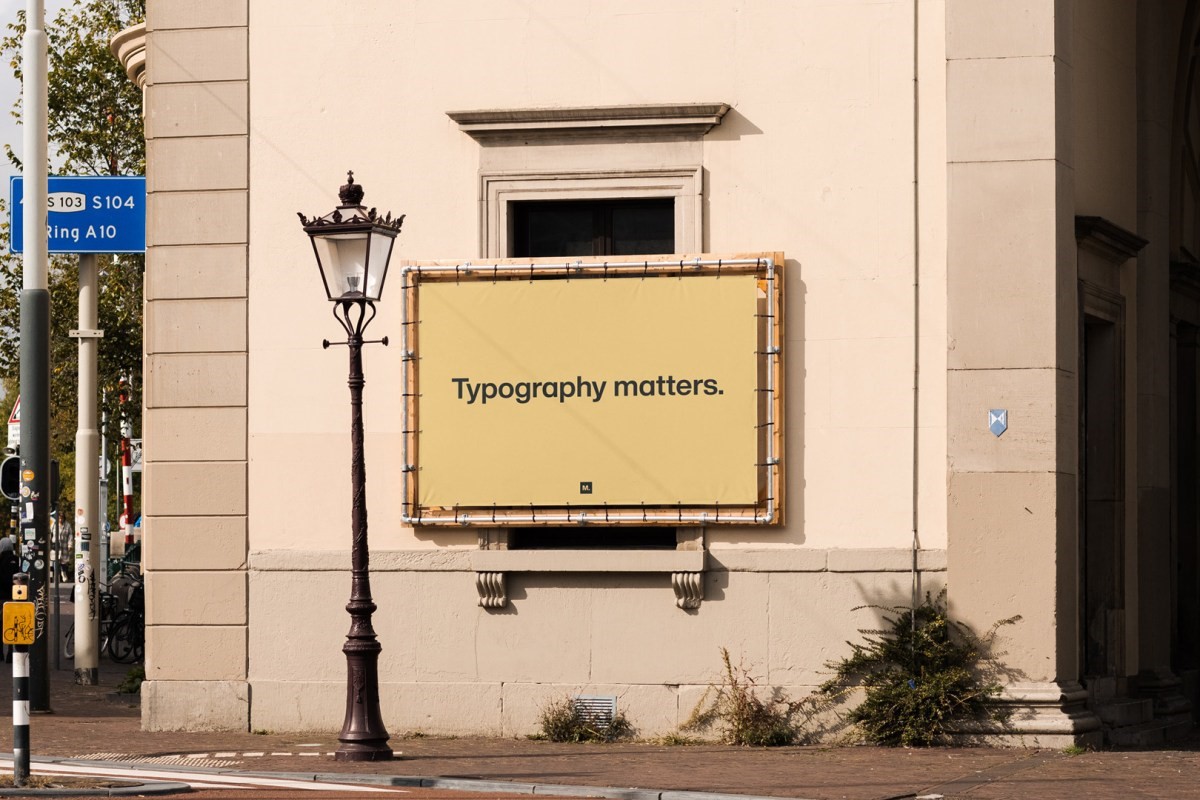
In 2021, Monotype partnered with Neurons, an applied-neuroscience company, to study whether typefaces can affect our emotional state. In their new report Typography Matters, the authors “wanted to understand how fonts drive experiences, associations, and feelings, and assess the effectiveness of different typefaces in unique situations.”
Their findings suggest global brands might want to rethink their type strategy.
Surveying 1,957 participants from eight countries—Australia, France, Germany, Japan, Portugal, Spain, the U.K., and the U.S.—researchers tested three typefaces: Gilroy, FS Jack, and Cotford. The study found certain typefaces were received similarly across all regions. A geometric sans serifs like Gilroy, for example, typically conveys honesty and clarity. While humanist fonts (those that have roots in hand-drawn calligraphy) like FS Jack, widely suggest innovation and distinction, according to the report. To test non-Latin alphabets, Monotype identified fonts of a similar style and origin, like the font Tazugane Gothic, which was used to assess Japanese characters.
This isn’t the first time researchers have tried to quantify the emotional associations of a typeface. In 2012, film director Errol Morris explored the “trustworthiness” of a typeface. Testing six fonts with some 45,000 New York Times readers, he found that the majority believed the centuries-old Baskerville to be the most trustworthy typeface (Comic Sans, unsurprisingly, was the least). “Baskerville seems to be the king of fonts,” David Dunning, a social psychologist and psychology professor at the University of Michigan, told Morris, speculating its letterform had a gravitas that made it look authoritative. (Dunning is a retired Cornell psychology professor.) “Fonts have different personalities,” said Dunning. “It seems to me that one thing you can say about Baskerville is that it feels more formal or looks more formal. So that may give it a push in terms of its level of authority.”
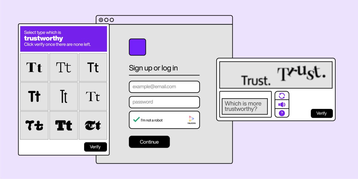
Monotype’s study with Neurons grew out of earlier research with MIT around legibility. After diving deep into research for this new report, Monotype executive creative director Phil Garnham says he’s left with even more questions about how people respond to type. Exactly why people view fonts differently across different cultures is complex, since readers bring a lifetime of their own associations and conditioning to the words they read. “As type designers and brand designers, we can be a lot more respectful now on an emotional level as opposed to just aesthetic,” he says.
Sarah Hyndman, a graphic designer and author of Why Fonts Matter, explains that designers and readers approach type differently. Whereas graphic designers and typographers “pay conscious attention to typography,” readers are word consumers who read almost constantly but without noticing. They “engage with type subconsciously and more emotionally.”

As Hyndman said via email, “Graphic designers typeset the lines. Word consumers read between the lines.”
Much like the experience of meeting a new person and forming a first impression based on appearance, Hyndman says people often make assumptions about text before even reading it. “Based on your first impression, you’ll decide whether to trust what you read; how friendly, aggressive, cheap, or premium it feels; and even whether you want to read it in the first place,” she says.
Rethinking a global brand
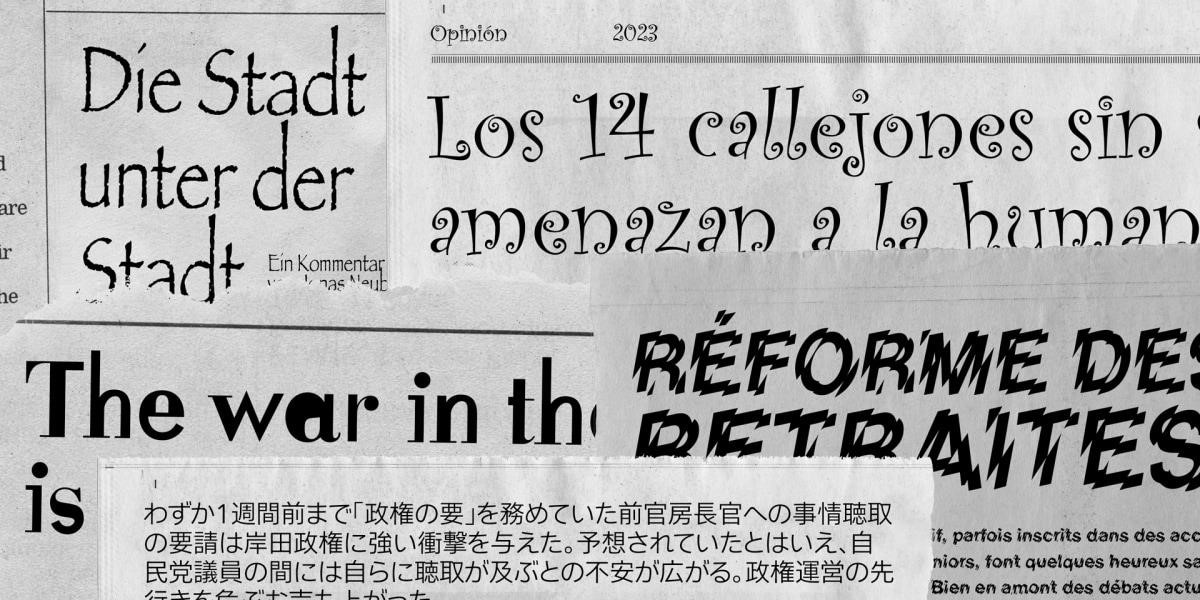
It’s common for graphic designers to use a consistent look across a brand, but Monotype’s study suggests that might not be so savvy in an increasingly globalized world. The company instead suggests that brands should focus on designing for shared, consistent emotions rather an a cohesive aesthetic.
For example, Monotype found that in the West, geometric sans-serif fonts are often used to communicate technology and innovation; but in Japan, humanist fonts are better for the job. “It makes a lot of sense in some ways because you think about Japanese calligraphy and the origins of using the brush,” Monotype’s Garnham says. “They’re the complete opposite of what we understand in Europe.”
Similarly, font preferences were impacted by a reader’s geography as well as their history with art and literature. In the majority English-speaking Australia, U.S., and U.K., readers were attracted to typefaces that were seen as “memorable,” “distinct,” and “unique.” Meanwhile, in France, Portugal, and Spain—“regions with a rich history of printing, which saw the rapid spread of movable type in Europe”—readers had a preference for the classic, ornate serif style of Cotford.
Many countries had different perspectives on what made a typeface trustworthy, too. In the U.K., humanist sans-serif typefaces were seen as the most sincere. But in France, the results were more ambiguous: geometric sans-serif fonts scored slightly higher than humanist ones. In Germany, readers were less conscious of a humanist font’s emotive traits in general, Garnham said, adding that Germans believed Cotford to be the most trustworthy of the fonts.
Though there’s more than a touch of pseudoscience to the findings, the discrepancies are telling. Typography and branding is not monolithic, and perhaps it’s time for companies to acknowledge that. “Maybe branding wasn’t meant to look the same everywhere after all,” Garnham says.
(23)

