The acclaimed filmmaker of The Thin Blue Line and The Fog Of War reveals why he now types all his manuscripts in Baskerville.
In 2013, acclaimed filmmaker and author Errol Morris ran a bold experiment. With the collusion of the New York Times, he asked 45,000 readers to take an online test. The test allegedly measured whether or not readers were optimists or pessimists. But in reality, Morris was trying to find out if the typeface a statement was written in had any impact on a reader’s willingness to agree with that statement. Simply put, are some typefaces more believable than others?
The answer is yes. Baskerville, a 250-year-old serif originally designed by John Baskerville, was statistically more likely to influence the minds of readers than Computer Modern, Georgia, Helvetica, Comic Sans or Trebuchet. The results of Morris’s experiment were published online in a two-part essay called Hear, All Ye People; Hearken, O Earth! and have now been put into print, as the 44th edition of the Pentagram Papers, the monograph that the design firm Pentagram sends to an exclusive list of individuals each year. Pentagram partner and long-time Morris collaborator Michael Bierut put together the typographically exquisite monograph, with with the help of designer Jessica Svendsen.
Truth and its many influences have always fascinated Morris, who is a tireless investigator—in films, he has freed an innocent man from prison and gotten former Secretary of State Robert McNamara to confess to war crimes. Typography might not be a matter of life and death, but it touches neatly on the theme that permeates Morris’s corpus of work. I sat down with Morris in his Cambridge office recently, surrounded by the preserved heads of horses and monkeys, to ask him about typography and how it can shape our perception of truth.
Co.Design: How long have you been interested in typography?
Errol Morris: I’ve always been interested in typography. I’m not sure when I first started to think about typography and truth but I’m always thinking about truth in one form or another. That seems to be an ongoing theme in my work. It’s a question that almost suggests itself.
How did your Baskerville experiment come about?
Part of it is probably influenced, if I tried to peel it back, by Saul Kripke’s important 1980 book, Naming And Necessity, which deals with the notion that truth and reference is independent of the beliefs that we have.
For example, if you say, “the atomic number of gold is 79,” there’s a view that that has to be true, that it couldn’t be otherwise. But what if the font in which that sentence is expressed influenced our perception of that truth somehow? Would there be a way of testing that, to test our capacity for credulity? Whether we’re more willing to accept it as true because it’s written in one typeface or another?

I’ve been writing for the New York Times for four or five years. I thought, I could use the Times to do this test. In a usual social science test, you might have access to a couple hundred people. Here, I had the readership of the Times, which is not unsubstantial. I wanted to see if there was a way to use the Times‘ readership to test that hypothesis.
In the New York Times experiment, you tested the “truthiness” of six typefaces—Baskerville, Computer Modern, Georgia, Helvetica, Comic Sans and Trebuchet. How did you choose those six?
I’d like to say there’s something that really went into it, that was scientific, and I wanted a combination of serif and sans serif fonts, so we picked three of each. It could have been more, but we picked six. Why those six? Your guess is as good as mine.
Did you have a working theory on how the experiment might play out?
Yes and no. If you’re asking me if I had any feeling what typeface might stand out, absolutely not. But did I think there would be some measurable result? I wasn’t sure, but I liked the idea that there would be one. There is something absurd about the essay. It’s absurd to think that we would be nudged by one typeface over another, into believing something to be true. Something disturbing about it, I’d go so far to say.
The New York Times experiment found that readers were more likely to agree with a statement written in Baskerville than other fonts. Do you think the experiment would play out differently on other websites?
I don’t know. There are a lot of reasons in any social science or psychology experiment why it might misrepresent some underlying reality. Do I think I’ve proven anything, that I can stamp a big Q.E.D. on this experiment? No, I don’t think that. I do think, however, that it was a worthwhile experiment, and that the results are meaningful, quote-unquote. What meaningful means is not exactly clear to me. All I know is that a lot of people responded, in excess of 40,000 people. That’s a huge sample in this kind of test.
Was there any resistance at the New York Times to the idea of taking part a social experiment that involved lying to their readership?
No. Although I was surprised they ran it, because you’re right. Doesn’t it involve tricking the reader in some way? Is that a proper use of the New York Times? Personally, I think yes, it is, and I was really glad my editors there went along with me.
The original essay was published online. How do you feel about its physical incarnation as a Pentagram Paper?
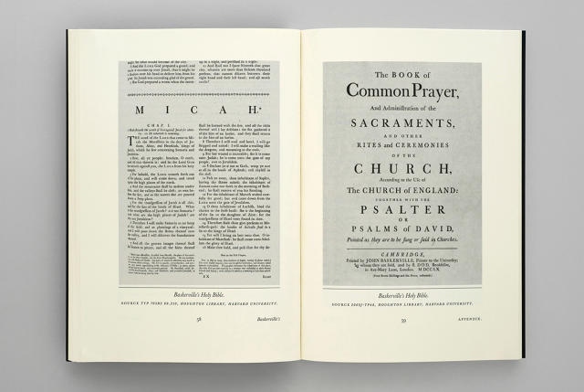
I think it’s beautiful. I’m just deeply grateful to Michael [Bierut] for doing this. I had no idea what to expect. It’s very cool. It’s full of amazing details. It has marbled end papers, which I’ve just never seen done in a paperback before. And, of course, the typography is just wonderful: it’s a book about Baskerville, printed in Baskerville, that looks like it could have been published by John Baskerville, during his life. My only complaint is that I originally wanted this to be in hardback, but Michael persuaded me that this is just as good. Having seen it, I agree, but I really wanted it to have deckled edges, like a hardback. Any book with a deckled edge, in my opinion, is better than one without a deckled edge.
Pentagram Papers are notoriously hard to find, unless you know someone at Pentagram. Are there any plans to make this printed version, or something like it, available to the public?
I would love for this to be in bookstores, or available so that people could purchase it, because it’s a beautiful object. It’s not just a book, it’s an objet d’art. If books are going to exist at all today, which is a big if, they have to be in some sense objects we want to possess. This, for me, fits that bill. I would love to see this at a table in a bookstore.
Publishing is really changing in so many ways. Books aren’t going out of existence, but I think the appetite for books like this is going to increase. I think there will be more interest in beautiful books, and books as objet d’art, as opposed to just simply a vehicle for conveying content.
Your Baskerville essay is ultimately about how we perceive the world through typefaces. Do you think that argument is augmented by Pentagram turning it into a beautiful typographic object?
Yes. I’m the author, and I take it even more seriously seeing what Pentagram has done with it than I ever did before! When I got my copy, I said to myself, ‘Wow, this is much more substantial than even I thought it was.’
When people read this for the first time, how do you hope that will change their own perception of the world?
I’m not really sure. I’m not even sure what exactly to make of the results, in truth. Everything I do—everything I write about and everything I make movies about—is about the distance between the world and us. We think the world is just given to us, that there’s no slack in the system, but there is. Everything I do is about the slack of the system: the difference between reality and our perception of reality. So in the sense that this essay lets us further reflect on the world around us, and even makes us paranoid about the slack in the system, then I think it’s a good and valuable thing.
Final question: have the results of your Baskerville experiment changed the typefaces you use?
Oh yes, I’m drinking my own Kool-Aid now. I used to write all of my manuscripts in Bembo. Now I write them in Baskerville.
[All Images: courtesy Pentagram]
Fast Company , Read Full Story
(161)
