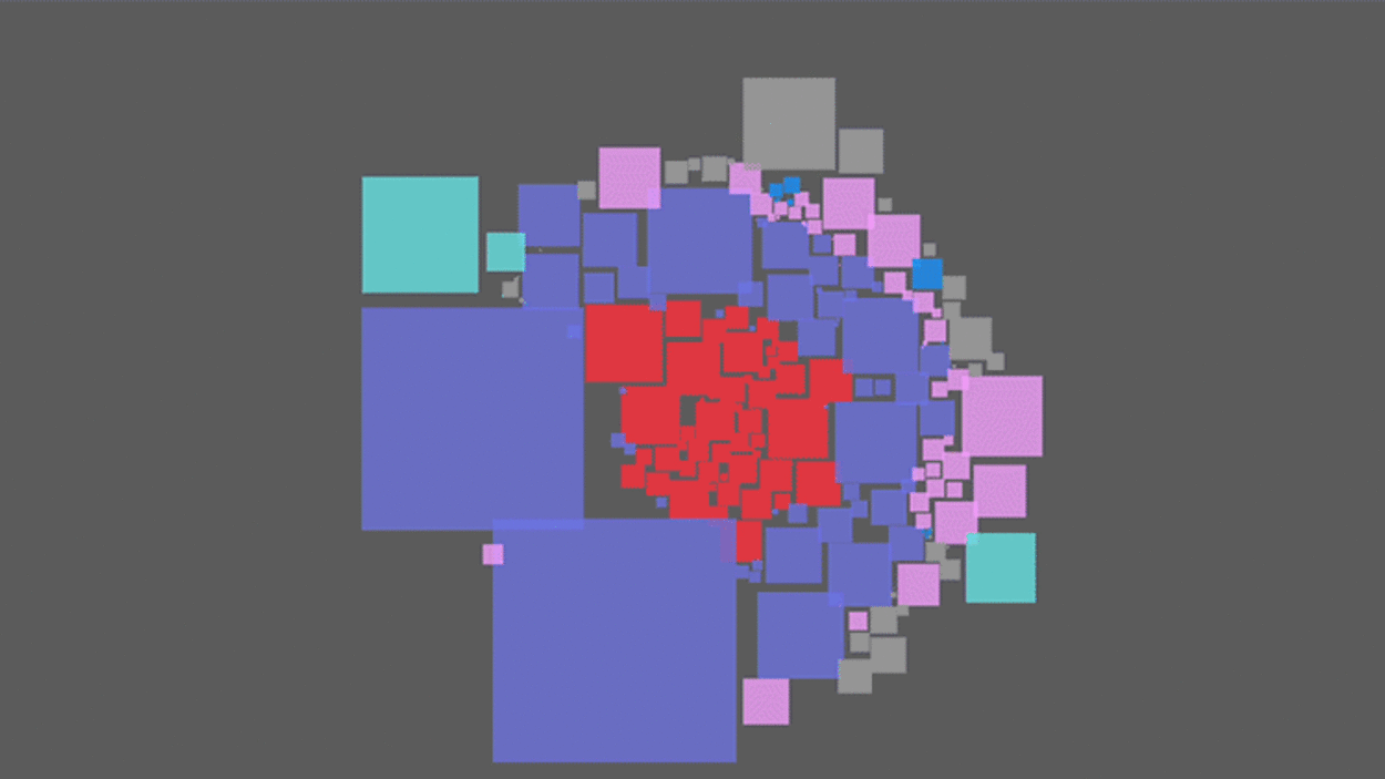
Flourish offers a great way to create charts and interactive visuals


By Jeremy Caplan

This article is republished with permission from Wonder Tools, a newsletter that helps you discover the most useful sites and apps. Subscribe here.

Flourish is the most useful tool for creating data visualizations. It’s free and easy to use to make line, bar, and pie charts. You can also use its templates to craft sophisticated 3D maps, word clouds, quizzes, or annotated timelines.

You can share, download, or embed your creations. Canva acquired Flourish in 2022, so you can use it on its own or insert graphics into a Canva presentation. This post is an update of an earlier write-up.

3 visuals you can create with Flourish

    Bar Chart Race: Compare changes over time. Show sales growth, a market value comparison, or a head-to-head assessment of athletic performance.

    Photo Slider: Show before-and-after images to illustrate damage caused by a natural disaster or how a face or place has changed over time. Just upload two photos.

      Default view: The viewer drags a slider back and forth to see image A and B.

      Fader style: Two images fade into one another as the viewer drags the slider.

      Spotlight style: Elements of image B are spotlighted when the viewer mouses over image A. This highlight changes to details within an image.  
    Cards: Flourish visualizations don’t require numbers. Cards let you highlight companies, political candidates, athletes, artists, or other entities with a carousel.

New in Flourish

    Scrollytelling renders your visuals as an immersive, scrollable visual story.

    Interactive calculators let viewers personalize data. You can even link a Google Sheet to Flourish to visualize survey responses as they arrive.

    Gauge graphics let you show data on a low-high gauge (as on election night).

4 useful features 

    Templates include more than 50 ready-to-make visuals. Drop in your own data to get a graphic to use for your site, newsletter, or social networks.

    Stories let you combine multiple visuals over a series of interactive slides. An example illustrates global exports.  

    Searchable charts enable your viewer to find relevant data within a graphic.  

    Annotations allow you to explain complex data sets or anomalies. 

Pricing

Flourish is free for basic use. Newsrooms can apply to use Flourish for free. Enterprise users can contact Flourish for a price quote.


Caveats

    No mobile app. Visuals created with Flourish do look good on mobile, though.

    Some visualization templates—like timelines and interactive calculators—are only available on paid plans.

    Data novices may find Flourish’s customization options overwhelming.

Learn More

Alternatives to Flourish

    Piktochart and Infogram have easy-to-use infographics templates.

    Genially lets you add a variety of interactive elements to your graphics.

    Datawrapper is free and simple, but has fewer visualization templates.

This article is republished with permission from Wonder Tools, a newsletter that helps you discover the most useful sites and apps. Subscribe here.

Fast Company

(11)