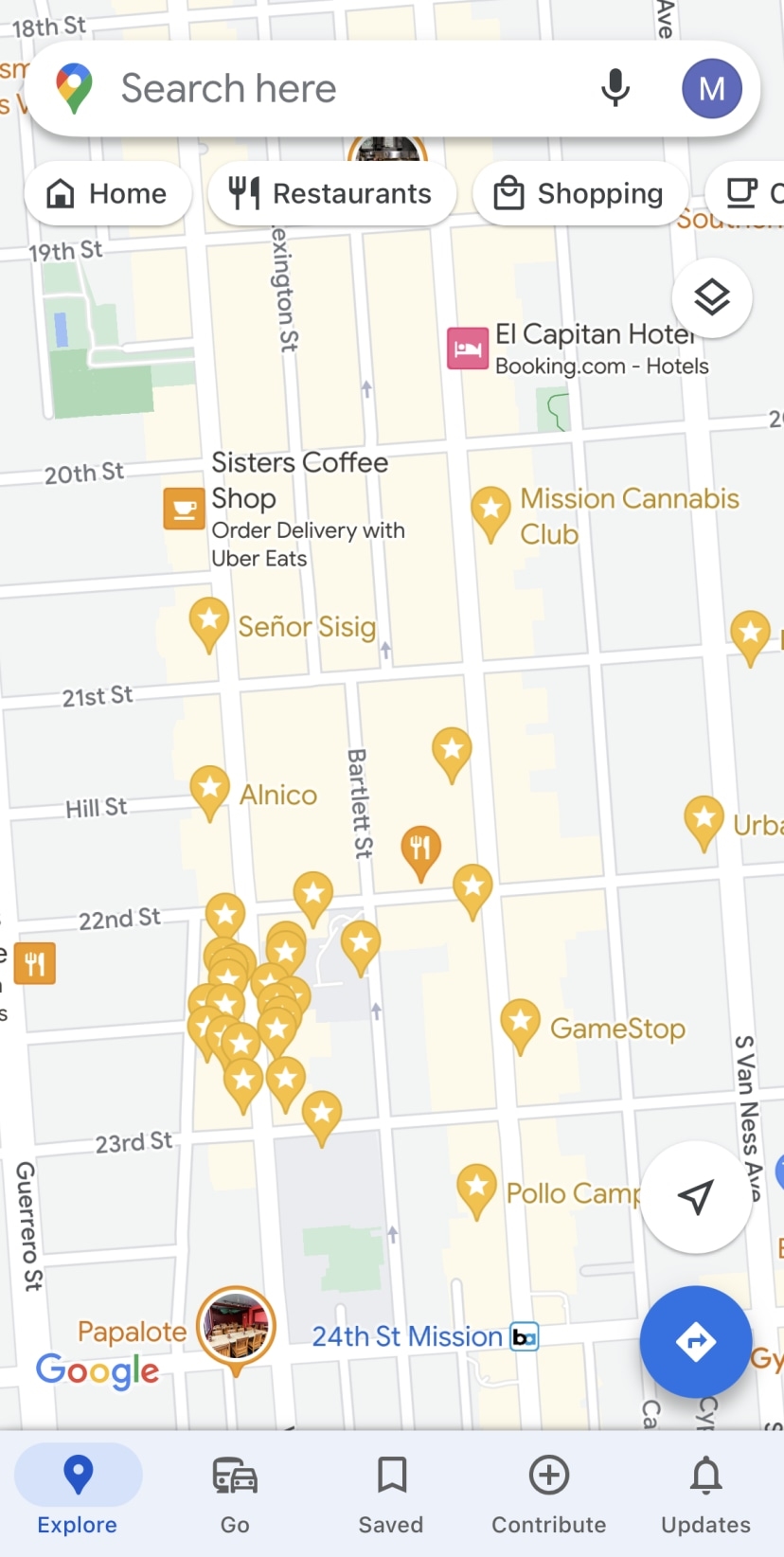
Last week I wrote a piece highlighting how Google Maps has become a bit of an eyesore in recent years. While Google Maps’ data on businesses and other points of interest is second to none, using the map to navigate has become a challenge, mainly due to excess visual clutter.
Since the story ran, others have chimed in about their gripes regarding Google Maps, particularly as navigation and map browsing is concerned. With that in mind, I’ve rounded up some of the most frequent complaints Google Maps users have. These are the top five.
What building is this?
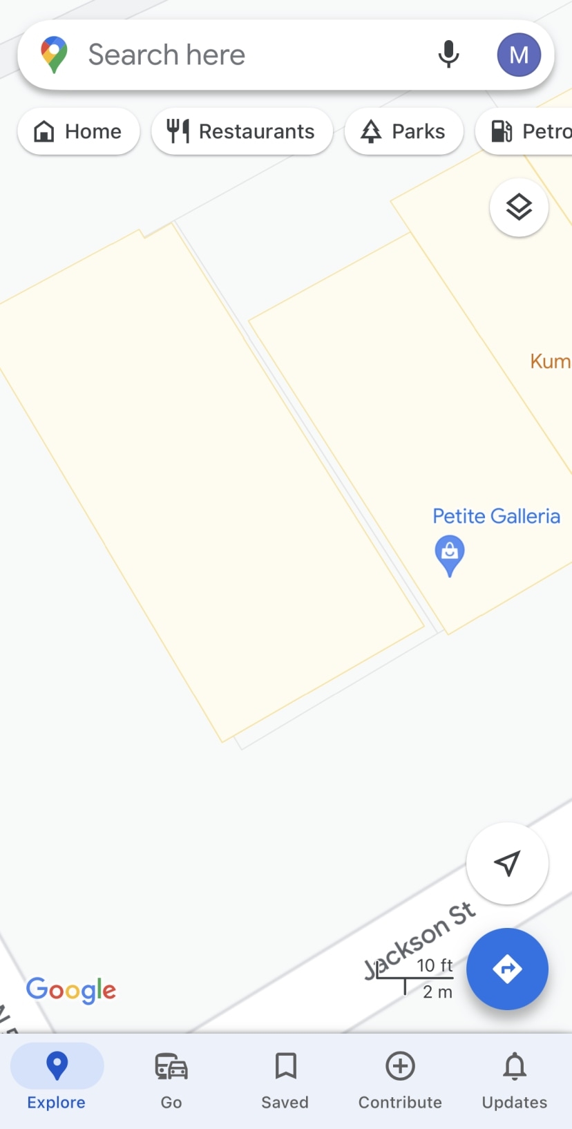
Google Maps was among the first modern mapping providers to show not just streets, but the shapes of the individual buildings on those streets. These shapes can greatly help a user while navigating or browsing a hyperlocal section of a map.
But there’s a frustrating thing about these shapes: They don’t always show what the building is—for example, a restaurant or a dentist’s office—no matter how closely you zoom in. Tap the shape of the building, and it reveals nothing. This is frustrating because many times the building you zoom in on shows no pin you can tap to find out information about the establishment, but the buildings on either side do. There is, of course, a pin available for the building—but the only way you can access it is to type the name of the company into the search function in the app. And if you knew the name of it, you wouldn’t need the map in the first place.
If a pin exists for the building shape we’ve zoomed in on, why not just allow us to tap the building to see the establishment’s information?

Your business is called, what, exactly?
Another frequent complaint I’ve heard a lot is that businesses are increasingly trying to game Google Maps by padding their official names with more descriptors. For example, if the name of a restaurant is called “123 Burgers,” the name that appears in its Google Map listing and pin might be “123 Burgers—27 Varieties! Open 24/7.” This extra information just further clutters the map.
To be fair to Google, the company does not endorse this type of SEO-focused name gaming. As a matter of fact, it strictly forbids it. Still, it increasingly seems that establishments either don’t care or have found a way around whatever systems Google has in place to prevent such egregious behavior.
Saved pins are great, until they’re not
As I mentioned in the previous post, the number of random and irrelevant pins that Google Maps chooses to surface to the user when they’re browsing the map is one of the main reasons Google Maps has become an eyesore. But those aren’t the only kinds of pins that are contributing to the clutter problem.
Another is a user’s saved pins. Saved pins allow you to mark a point of interest so that you can quickly navigate to it later on. I want to be clear: Saved pins are one of the most useful features of Google Maps. But if you have lots of them in one location, they can quickly crowd out other points you might be looking for.
Of course, this isn’t Google’s fault. The user chooses the number of pins they will save to the map. However, it would be nice if Google added a toggle button that allows the user to quickly hide or show saved pins.

The categories bar
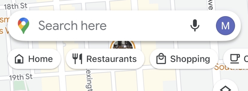
While not a map feature itself, many readers of my previous post have said that they find the categories bar that runs at the top of the map (right below the search field) in Google Maps to be so awkwardly placed that it’s a deterrent to use. Not only does it cover some of the map, but I’ve also accidentally tapped a category button from this bar when I meant to tap the search field.
While the bar can be helpful if you just want to browse certain types of establishments on Google Maps, its horizontal navigation makes it feel incongruous to use. And the fact that you can’t customize the category buttons in the bar is a drawback.

The social-mediafication of the app
Finally, readers have weighed in to say that they lament the increasing social-mediafication of the Google Maps app. When it comes to the app’s UI, I see their point. Two of the five bottom toolbar buttons aren’t actually dedicated to mapping or directions. Instead, they are dedicated to the user’s contributions to Google Maps and updates from other Google Maps contributors whom they have chosen to follow.
If you strictly go to Google Maps to get directions or find establishment information, I completely understand this gripe. It makes the app look cluttered and more like a social media platform than a navigation app. These features are for power users, not everyday users.
However, the reason Google Maps has the best establishment information of any mapping service is that it does have a community of millions of users around the world who actively contribute updated information to establishment listings as well as photos of everything from the interior of a place to a restaurant’s menus—not to mention high-quality reviews of different businesses.
Without these contributions from the community, Google Maps would be a shell of itself, and I believe users would be worse off. A happy compromise would be to allow the user to hide the toolbar buttons they don’t use and feel clutters the app, giving them a streamlined interface dedicated to search and navigation. After all, isn’t that the point of the app?
(73)