Mies van der Rohe’s famed New York City skyscraper is the mid-century modernist equivalent of the gigantic hit record.
First, the obligatory disclaimer: Mies van der Rohe’s Seagram Building is unquestionably a great piece of architecture. But this slick glass tower, which rises 39 stories over Park Avenue in New York, is also something else slightly more peculiar: the underwhelming masterpiece. Loved, admired, worshipped and revered by the architecture profession, it has become a building whose virtues need some explanation, especially to the uninitiated.
One of the most influential office towers of its time, the 1958 Seagram Building has been endlessly copied, ripped off, morphed, and mutated, not just up and down Park Avenue, but over on the canyon of towers on New York’s Sixth Avenue, and in virtually all cities around the world (and even some suburban industrial parks). Most Manhattan office towers built after 1958, in fact, owe some sort of aesthetic debt to the Seagram Building. It’s mid-century modernism’s equivalent of the gigantic hit record.
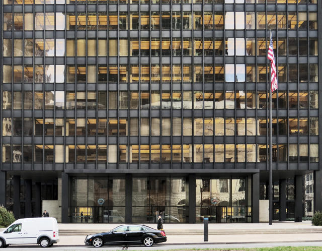
This is especially apparent—almost painfully apparent—on the building’s home turf, just north of Grand Central Terminal, where with the exception of the wonderful and jaunty Lever House and a few even older historic structures, real estate developers and their architects plopped a sad row of lumbering giants, most of them bigger, boxier, with smaller or nonexistent plazas and utterly banal lobbies. All of these buildings loosely employ the same vocabulary as Seagram (with none of the refinement and charm), but all of them were executed for maximum profit. What this has done—besides create a somewhat dreary and overscaled pedestrian streetscape—is rob the Seagram Building of its visceral punch. Buildings like Grand Central, Frank Lloyd Wright’s Guggenheim Museum, and the Flatiron Building pack a wallop because they remain one-offs. There aren’t bad, steroidal imitations of them littering the urban landscape, diluting the brand. They still possess the power to wow.
As a result, a fuller appreciation of the Seagram Building has become a kind of intellectual exercise, requiring architectural tour guides. Its subtle beauties, I would argue, aren’t readily apparent to the man or woman on the street. The building is beautiful-upon-closer examination (a distinction, for me, that is somewhat similar to Sex and Talking About Sex). Unless you’re an architect, you don’t pull up to 375 Park Avenue, open the cab door, and cry: Look at that magnificent curtain wall! Those perfectly detailed mullions! That austere-yet-classical symmetry! You don’t think—as people often do, gazing up at the Empire State Building, staring slack-jawed in front of a Gothic cathedral, or even pondering the sheer lunacy of a half-mile high tower in Dubai—how could human beings have possibly built this? Instead you’re likely to glance to Mies’s crowning achievement, standing pristine and perfect, amid a forest of vastly larger and inferior knock-offs, and think: nice office building.
But in its day, with entirely different neighbors and a more immediate context, the Seagram Building was a symbol of rebirth and American ascendency, every bit as wow-inducing as Grand Central, which at the time was feeling the pressure of development and beginning to look as if it was stuck in the previous century. Fifty-seven years later, our perceptions of both buildings have changed. Today appreciating the Seagram Building is a little bit like stumbling across David Letterman on late night TV. He’s one of television’s most influential and widely imitated comedians, a true pioneer, but his cultural impact (just like the Seagram Building’s) has been muted by time and graceless hacks. So, unless you look closely, or have a design docent at the ready, it might be hard to see what all the original fuss was about.
More Essays On Overrated Design
What Champions Of Urban Density Get Wrong by Inga Saffron
The Case Against Open Design Competitions by Kriston Capps
It’s Time For The Minimalist Poster Trend To Die by John Brownlee
No, Flat Design Won’t Save Your Garbage App by Adrian Covert
You’ve All Been Had, Keurig Coffee Is The Devil by Mark Wilson
Beats By Dre Isn’t Great Design, Just Great Marketing by Devin Liddell
Please Stop Making Stupid Smart Jewelry by Kelsey Campbell-Dollaghan
Delightful Interaction Design Needs To Die by John Pavlus
The Thinkpad Is A Lasting, But Overrated, Design by Mark Wilson
[Top photo: Flickr user Jules Antonio]
Fast Company , Read Full Story
(333)
